
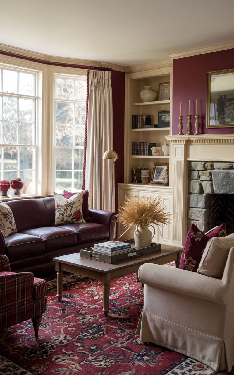
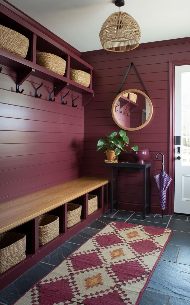
Burgundy is a sophisticated color tone to use in your home considering how it evokes the cozy elegance of a glass of red wine. It can add a sense of warmth to the space considering the stylish mix of rusty red and brown with a gorgeous touch of purple. Whether you’re interested in a full room makeover or just adding some decorative accents to the room, it’s important to figure out how to integrate burgundy with other colors. This dark red hue shows off decent versatility but it’s recommended to focus on certain tones to make it pop or enhance its refined moodiness.
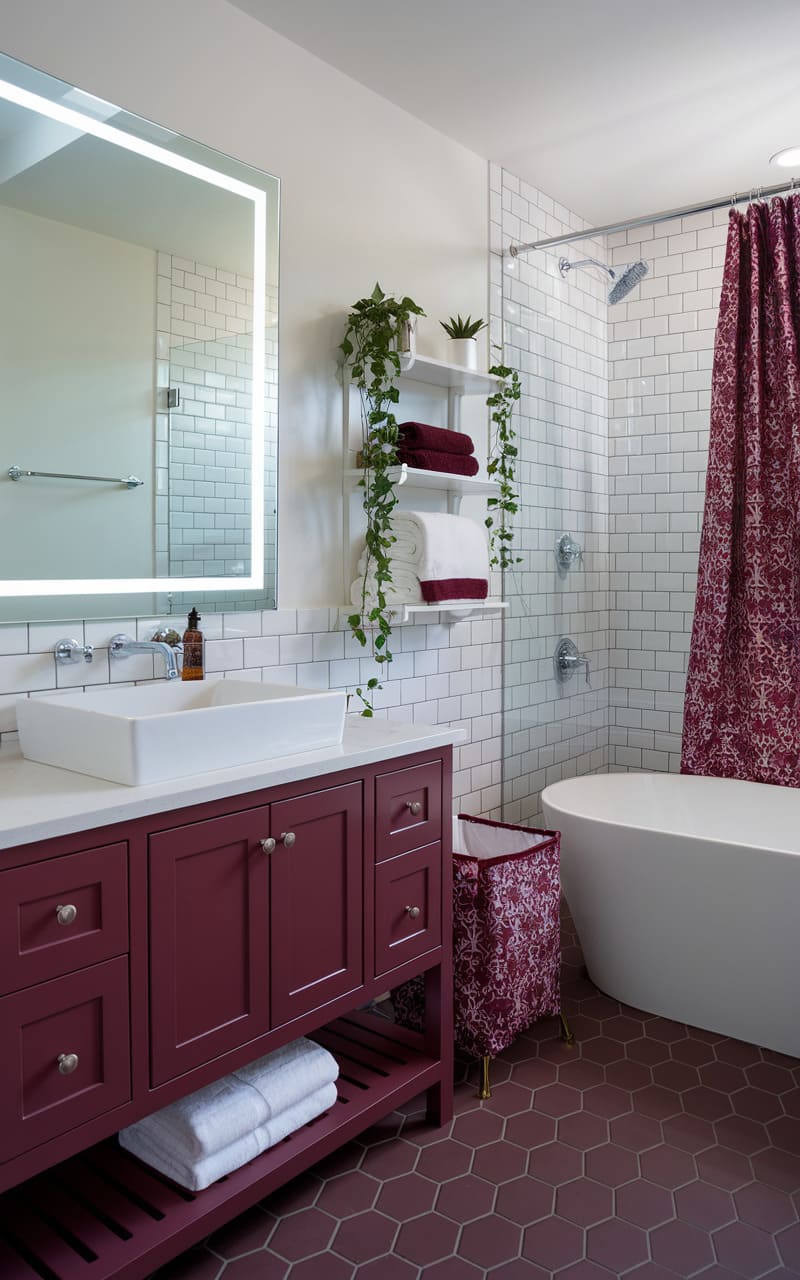
1. White
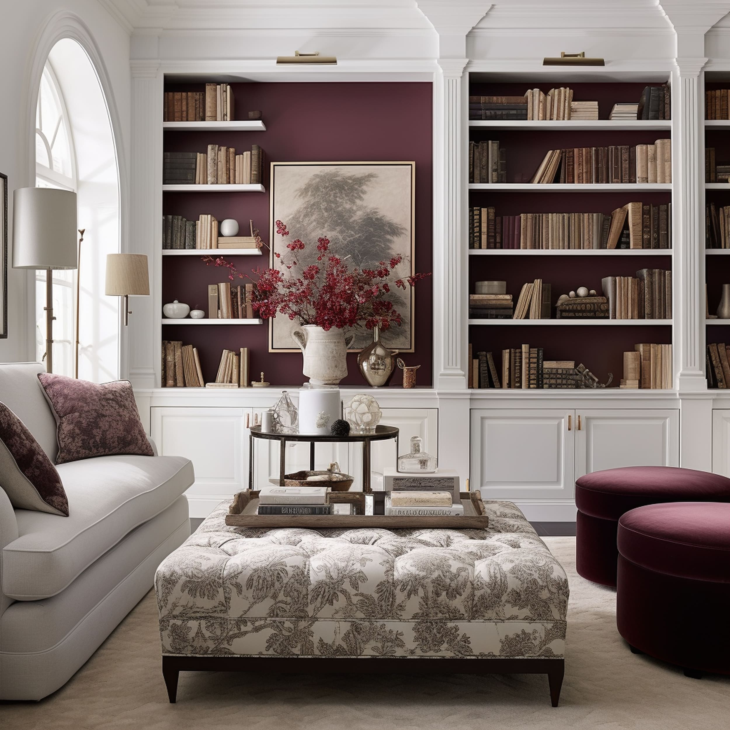
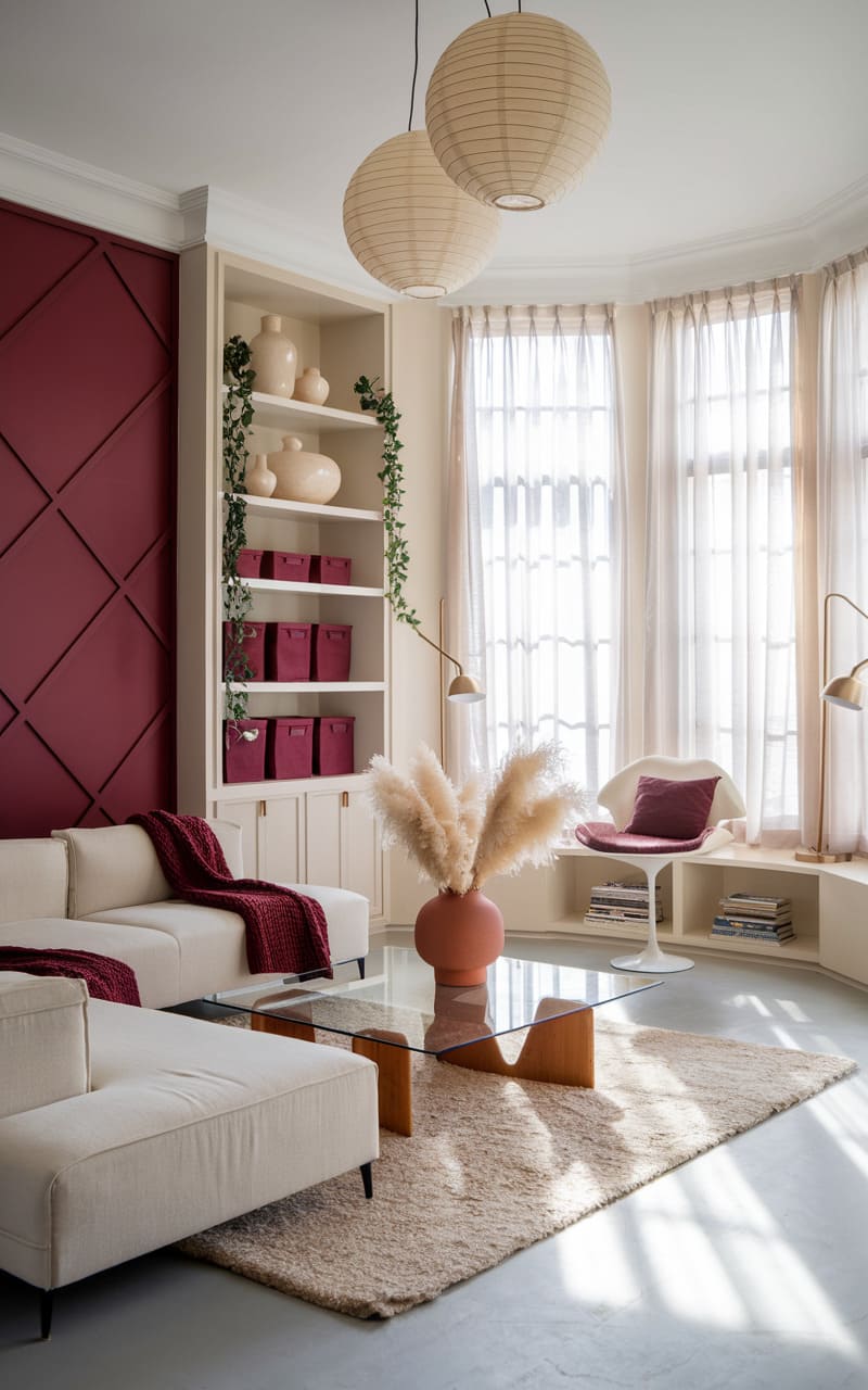
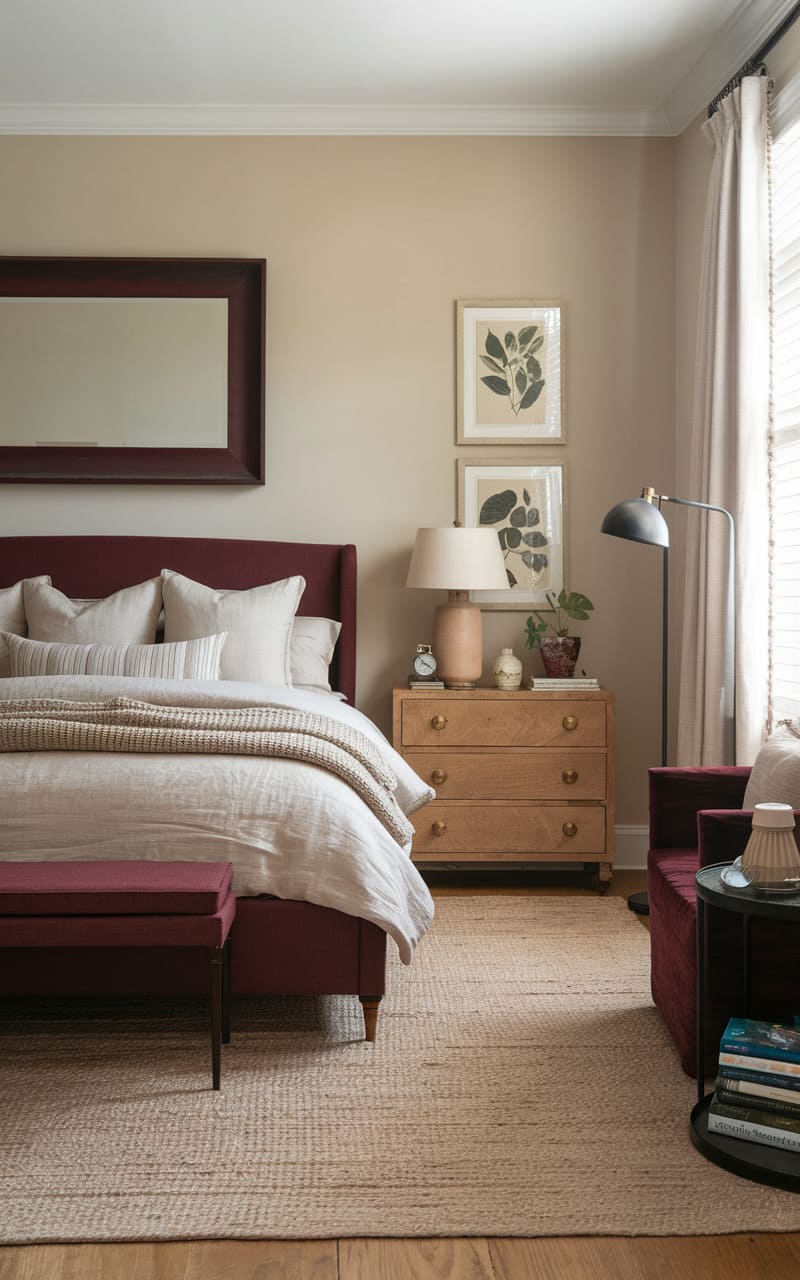
A crisp white background works ideally for burgundy elements to show off an attractive contrast. Considering the dark-toned style of burgundy, it’s safe to say that any neutral color scheme focusing on light tones should act as a good visual match. Allowing white walls and other architectural details to dominate the space can provide an excellent opportunity for a pop of color. That’s where a sophisticated jewel tone such as burgundy can make a bold impression. Aside from furniture pieces like an ottoman, burgundy touches can also be added in more creative ways such as through the inside of white bookshelves.
2. Gold
3. Teal
4. Pale Green and Off White
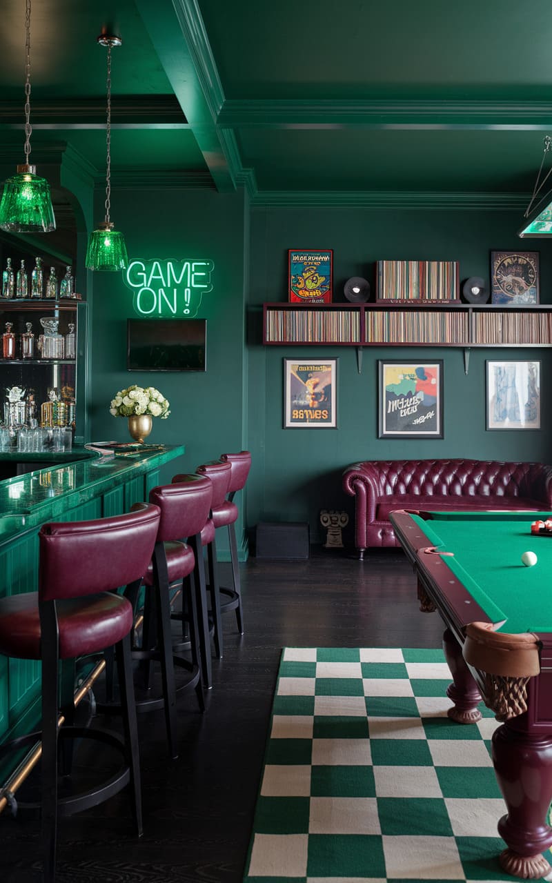
5. Black
6. Blue
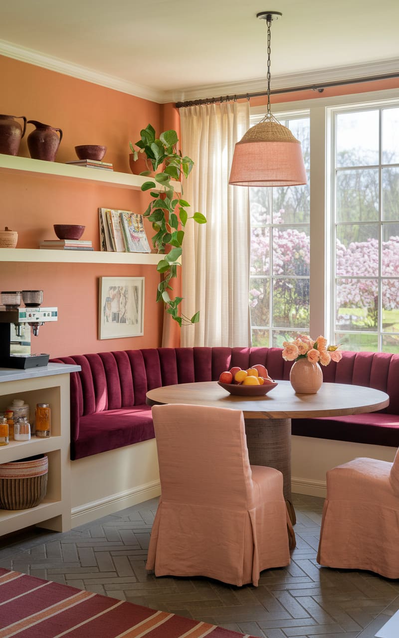
7. Burnt Orange
8. Dusty White
9. Vibrant Green
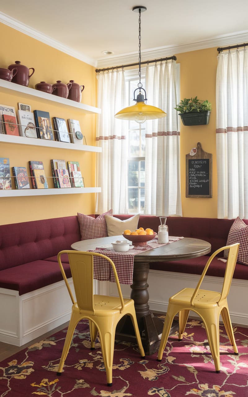
10. Deep Yellow
11. Black
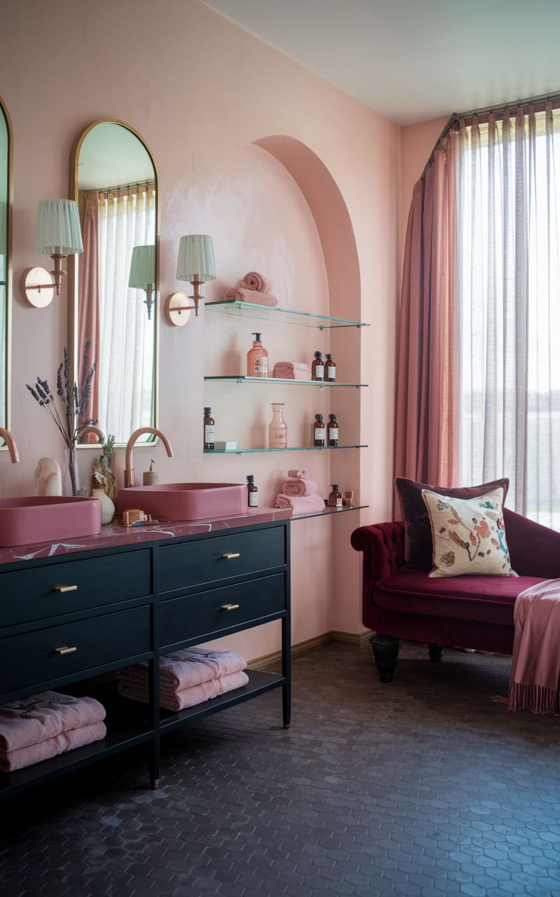
12. Pale Pink
13. Navy Blue
14. Terracotta
15. Lilac Purple
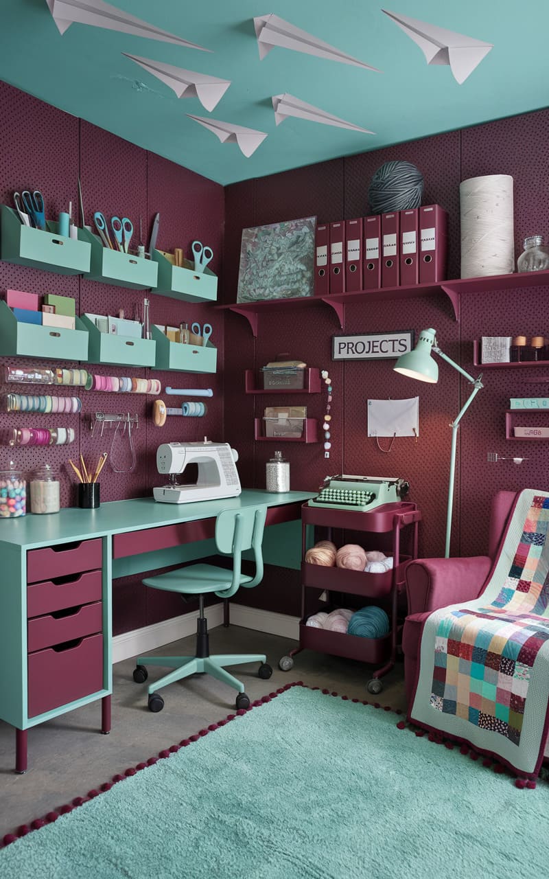
16. Mint Green
17. Dark Blue
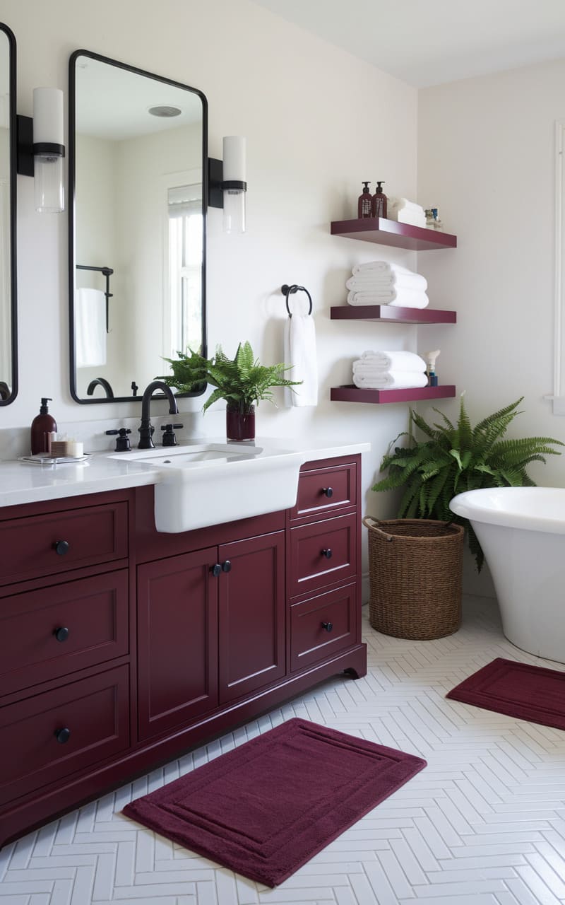
18. Cream
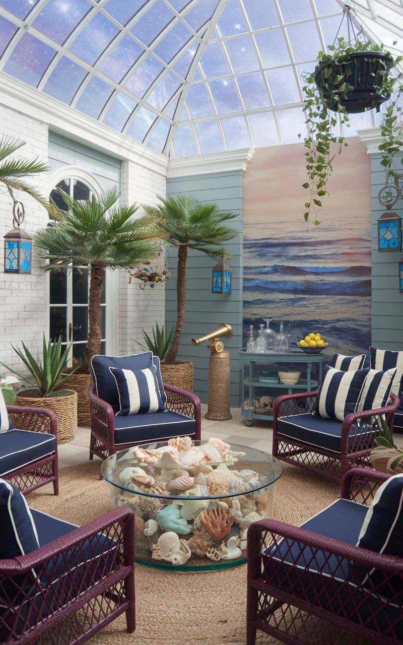
19. Ocean Blue
20. Neutral Colors
21. Gray
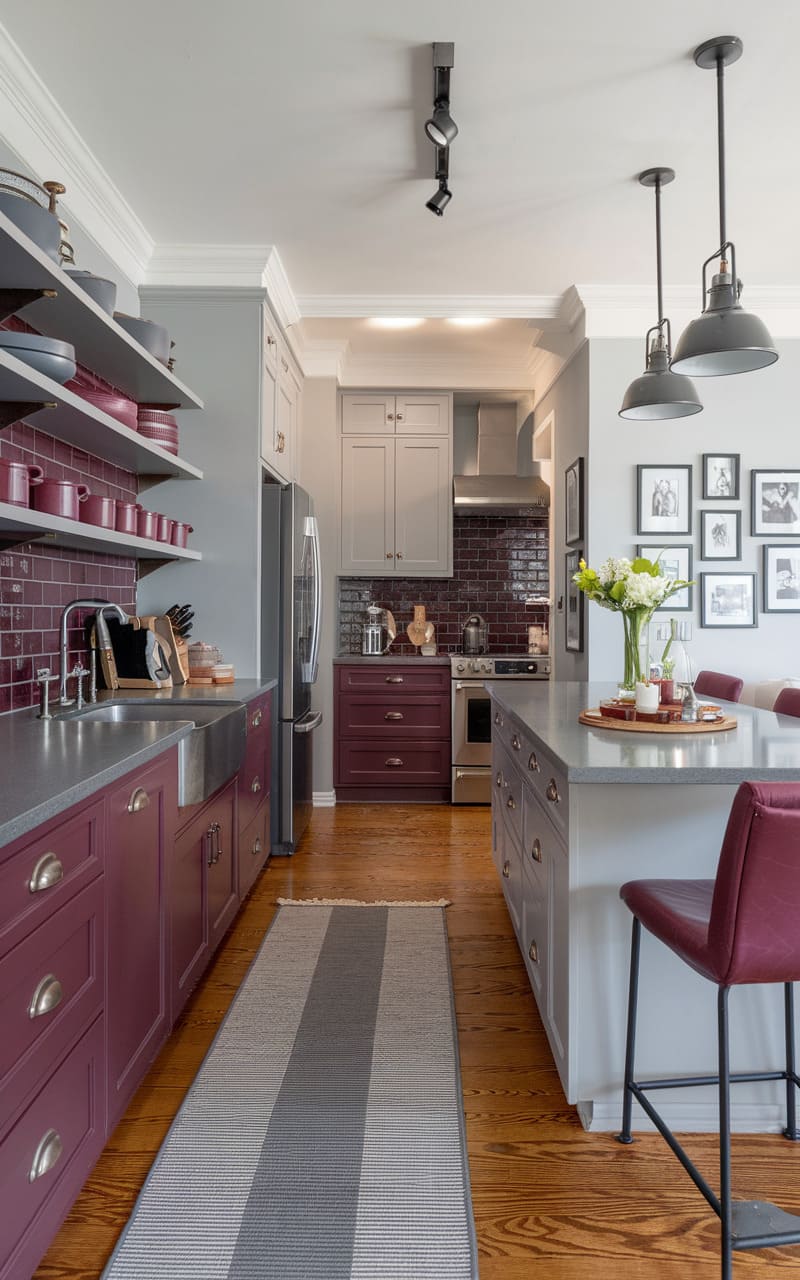
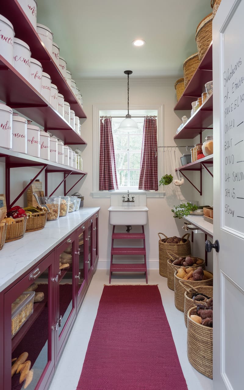
22. White
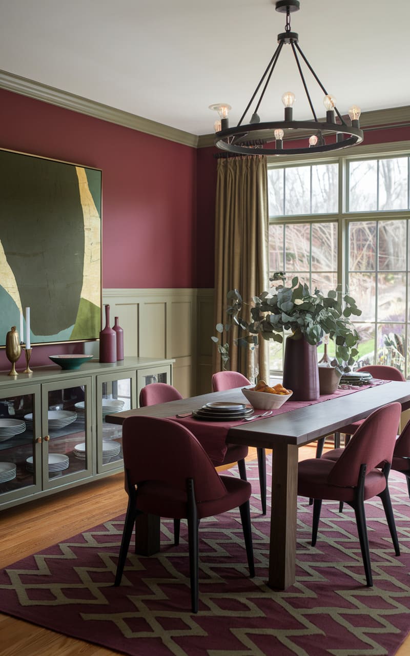
23. Olive Green
24. Dusty Pink
25. Dark Gray
26. Light Gray
27. Sky Blue
28. Natural Wood
29. Sunny Yellow
30. Forest Green
31. Shiny White
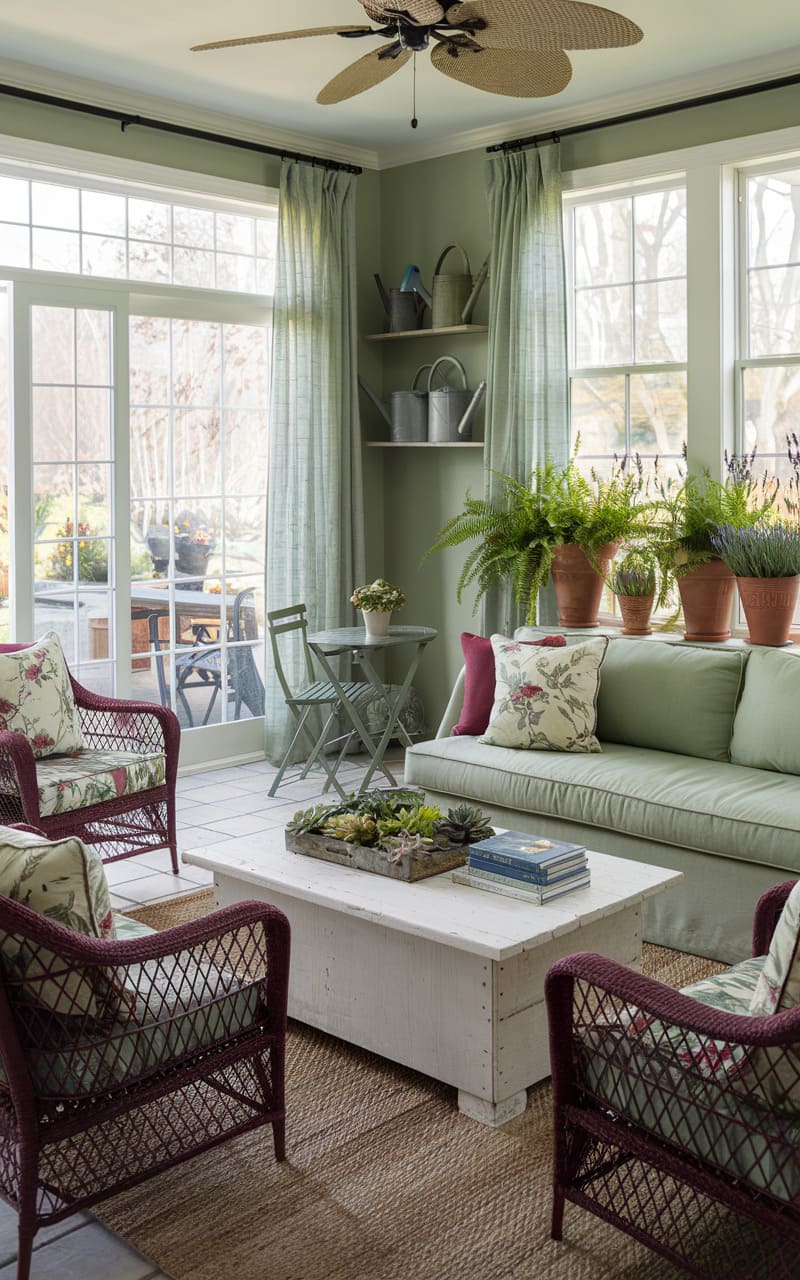
32. Sage Green
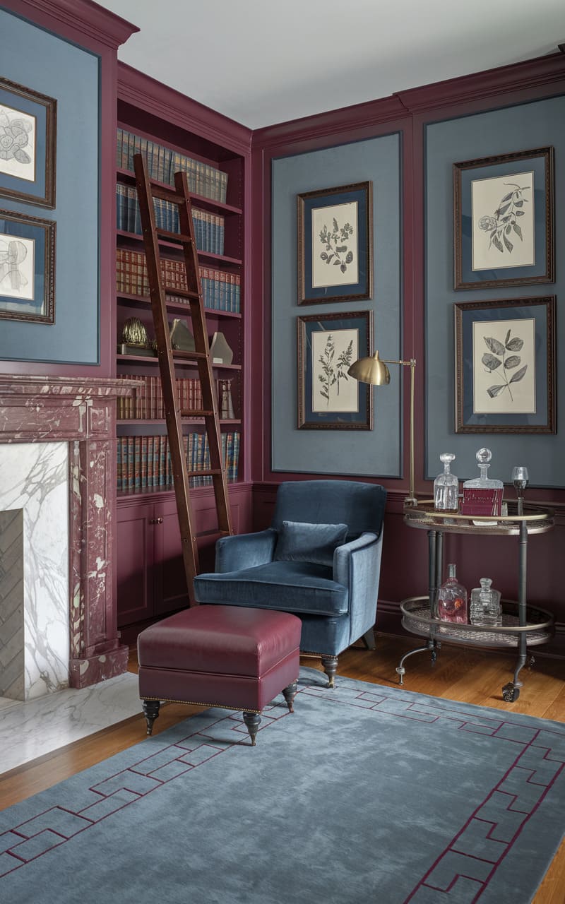
33. Gray-Blue Compound
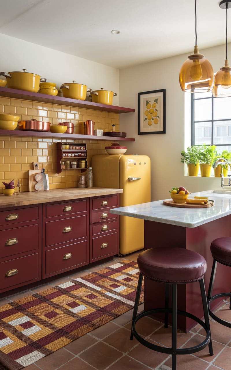
34. Bright Yellow
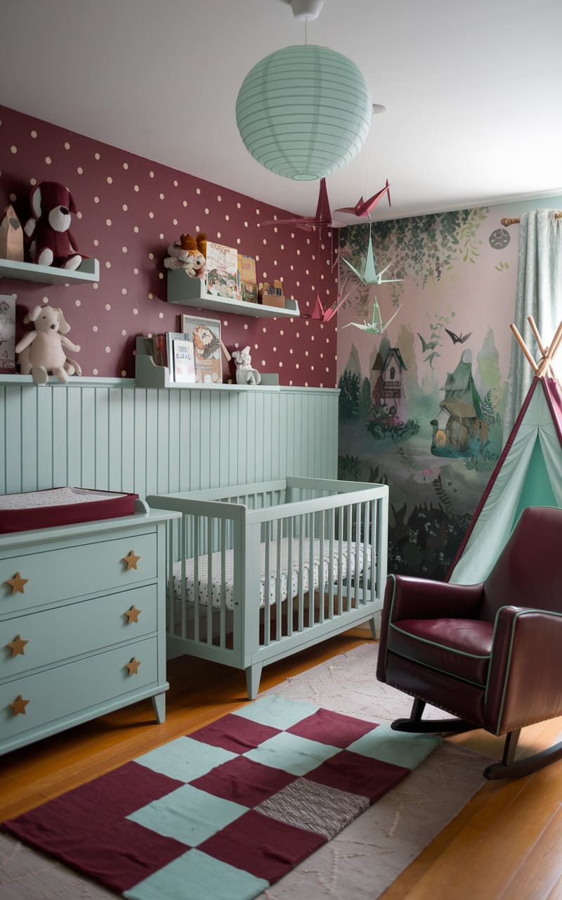
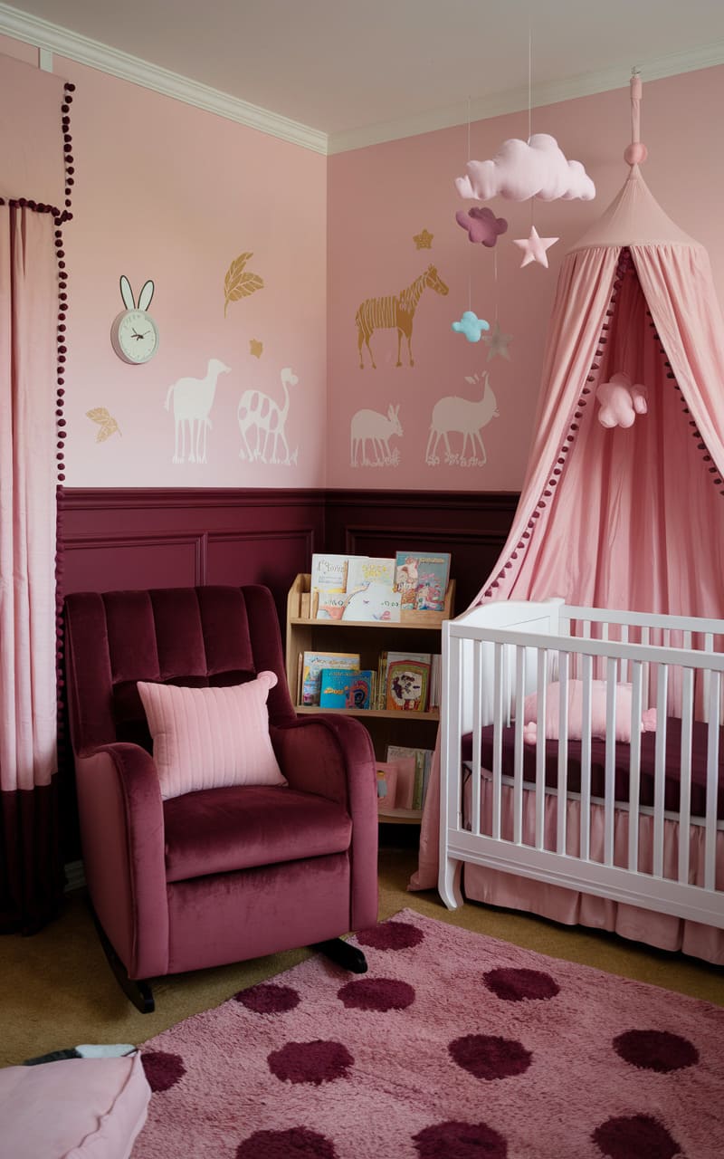
35. Light Nursery Pink
36. Pale Sage Green
37. Royal Blue
38. Light Brown
39. Teal Blue
40. Tile White
41. Classic Yellow
42. Plant Green
43. Shiny Gold
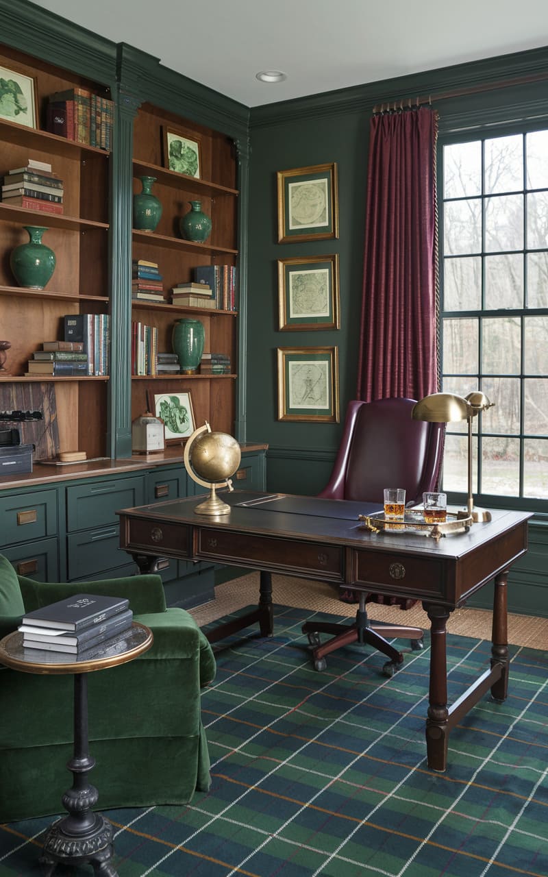
44. Deep Green
45. Peach
46. Seafoam Green
47. Industrial Gray
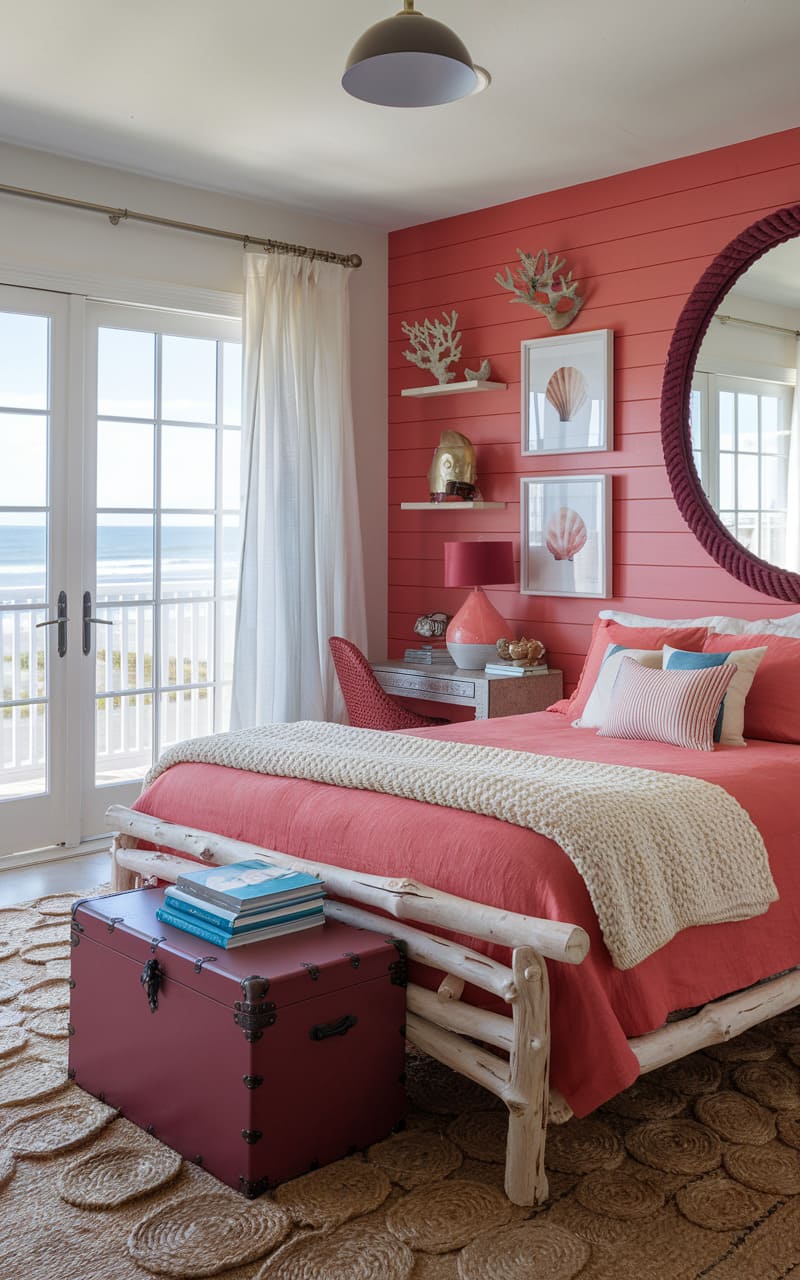
48. Coral
49. Farmhouse Cream White
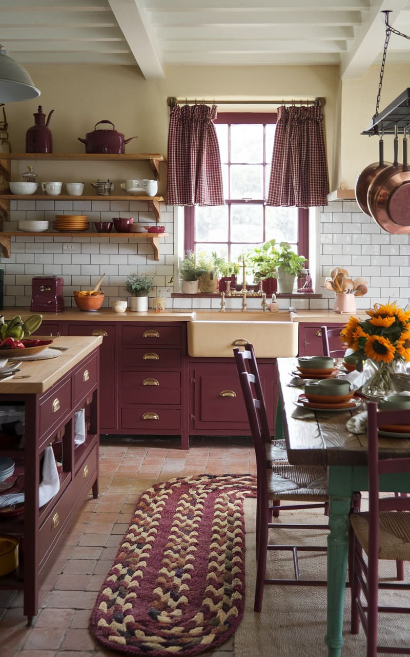
50. Purple
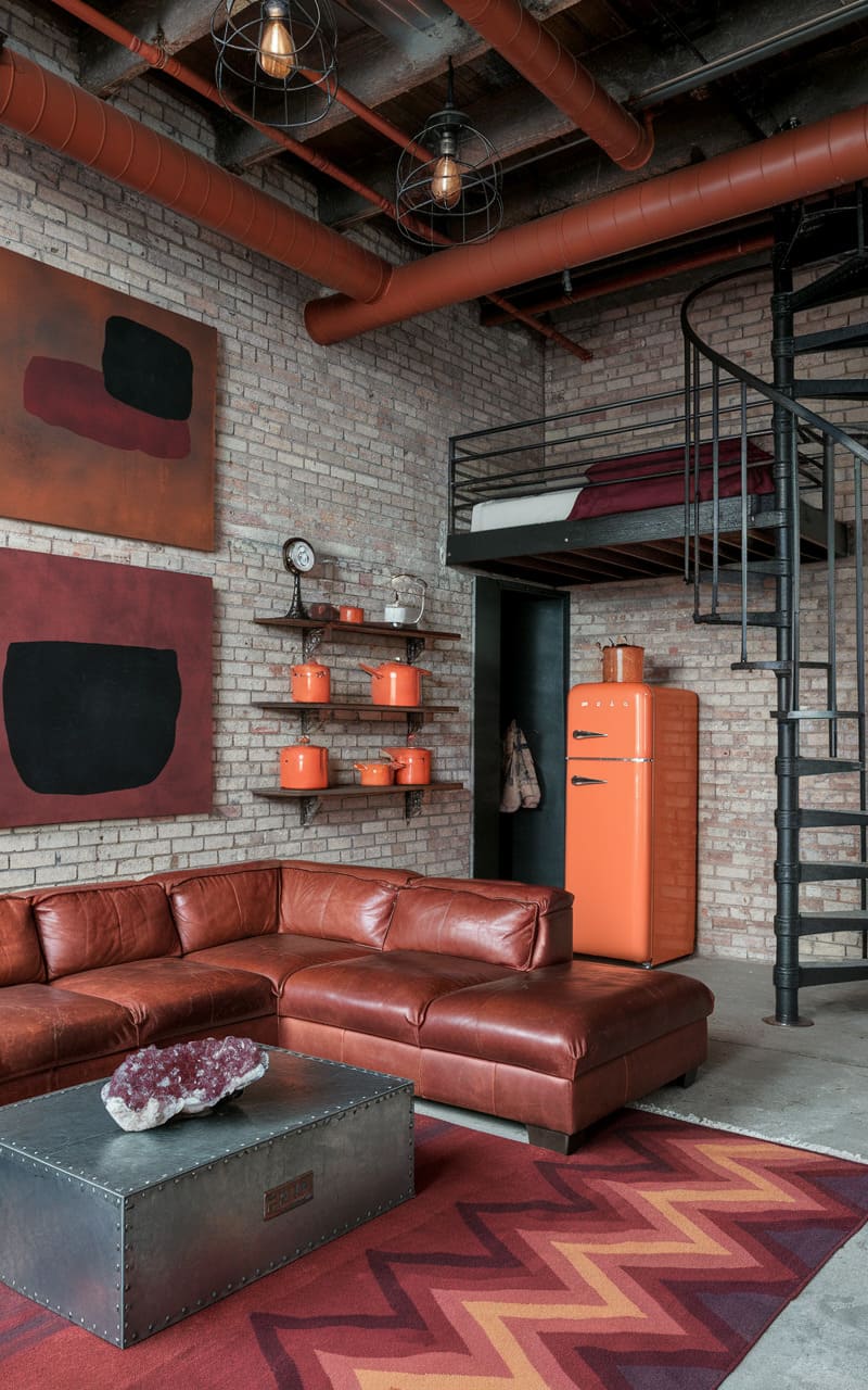
51. Mahogany
52. Orange
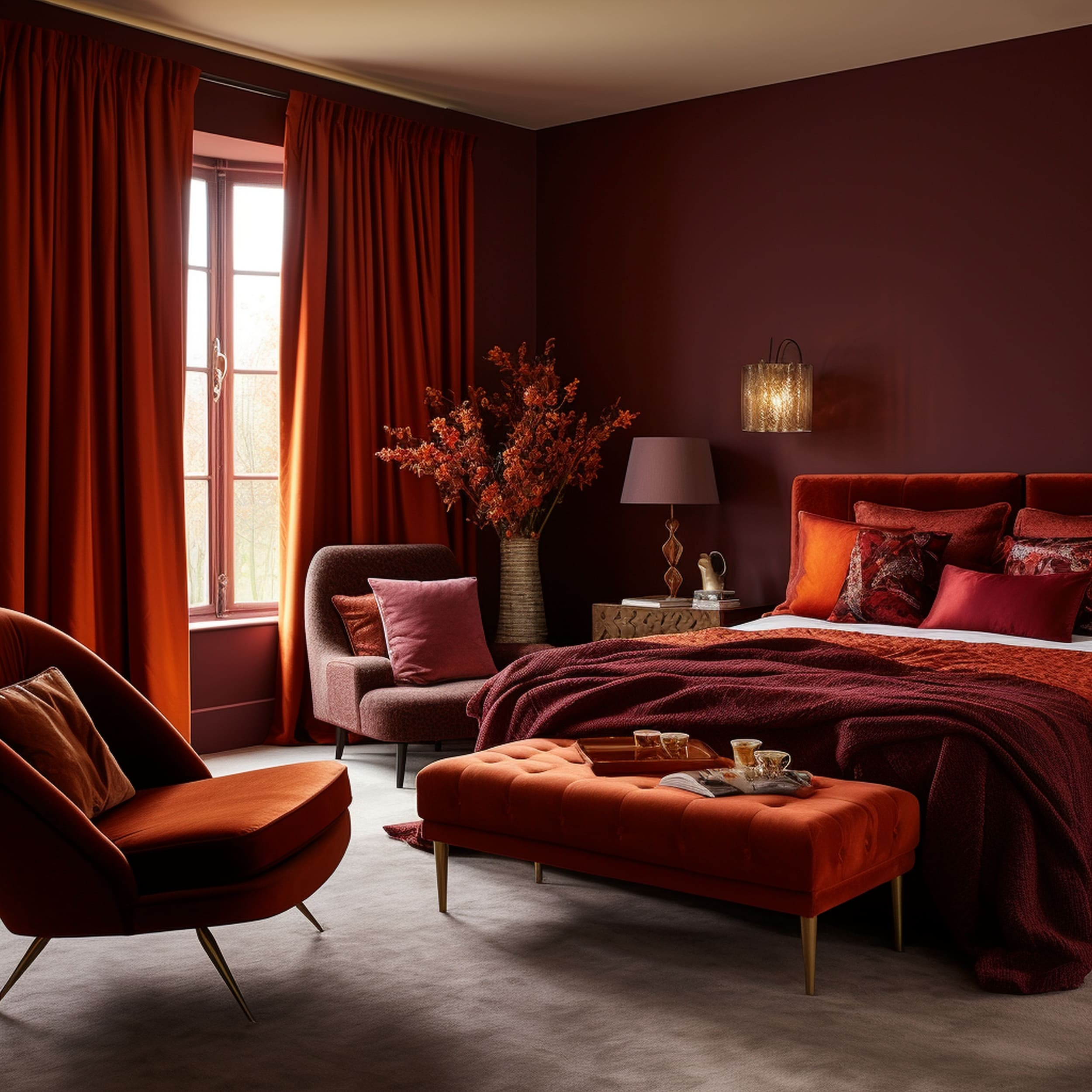
With the help of a delicate shade of orange, you can introduce welcoming warmth to a burgundy space. It might seem like an odd pairing but orange is quite similar to burgundy. You can integrate some pastel orange hues to add distinctive character to the monochromatic color palette centered on burgundy. It doesn’t take a high dose of orange to warm up the atmosphere in a stylish way. Try accenting burgundy walls in the bedroom with orange bedding accessories such as throw pillows or blankets.
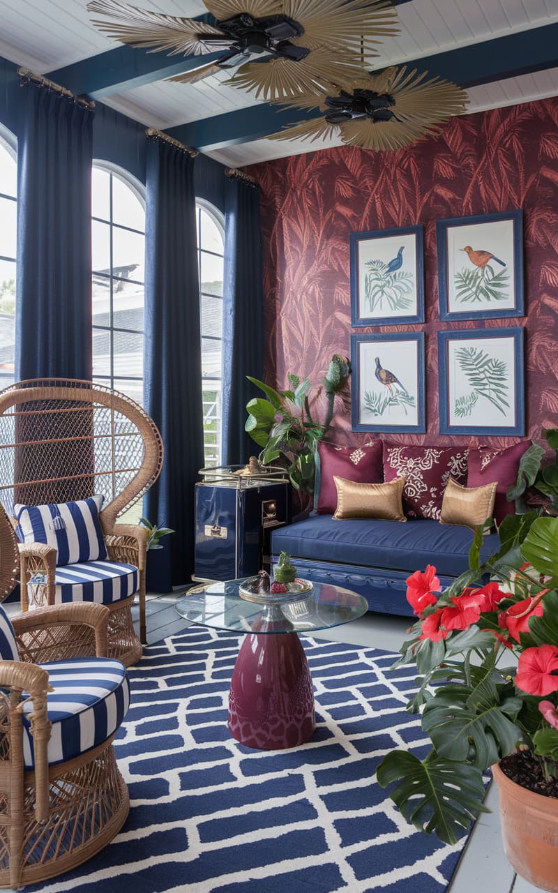
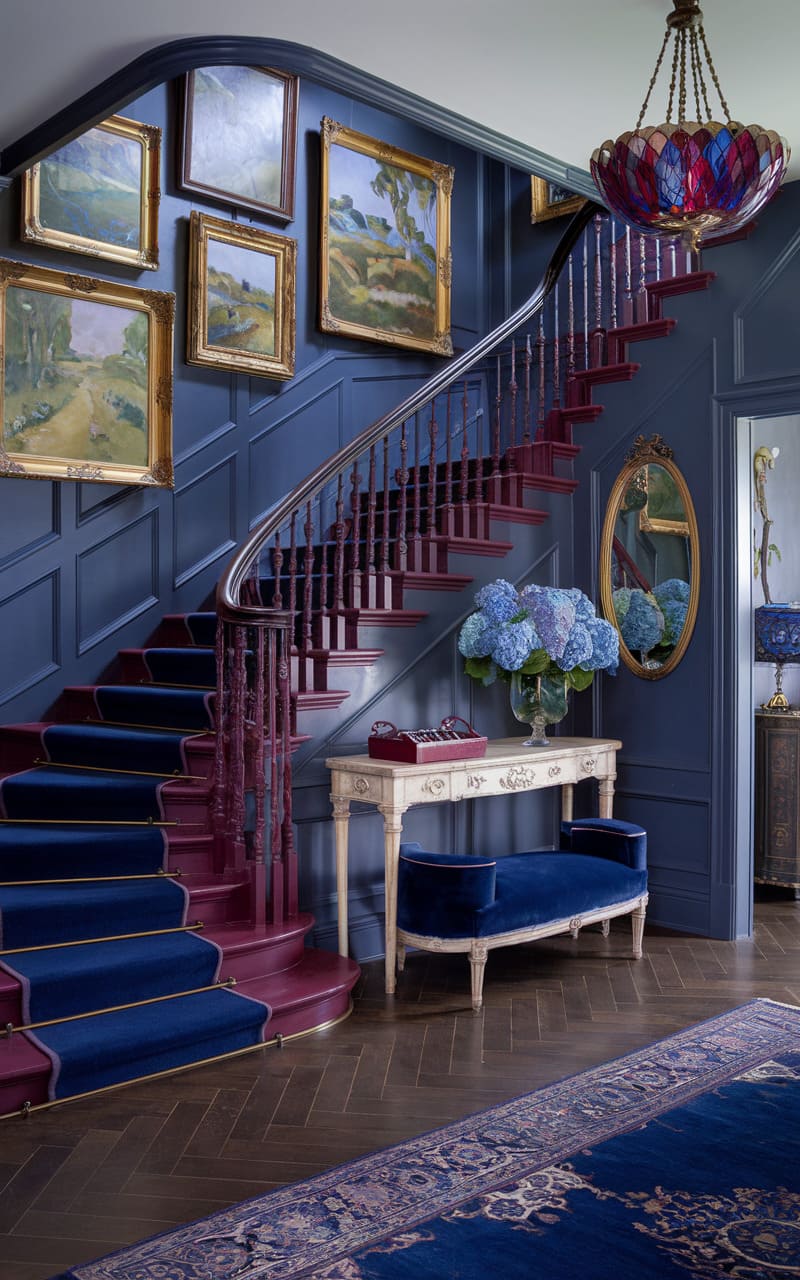
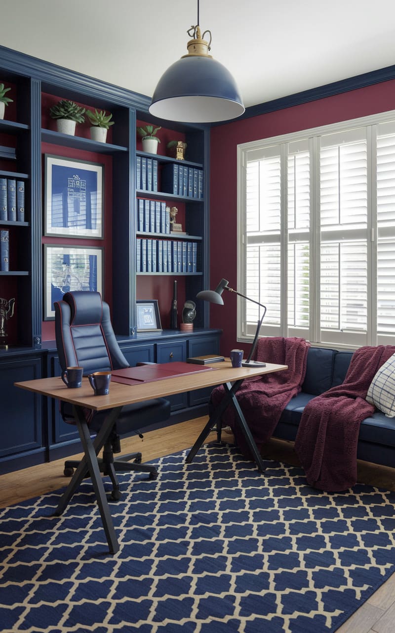
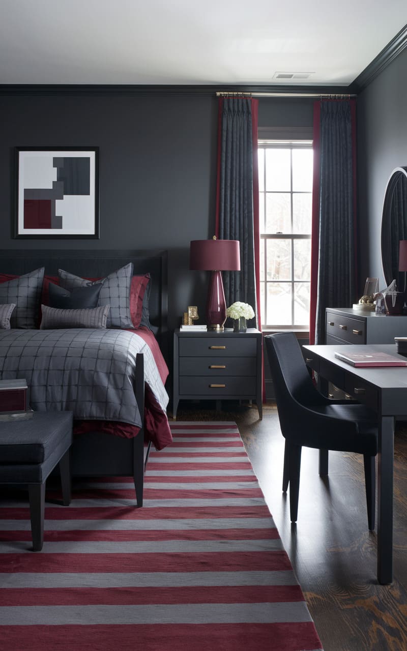
53. Dark Navy Blue
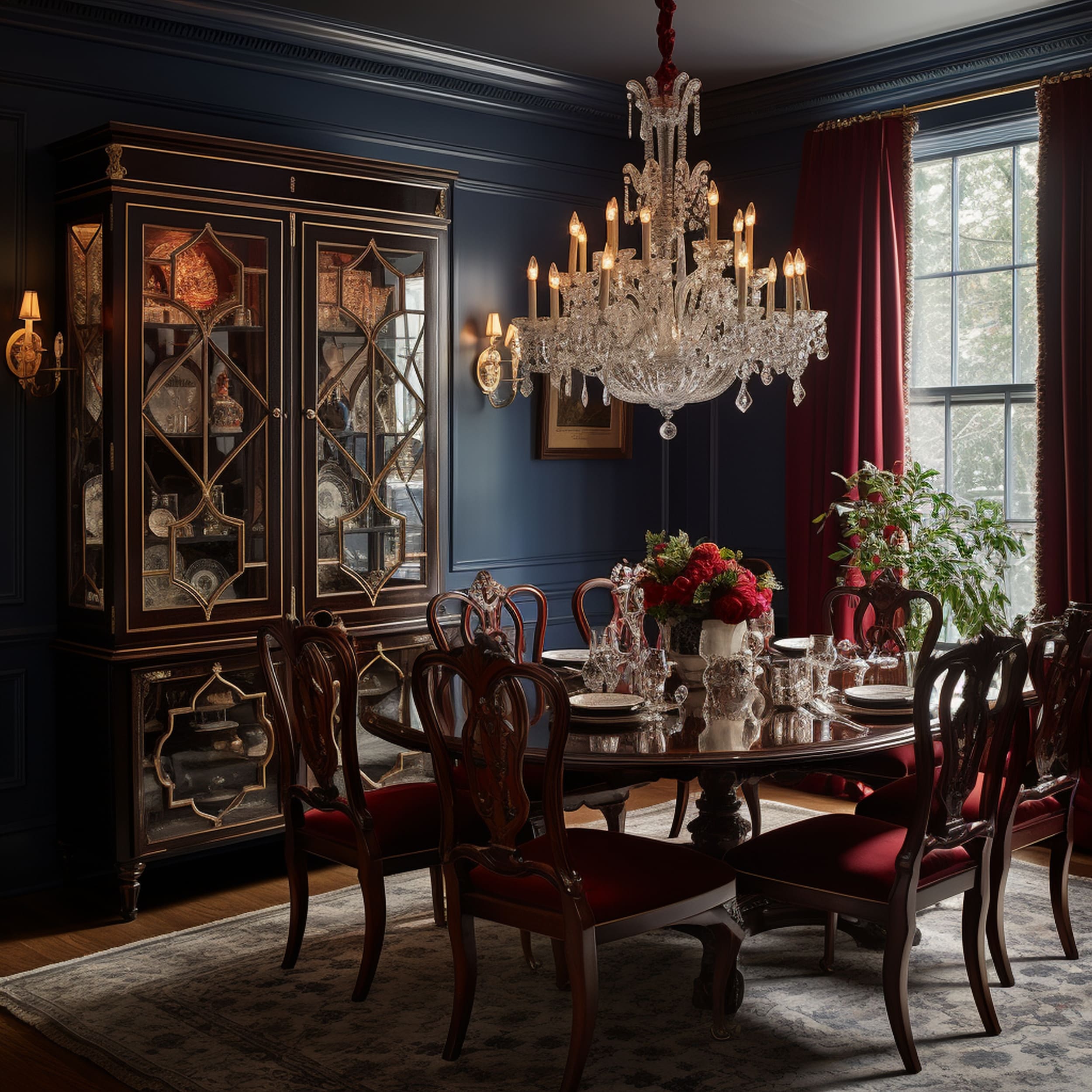
Looking to take the elegance of a traditional dining room to a new level? Consider an eye-catching combination of navy blue and burgundy through painted walls and chair upholstery. These are two sophisticated color shades that can complement each other surprisingly well. It’s recommended to pick a darker tone of navy blue to match the brightness of burgundy and maintain a sense of understated maximalism. This color pairing is worth considering to refresh the look of classic furniture and completely change the vibe of the space.
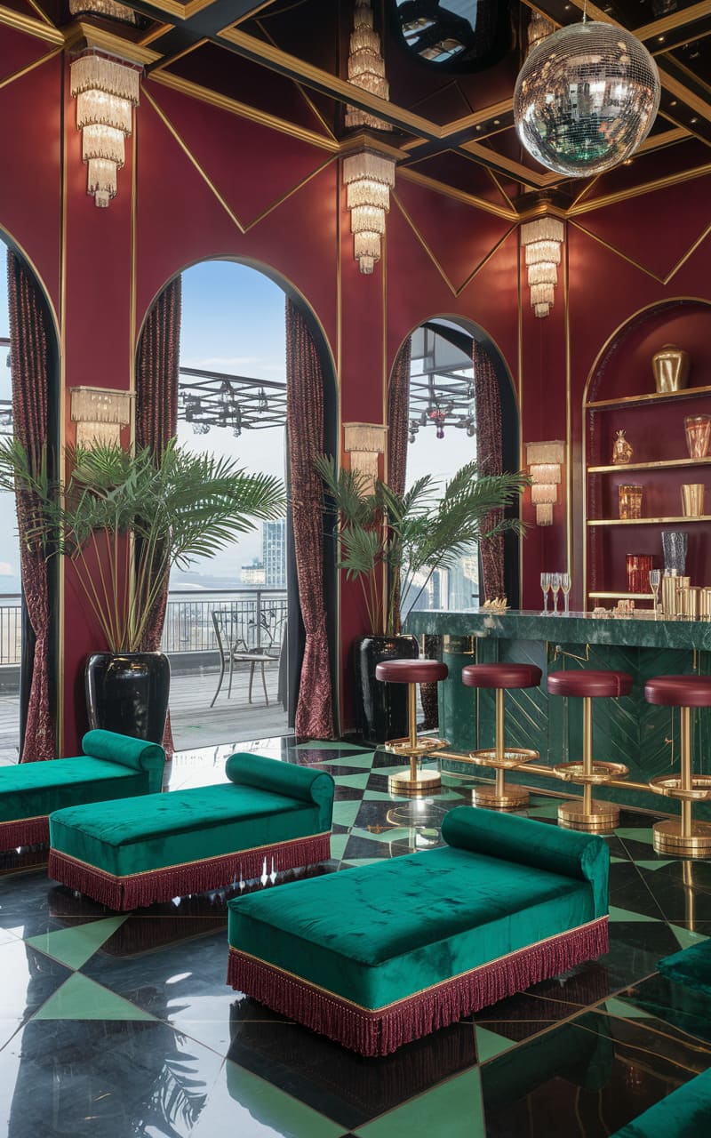
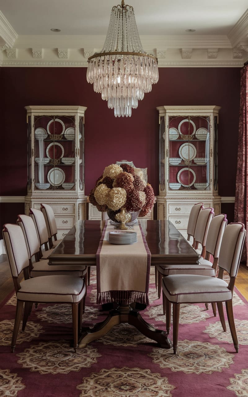
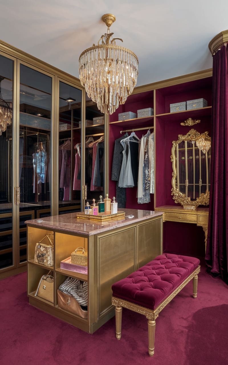
54. Subtle Gold
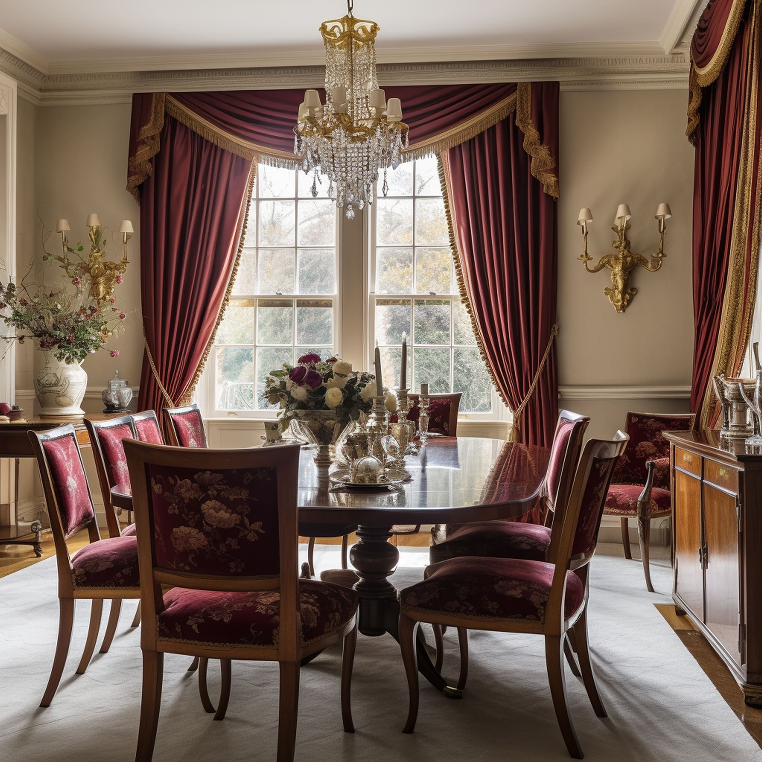
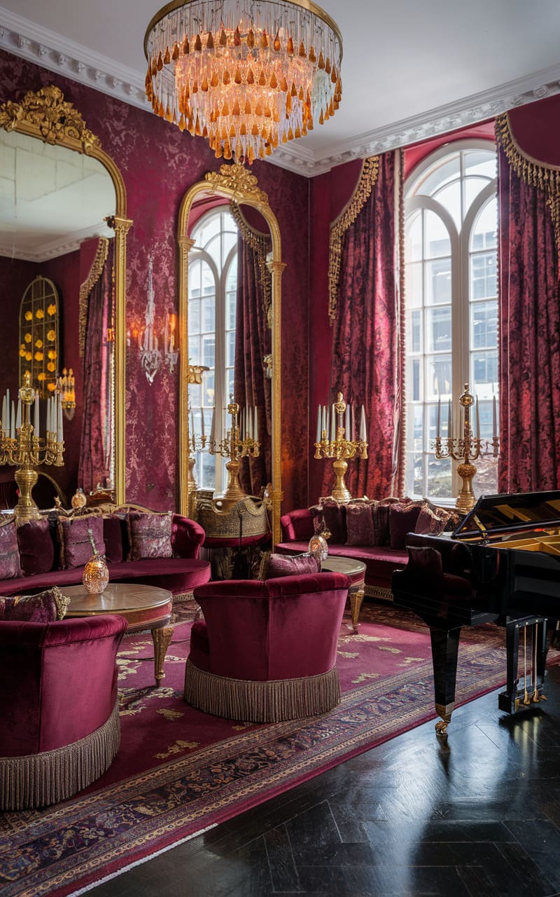
Gold and other bold yellow shades can elevate the visual appeal of burgundy. The luxuriousness of gold elements complements the royal sophistication of burgundy as evidenced by this traditional dining area. Gold-tipped burgundy curtains give off pleasant warmth that blends together with the classy upholstering of the chairs using matching colors. The result is an extremely elegant space that’s formal yet full of character. Considering the tendency of burgundy to darken the space, it’s worth including plenty of gold to brighten up the atmosphere and maintain visual balance.
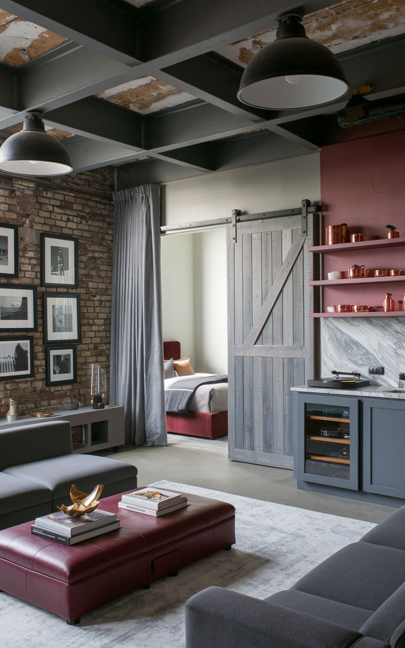
55. Gray
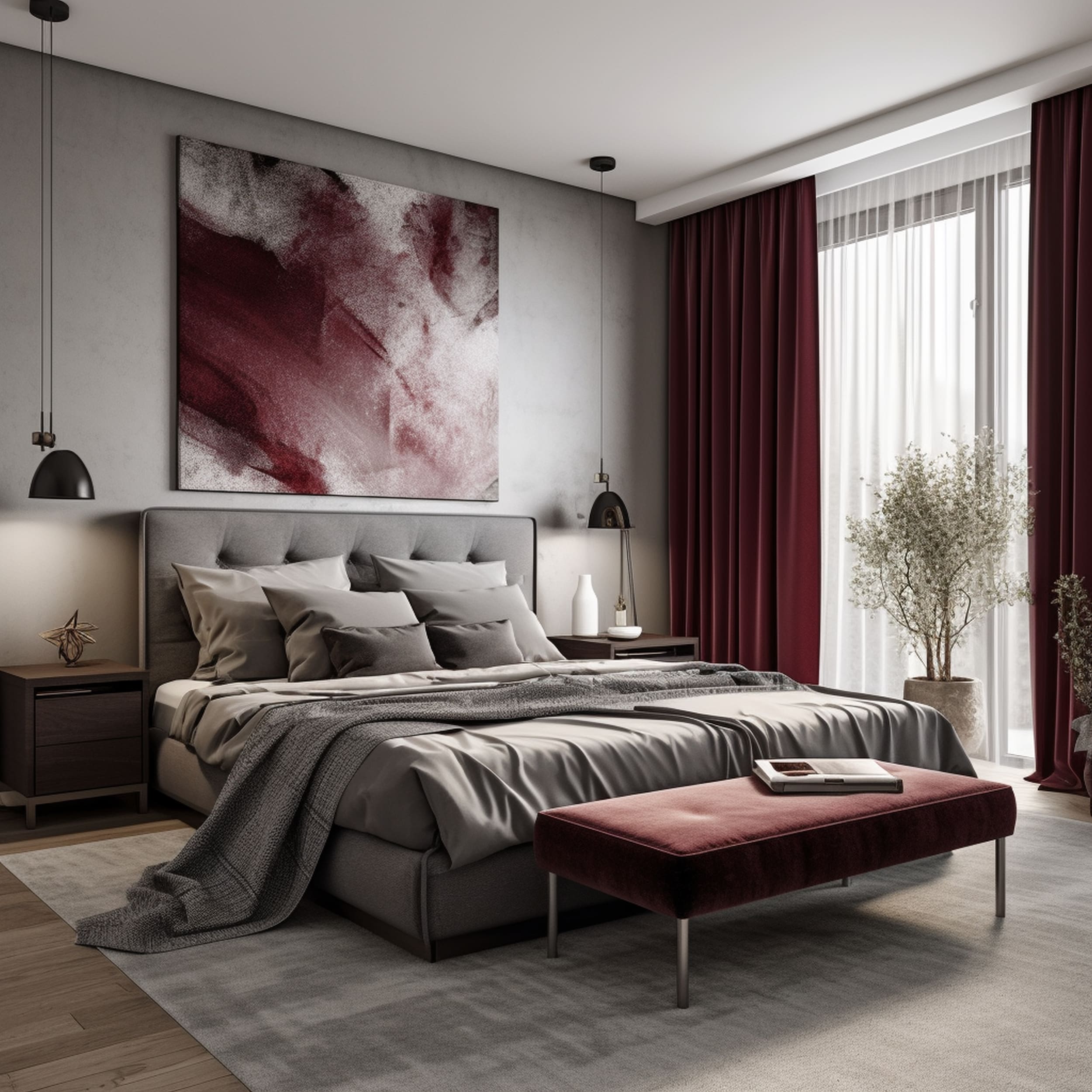
Due to its cold moodiness, gray seems like a good match for the rich warmth of burgundy. This is an excellent color combination if you want to improve the natural depth of burgundy and craft a more captivating atmosphere. Gray walls might appear a little plain and too formal. Burgundy elements such as curtains and throw pillows can be used to provide visual interest. You can also create a stylish textural contrast if you mix soft burgundy items against the smooth surface of a gray wall.
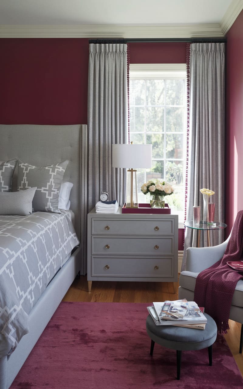
56. Ivory
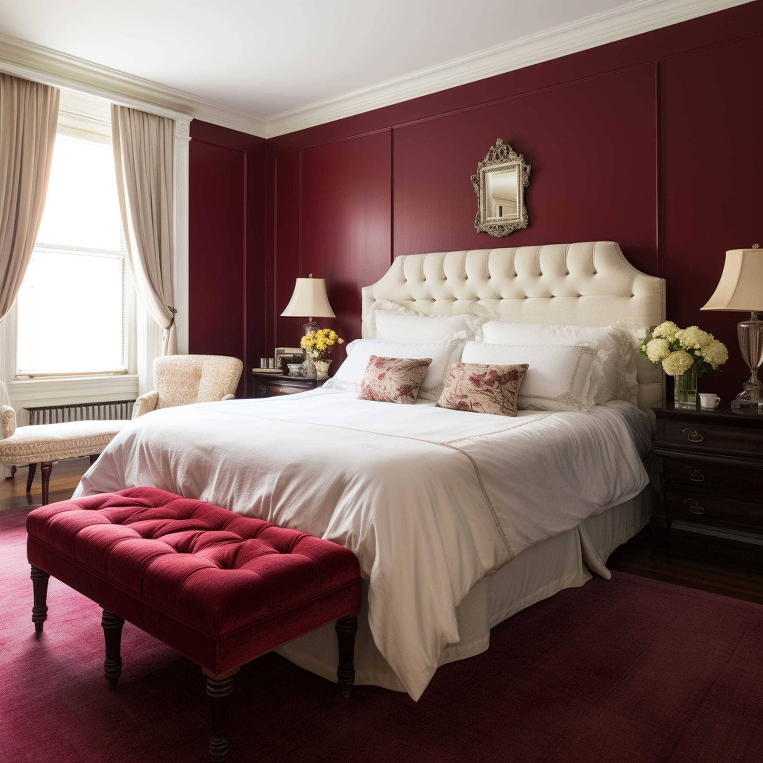
You can’t go wrong by attempting to complement the refined elegance of burgundy using neutral tones. Ivory is another excellent hue to consider if you prefer a slightly warmer aesthetic as opposed to simple bright white. Make burgundy elements tale centerstage by accenting them with the enduring appeal of an ivory shade. The best solution to ensure a balanced burgundy color scheme is to use the right neutral tones that work together with this style of dark red. This modern ivory bed looks stunning in the burgundy bedroom.
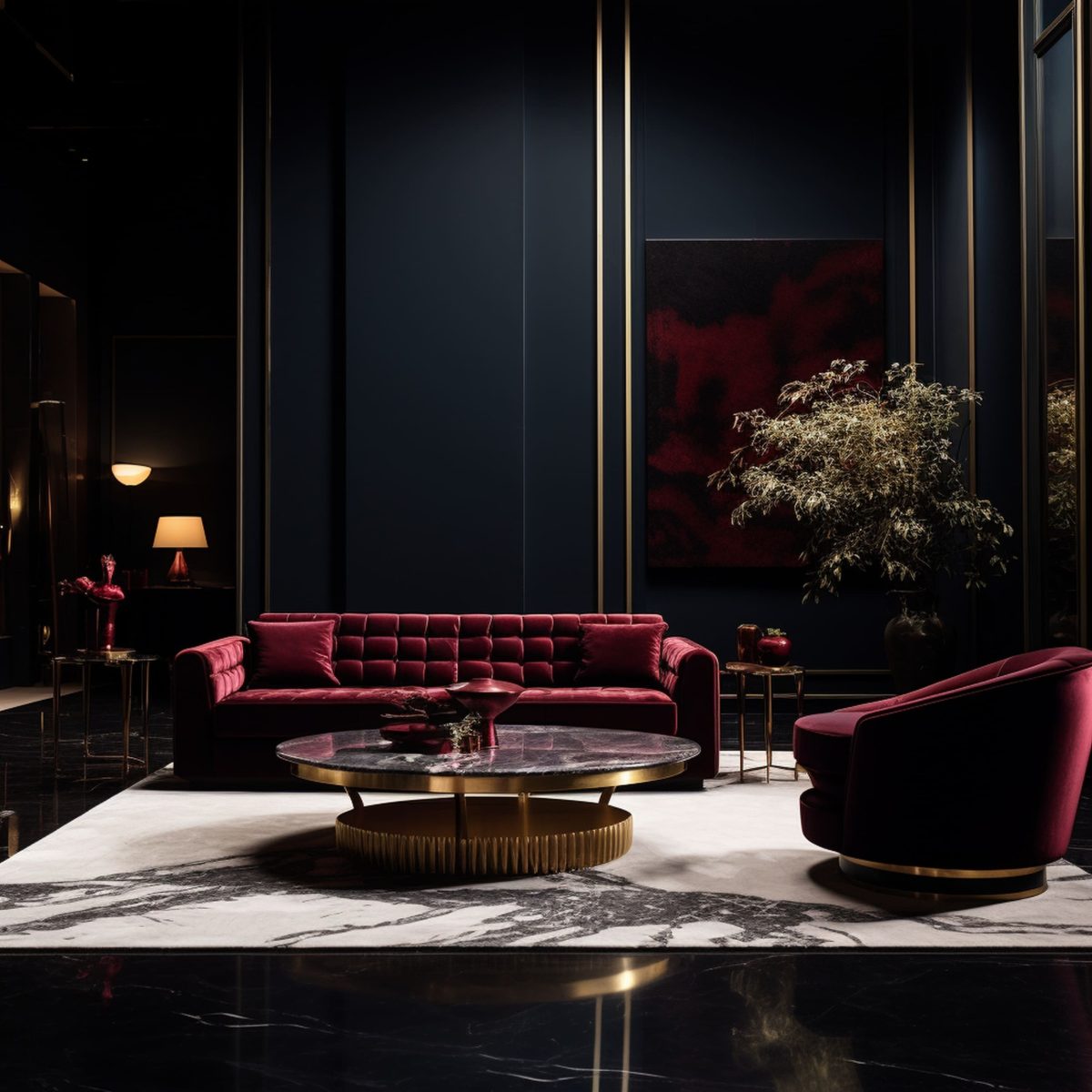
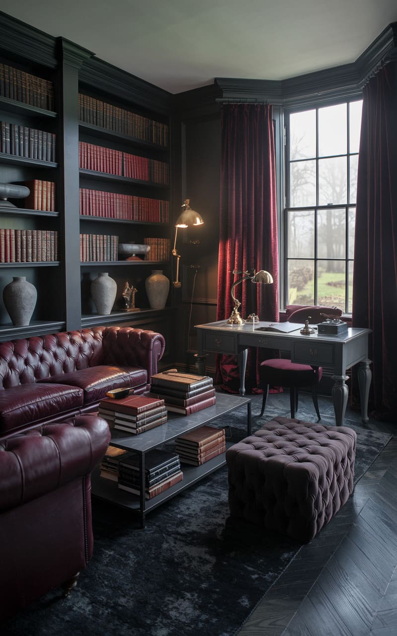
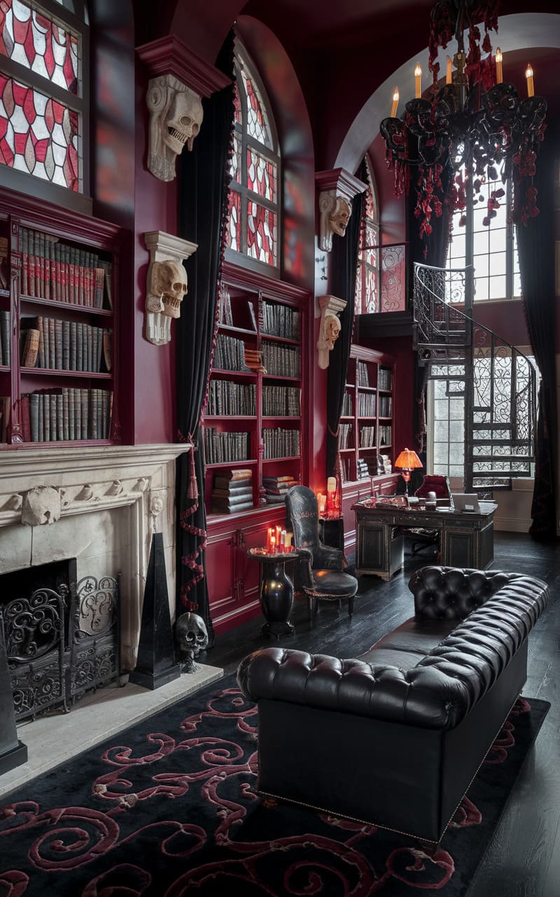
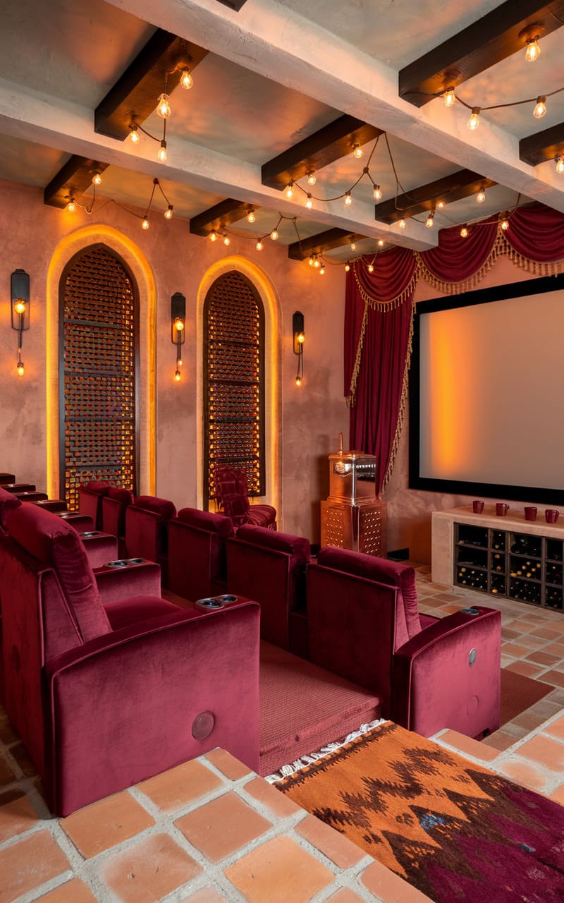
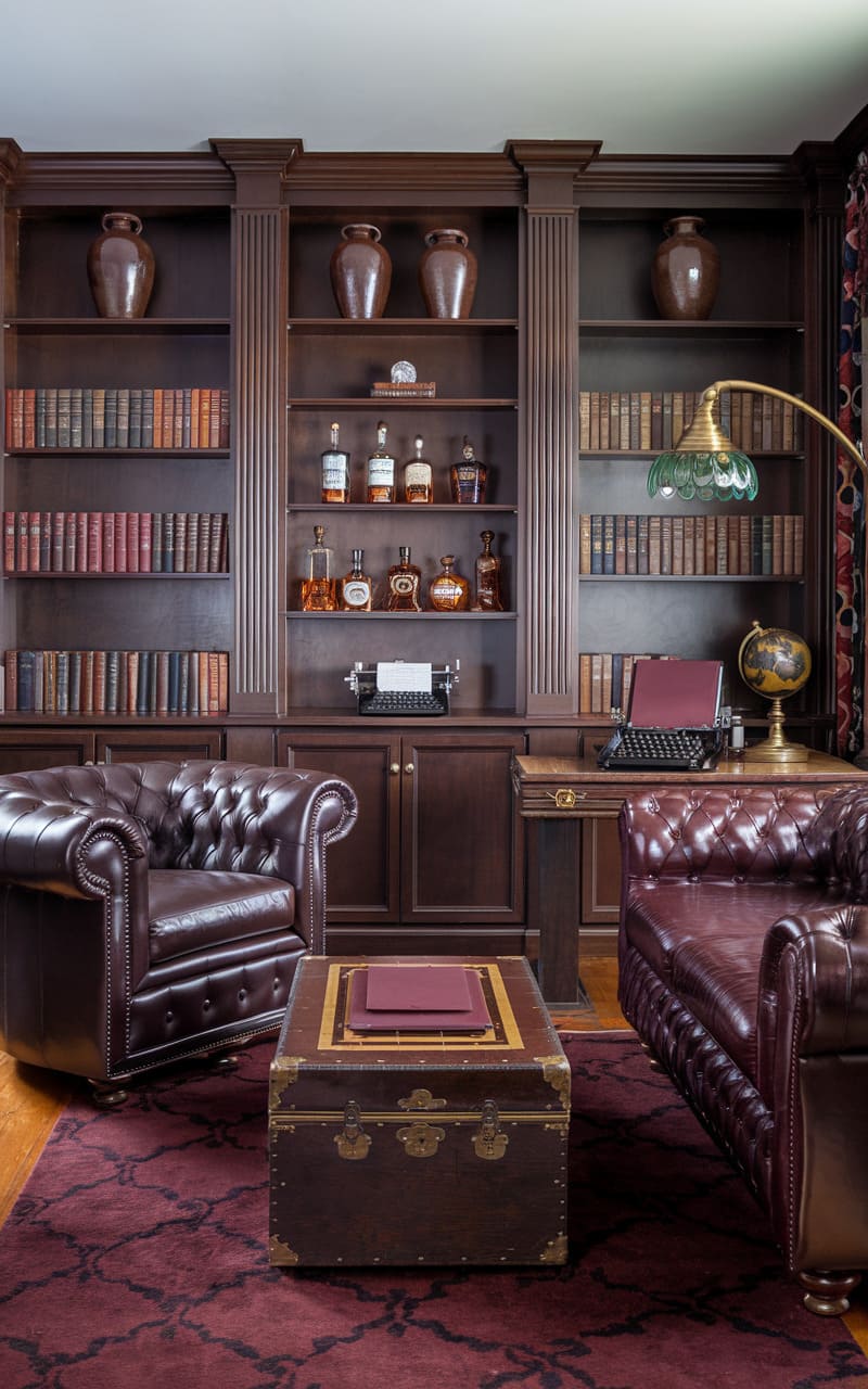
57. Deep Black
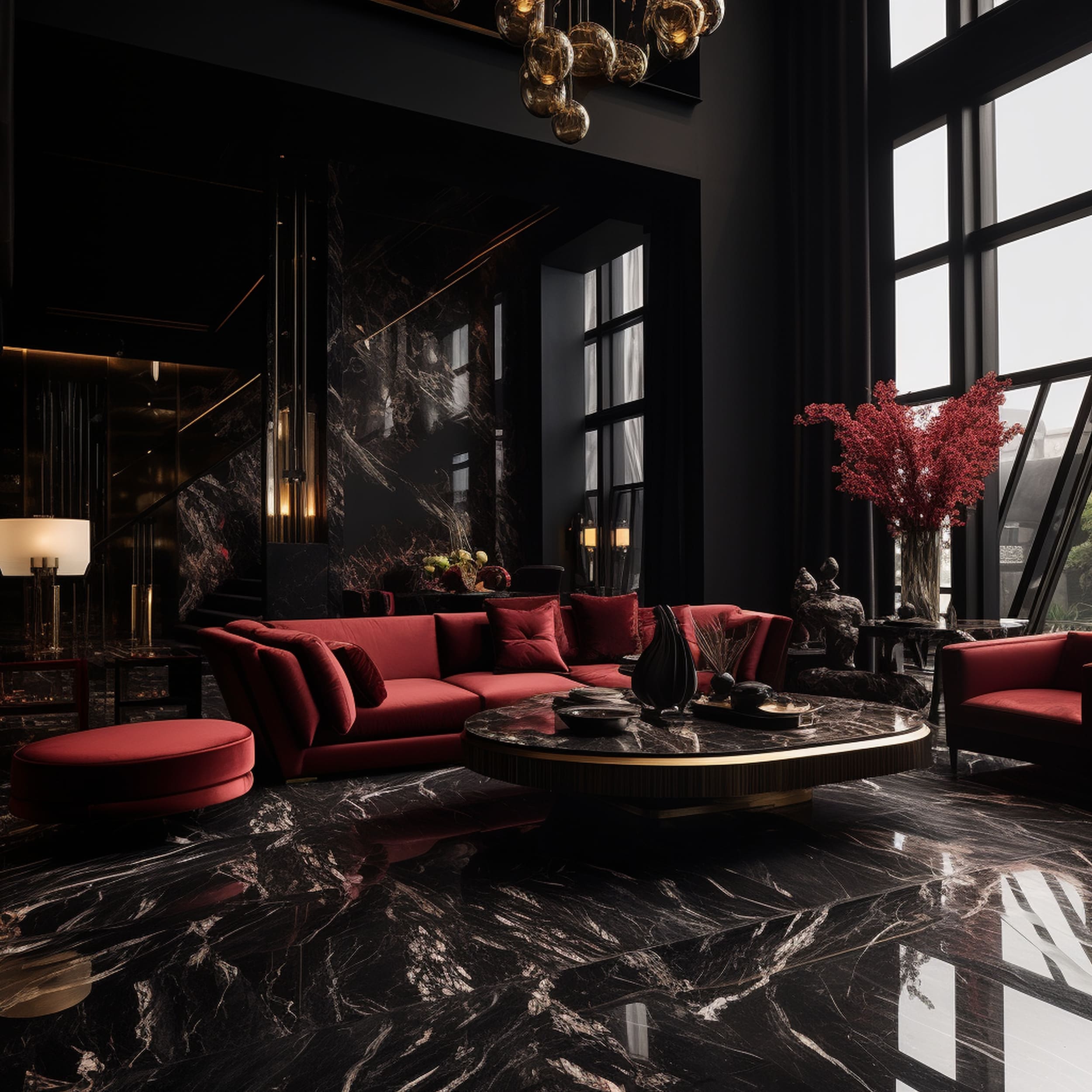
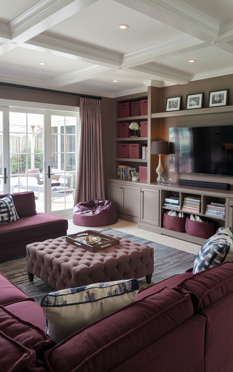
If you prefer a more dramatic design style when decorating the room with burgundy, you should try implementing a solid dose of black. The atmosphere can instantly become more luxurious and sophisticated when burgundy is paired together with dark tones. Black is the obvious choice to crank up the drama as evidenced by this modern living room that features a maximalist influence. Velvety burgundy furniture looks brilliant against the black marble-style floor and dark wall. The large windows help to maintain a balanced aesthetic considering the moodiness of an interior dominated by black..
58. Pale Blue
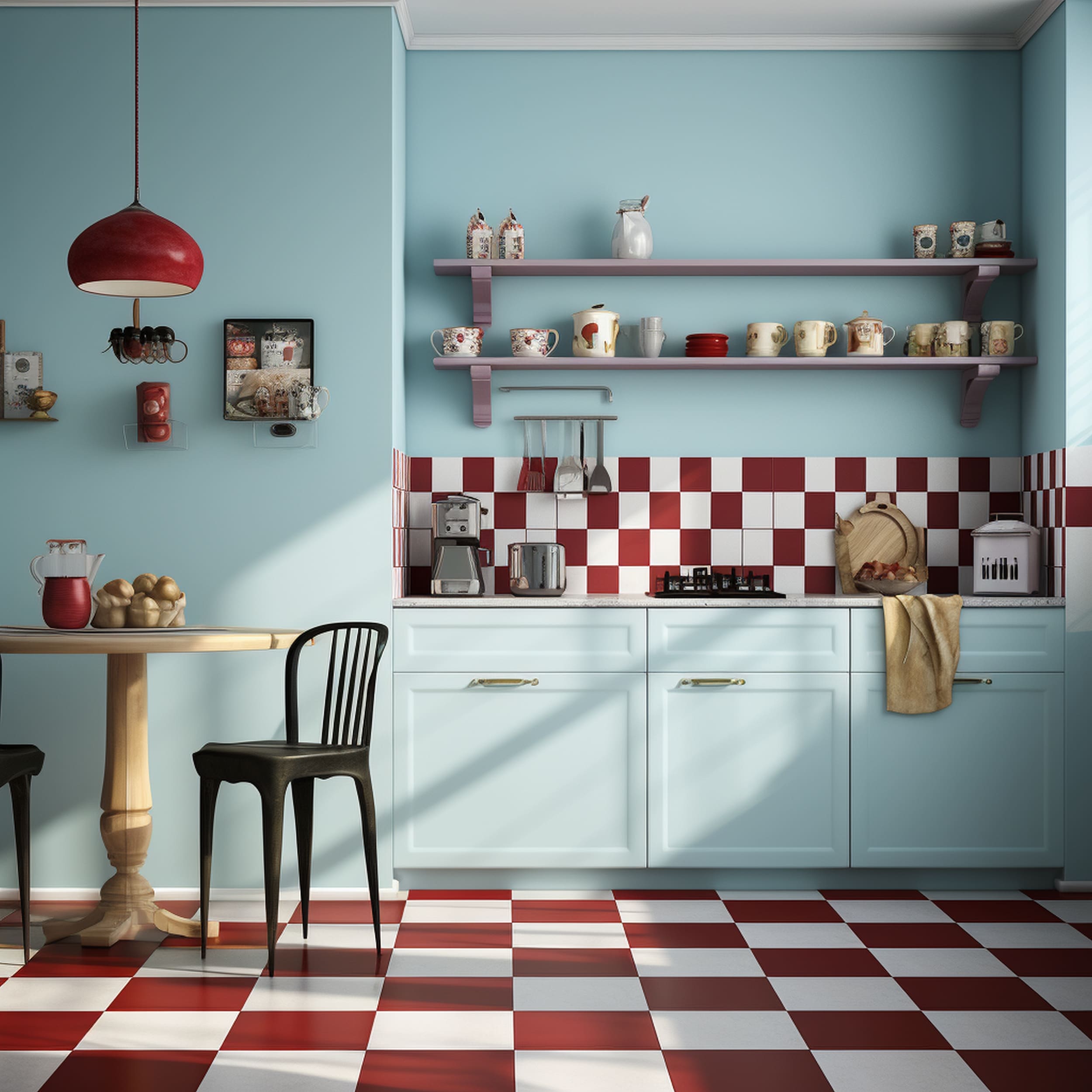
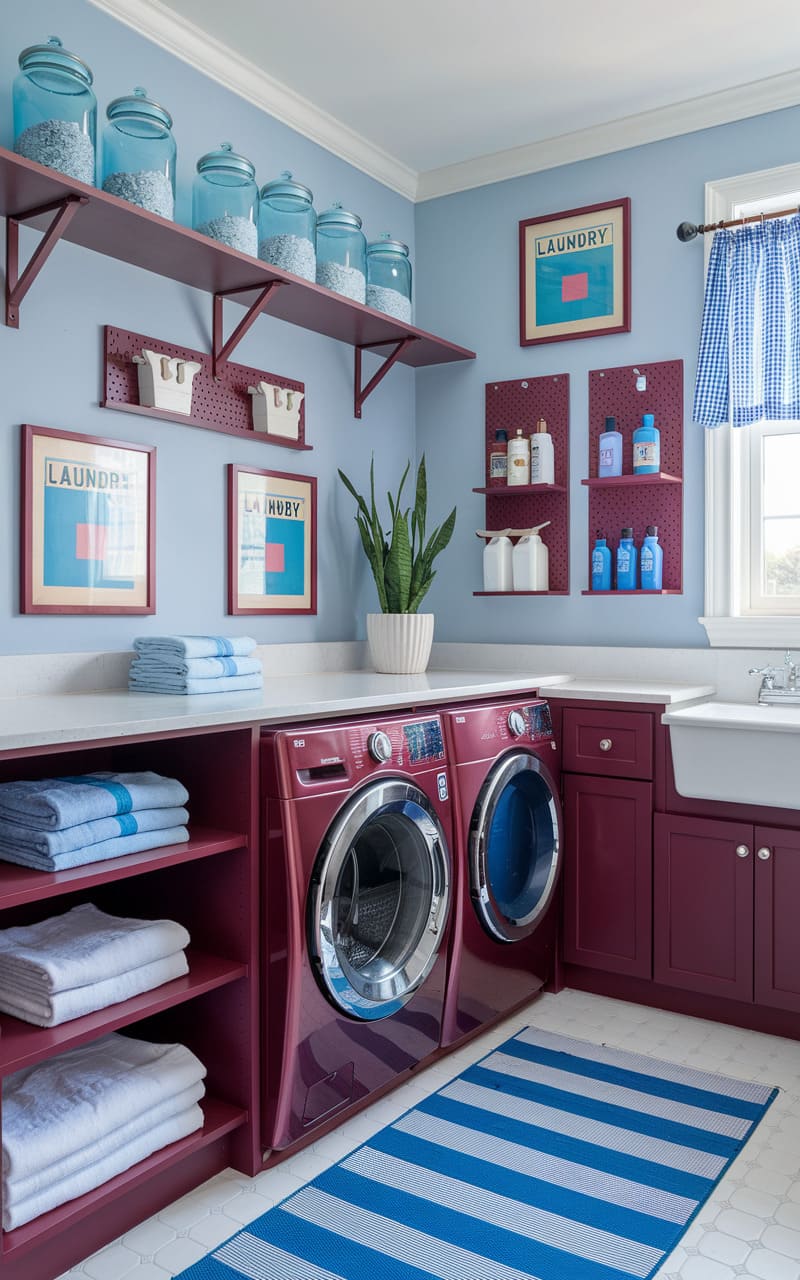
Blue brings a calming effect to reduce the intensity of a dark red hue like burgundy. We’ve seen how a navy shade works alongside burgundy but lighter tones of blue can also result in a stylish color scheme. A serene pastel blue can make any kitchen stand out while burgundy accents prevent the space from feeling too cold. This elegant backsplash adds a touch of playful color to make the neutral blue tone appear more distinctive.
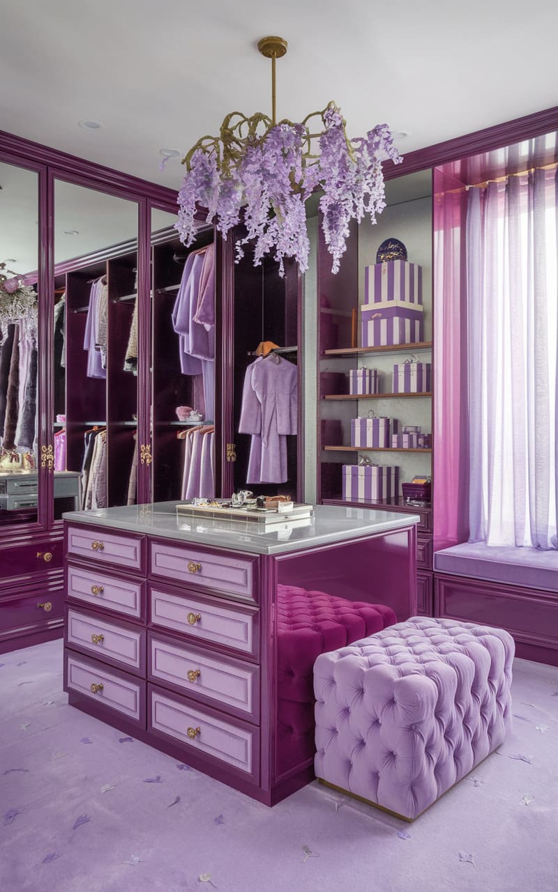
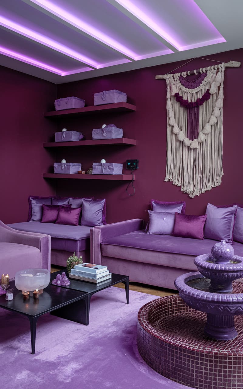
59. Purple
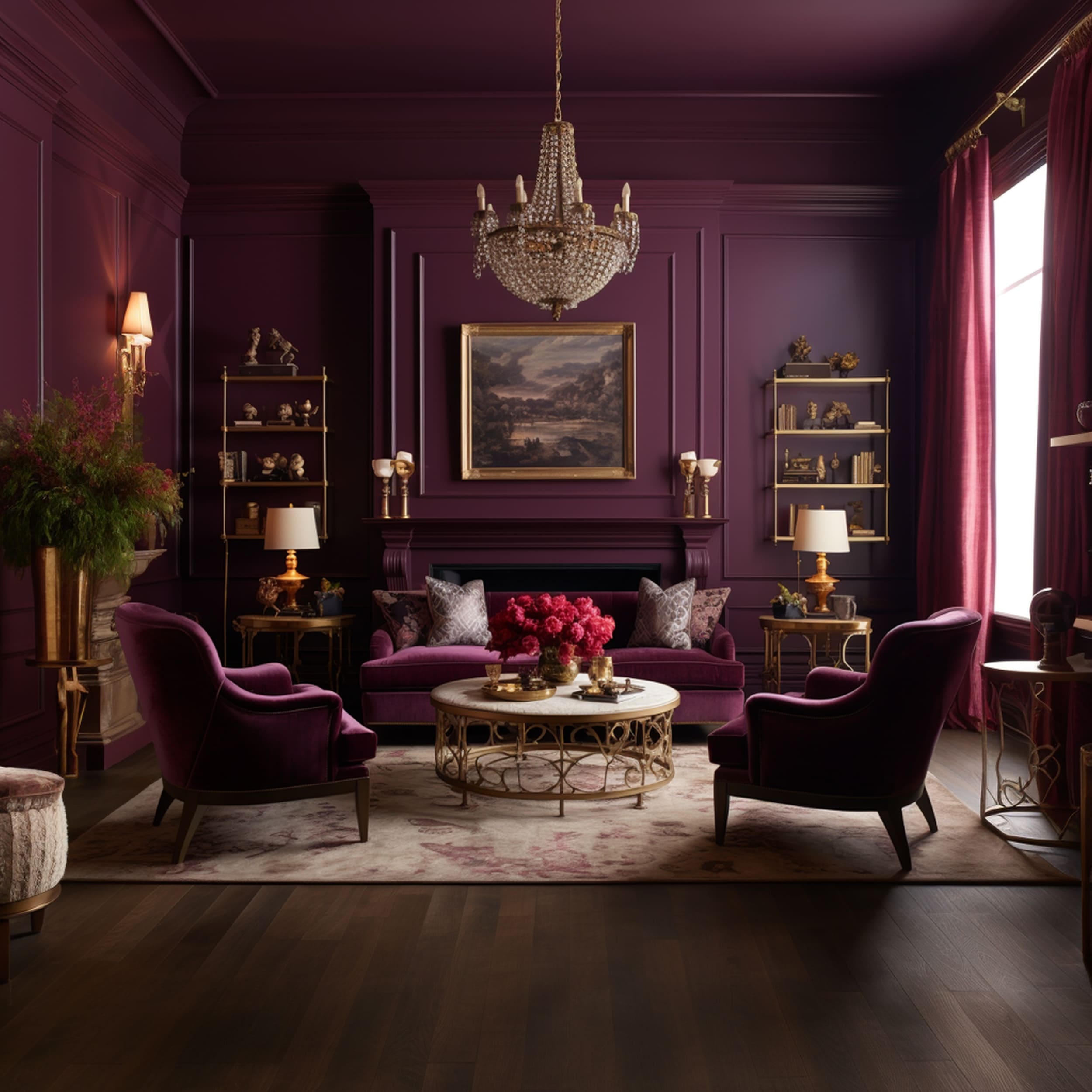
Burgundy can form a regal combination when paired with purple. Depending on the aesthetics of the room, you can create a fun and cozy color scheme or a sophisticated mature one with the help of this color mix. Purple is essentially an undertone of burgundy which results in a cohesive look with an elegant contrast. There are different ways to combine these two shades in the same interior space. Using a blend of colorful furniture pieces could be an ingenious solution to breathe some life into the room.
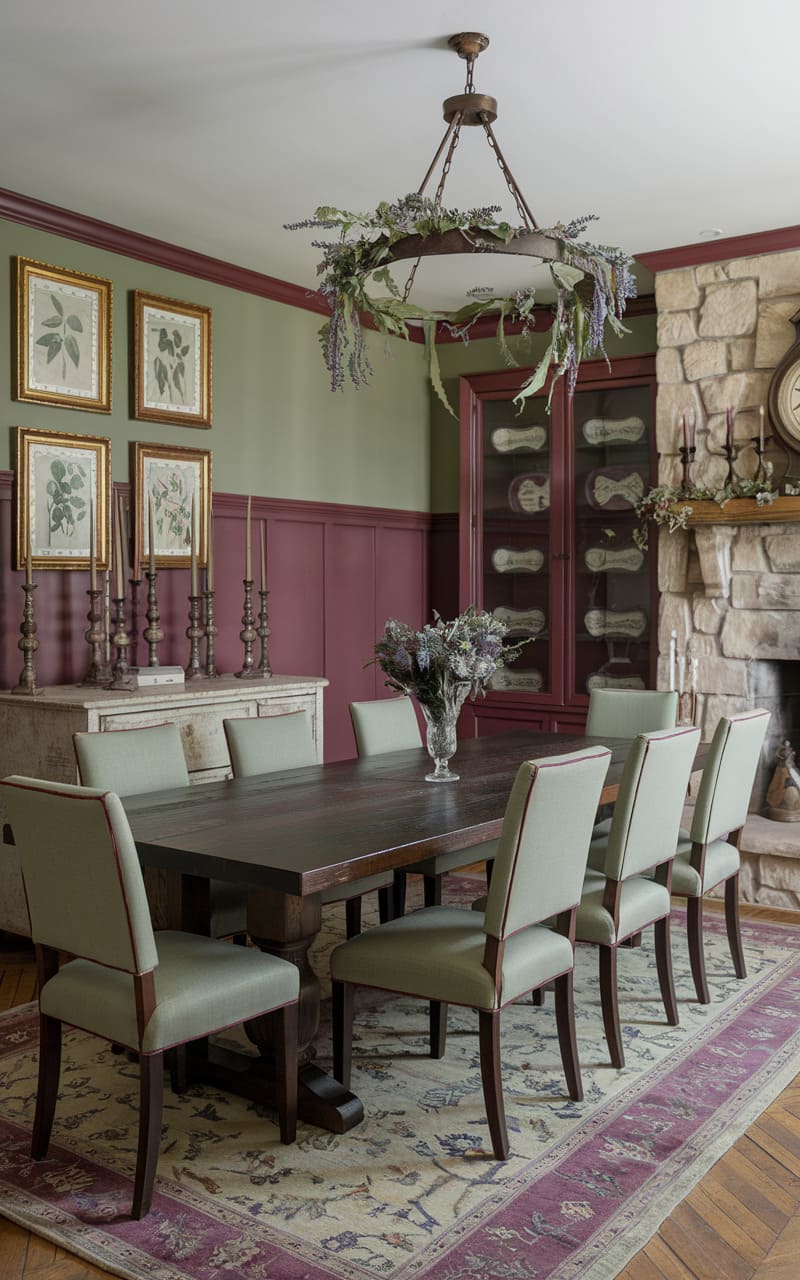
60. Olive Green
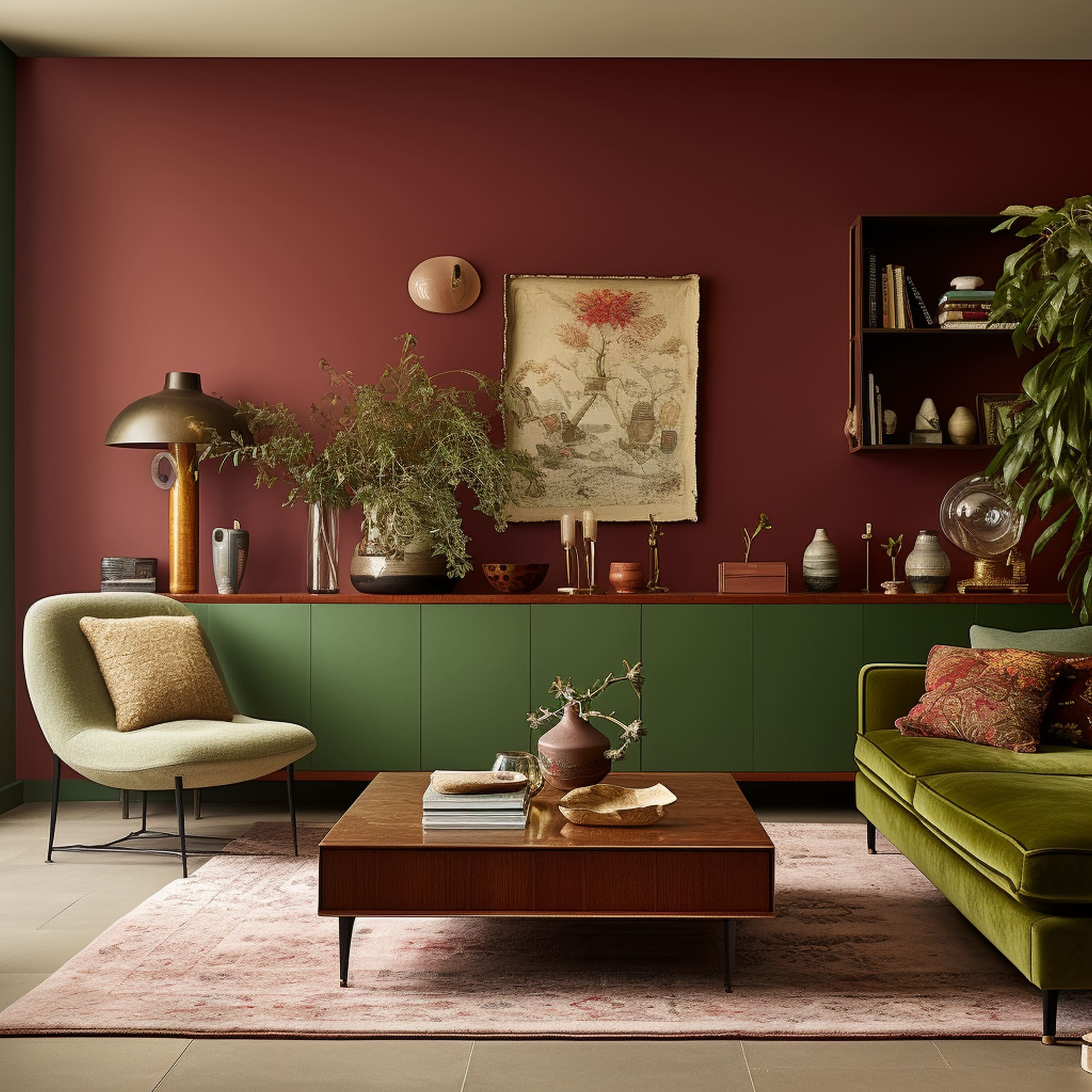
Considering the positions on the color wheel, green goes well with burgundy as the two shades complement each other nicely. If you want to create a balanced combination, it’s worth including a darker shade of green such as olive to add a sense of earthy coziness to burgundy. The stylish wall in this living room provides a generous dose of burgundy to form an elegant backdrop for olive green furniture elements. Despite the somewhat eclectic color scheme, the space feels timeless and welcoming.

Leave a Reply