
Whether through metallic accessories, furnishings, or other luxurious accents, gold is a bold color choice to bring to any room. It can instantly upgrade the level of drama by adding a solid dose of glamor. However, using gold in your home decor effectively requires a good color pairing. Both airy neutrals and dark tones can make gold stand out in the room. If you don’t know how to create a stylish gold color scheme, it’s recommended to check out the best tonal partners to achieve the desired look. Here are the ideal colors to use together with gold to take advantage of its precious-metal qualities.
1. Black
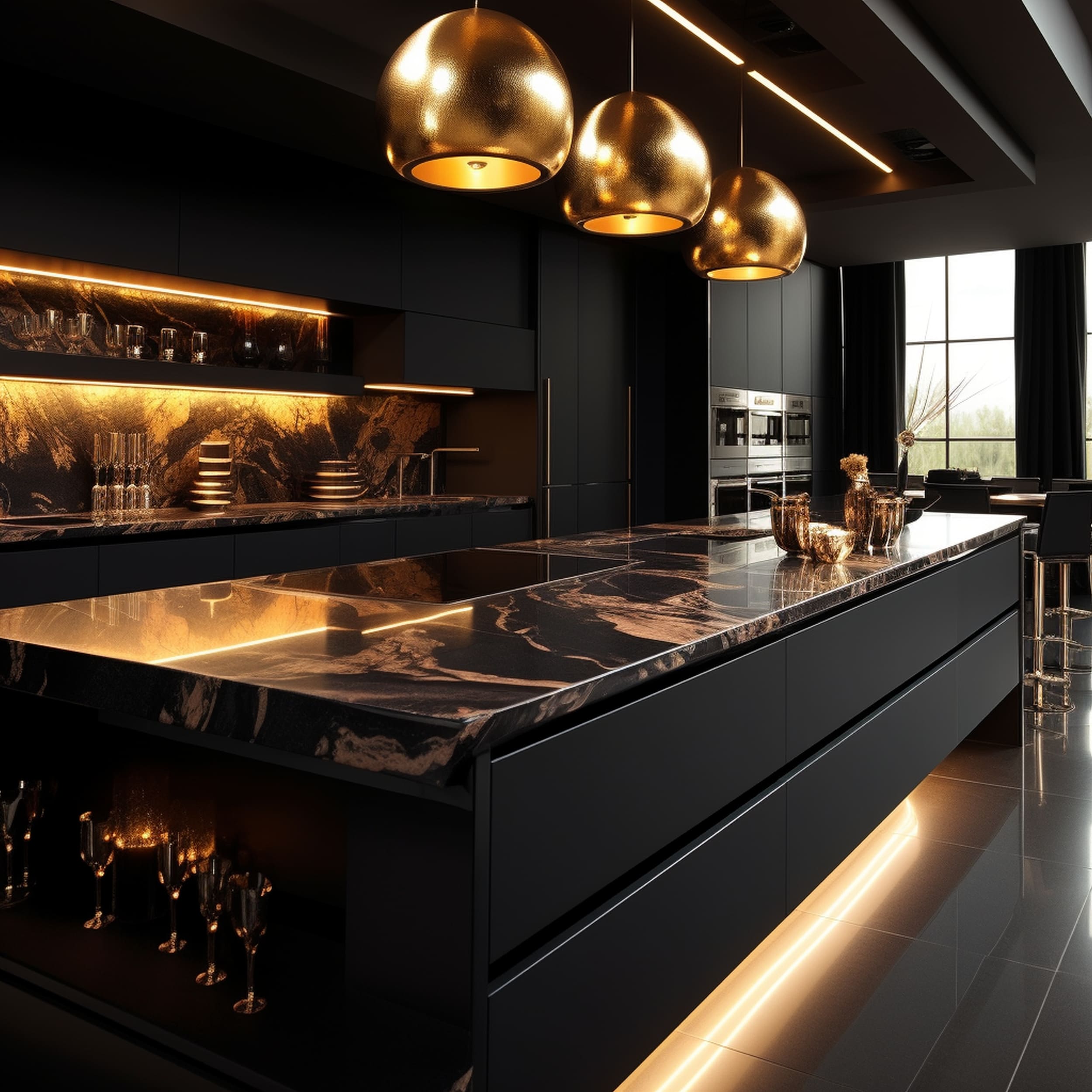
Gold and black make a stunning pairing if you’re looking for an incredibly luxurious color combination. Although it might seem quite straightforward to decorate the room with the help of this kind of color palette, it’s actually quite difficult to pull off. Black and make the glamor of gold a little too intense. This is why it’s important to keep the visual balance by layering warmer shades as well. Don’t use only pure jet black mixed with gold. Include variations like chalky ink tones to avoid an excessively brash design.
2. Emerald Green
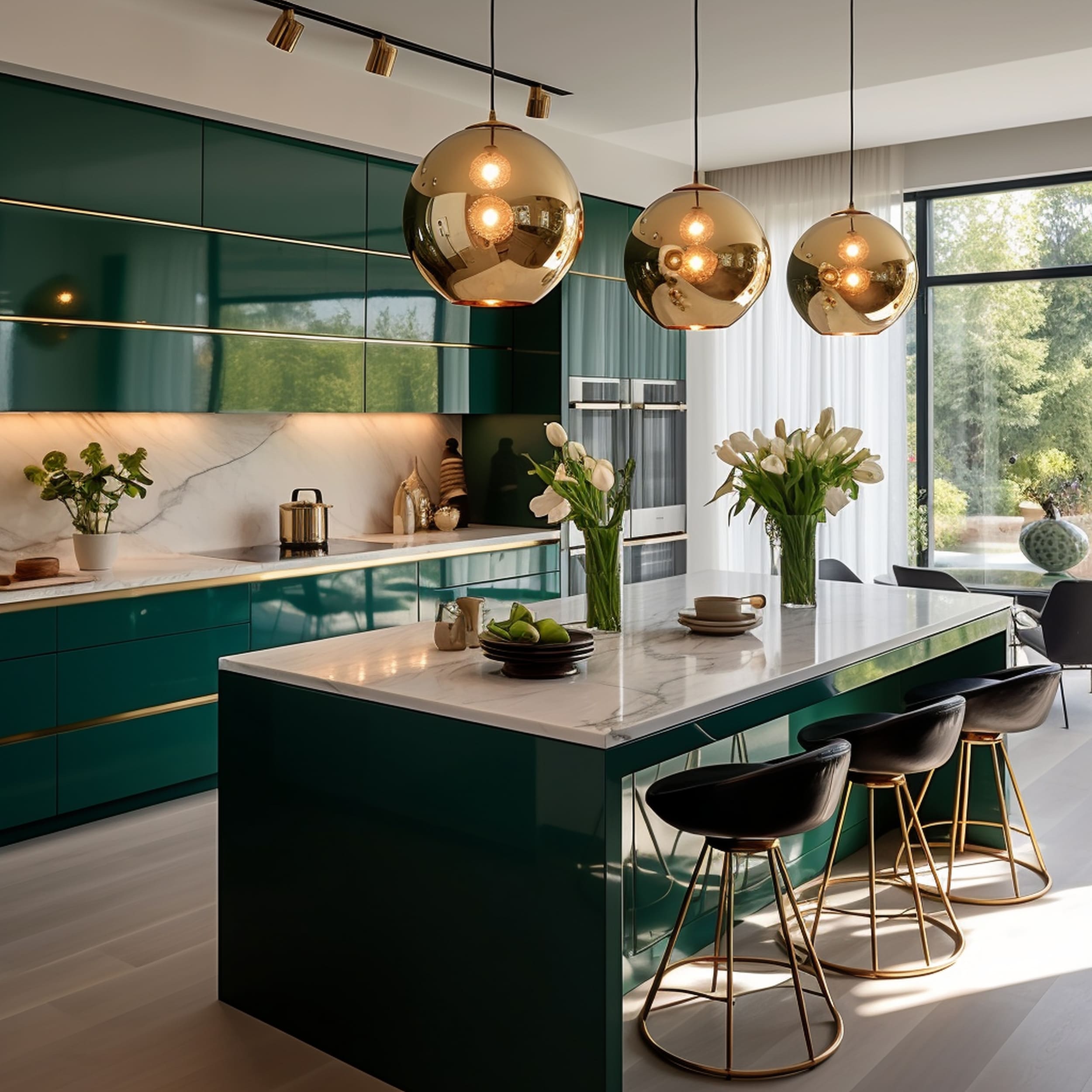
Emerald green or any other jewel tone works like a charm together with gold. The regal vibe of emerald green elements can be accentuated elegantly with the help of gold accents to match the luxurious appeal. Thanks to its natural vibrancy, this tone of green brings out a more invigorating atmosphere when layering multiple gold decor pieces. Color schemes based on gold and emerald green seem particularly fitting for kitchens where an extra dose of energy is very much welcomed.
3. Pink
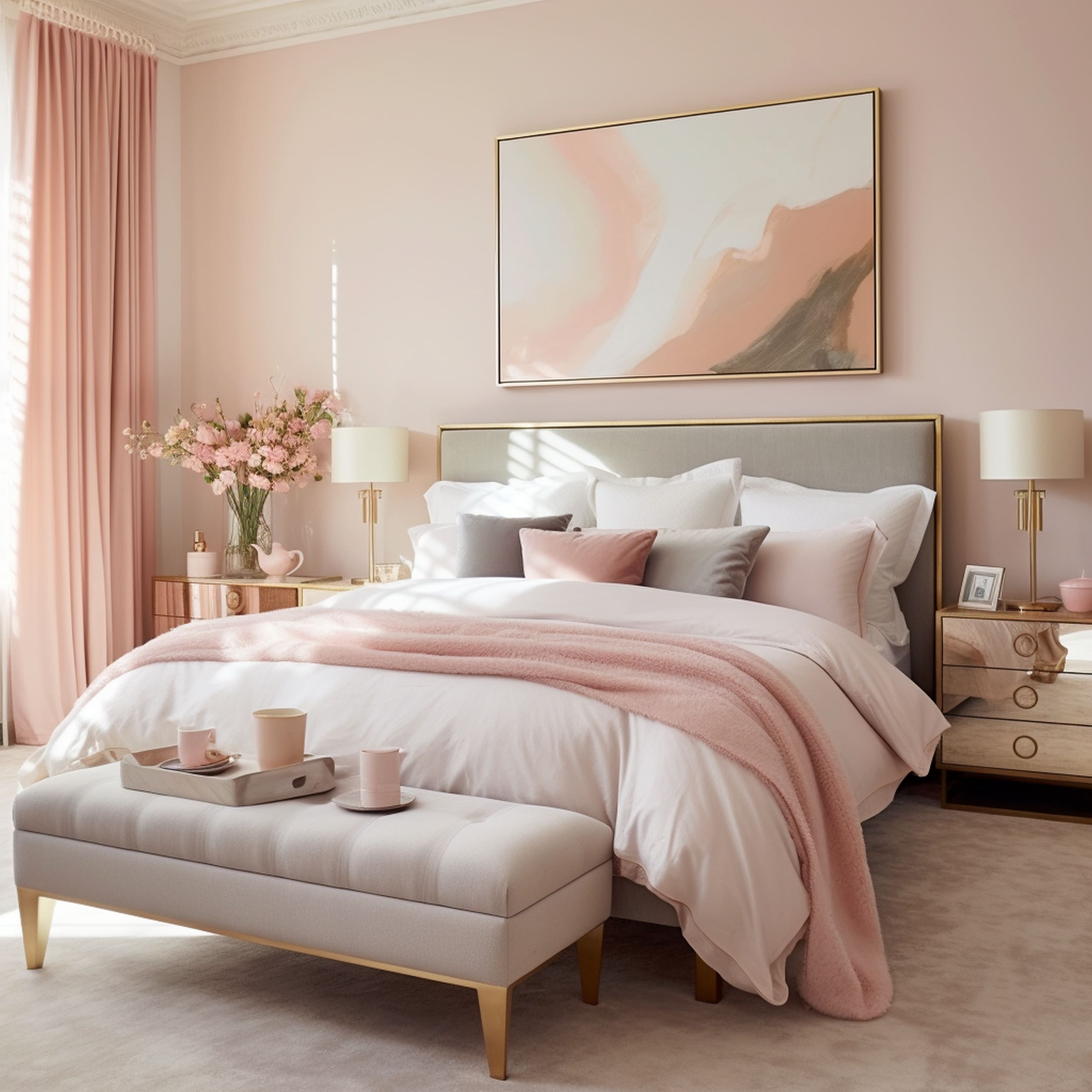
Peachy pink tones can be beautifully complemented by gold accents. This is a classic pairing that gained a lot of popularity in recent times. The delicate style of pink can make use of the glamorous look of gold to feel more playful without any childlike vibe. You can try combining gold with many different shades of pink, but it’s safe to say that understated tones work best. Whether it’s a peachy, dusky, or blush pink shade, you can enhance its style to create an attractive modern interior look.
4. Gray
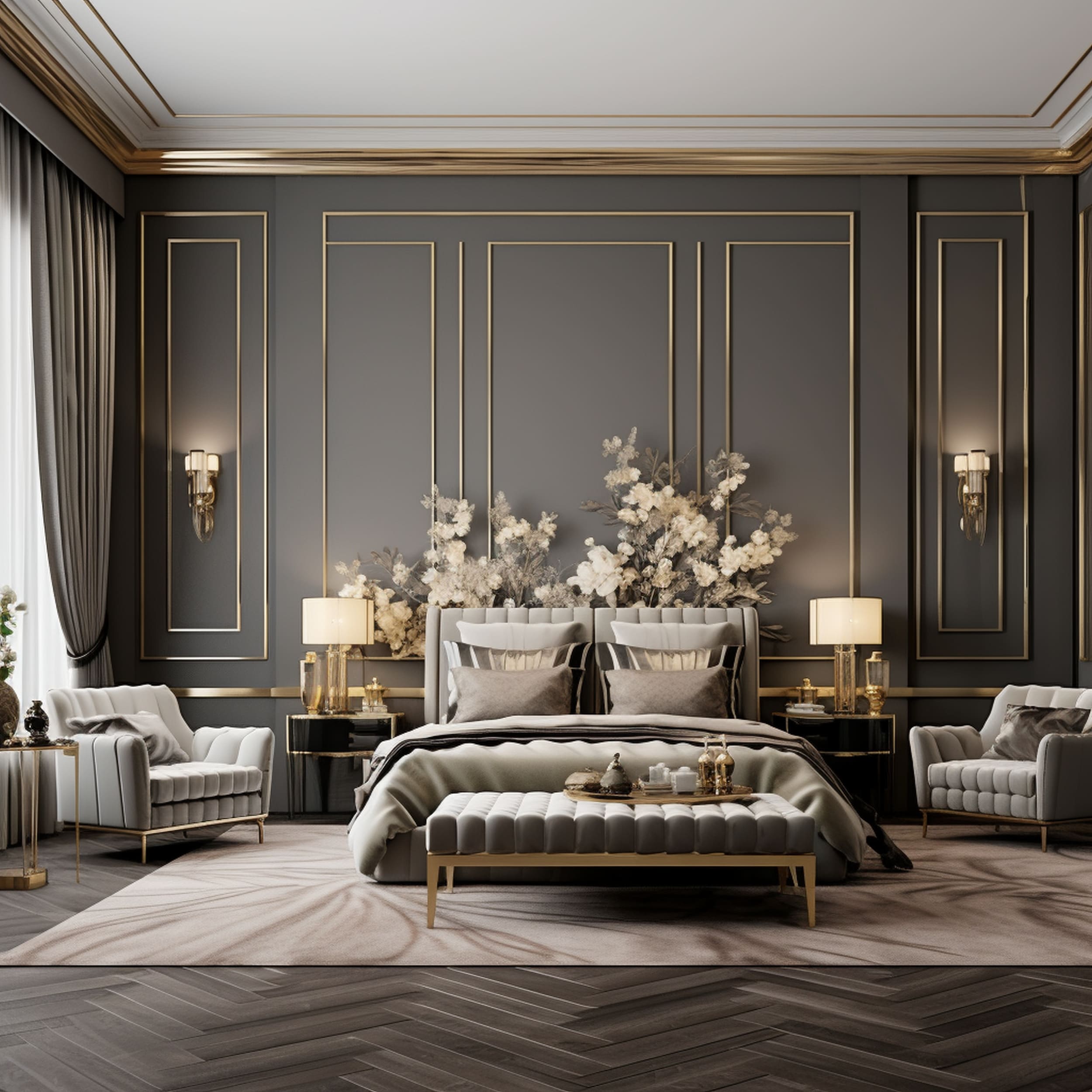
A neutral tone like gray can be paired successfully with gold if you want to introduce a touch of glam without overwhelming the color scheme too much. As opposed to more daring tonal combinations, gray feels like a safe bet as it integrates the gold more elegantly into the space. Instead of a strong contrast between dark gray shades with gold, it’s recommended to focus on warmer tones. It’s a more unexpected design approach but it can pay off if you’re worried about creating a somber atmosphere. Warmer grays are well complemented by gold accents to enrich the palette with luminosity and a subtle metallic glow.
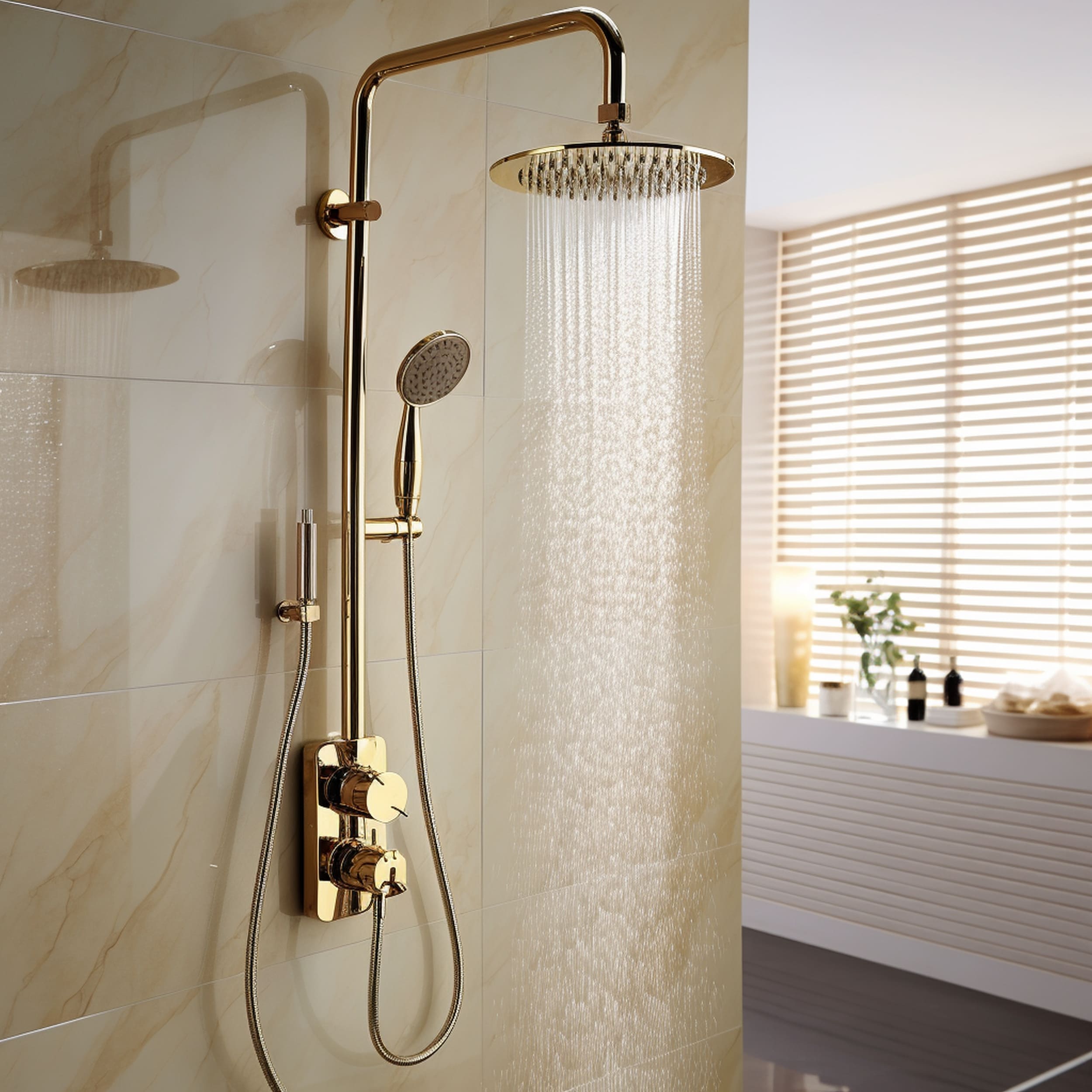
5. Royal Blue
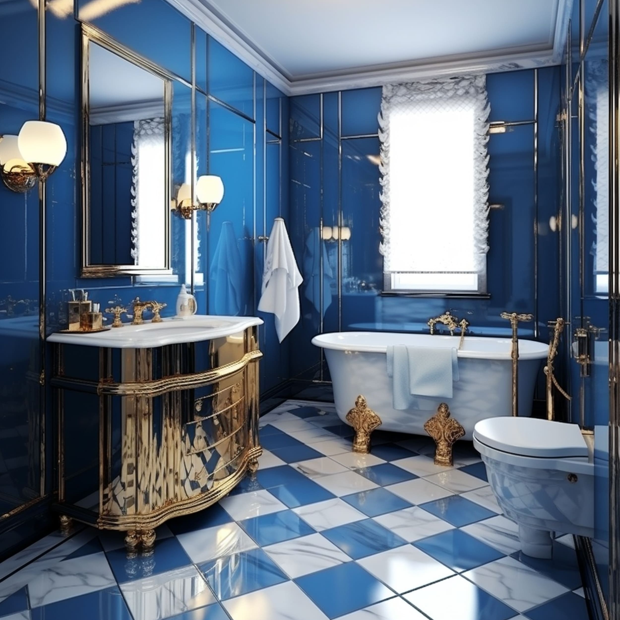
If you’re interested in maximizing the regal atmosphere obtained by a gold color scheme, it’s a good idea to incorporate royal blue. This kind of deep shade adds a sense of vividness that grabs the attention instantly. At the same time, the blue elements are complemented by glitzy gold touches to help them pop even more. It results in a dynamic look with plenty of energy. Royal blue-and-gold color palettes could be ideal for a bathroom if you wish to enjoy such a stunning look first thing in the morning.
6. White
Mixing together white and gold can result in the kind of vintage look that’s reminiscent of the Regency period. However, when used in the proper modern context, it’s easy to create a fresh look. Allowing the gold elements to take centerstage can work well for this kind of color scheme because white is a neutral tone. It makes shiny gold accents feel sleek and serene without making the style seem gaudy. If gold kitchen cabinets are too bold for your tastes, you might try to include gold in a white-dominated room with the help of textiles or other more subtle elements.
7. Teal
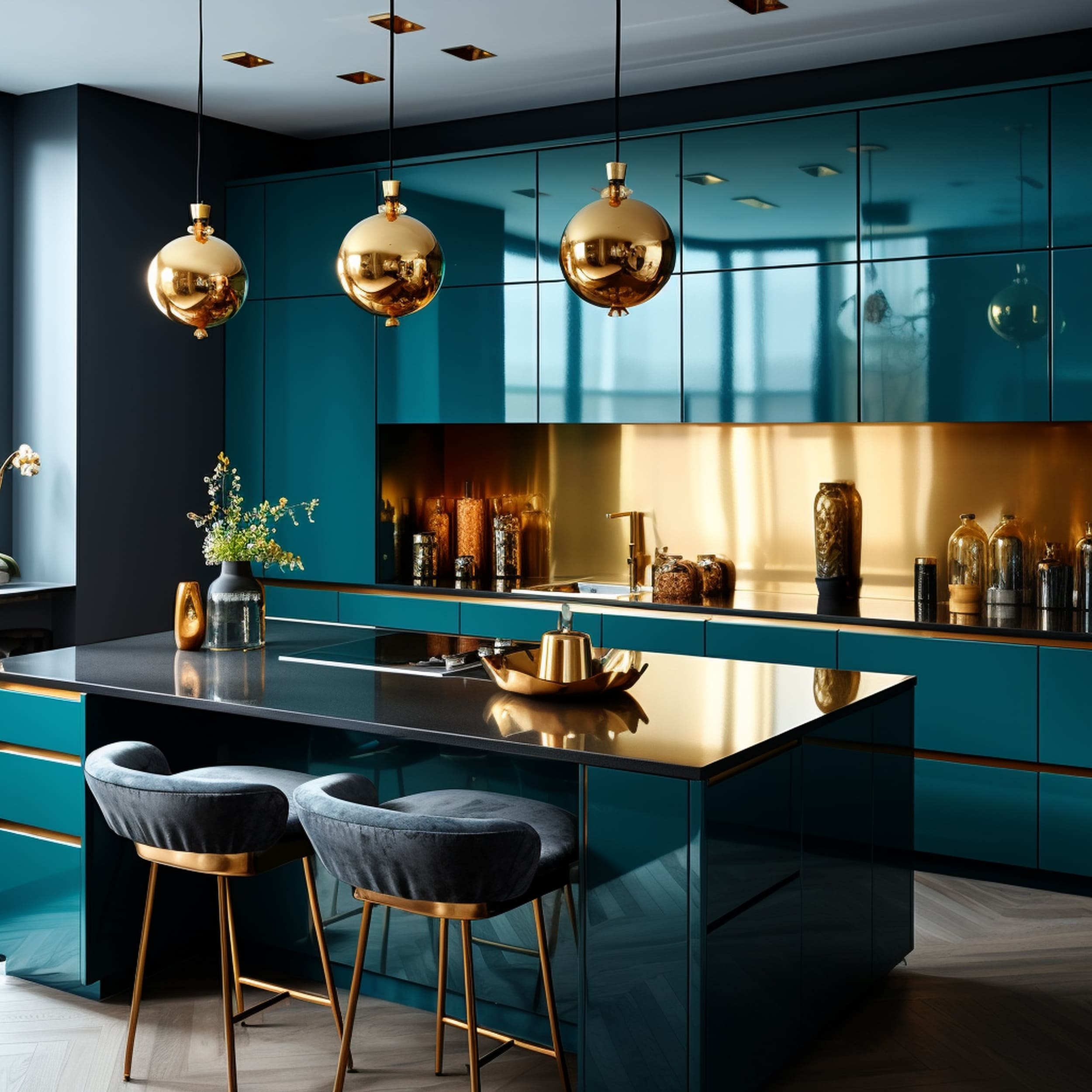
Teal combined with gold can make any room burst with sophistication and opulence. It’s the perfect mix for decorators who aren’t afraid of a dramatic makeover. Rich teal tones seem to borrow the energy of green and the calmness of blue. If you also add gold, you can obtain the kind of color pairing that would be expected in a regal home. It could be just a dash of glamor by using a few chic gold accents or you can fully jump on the trend by opting for large elements to make the most visual impact.
8. Purple
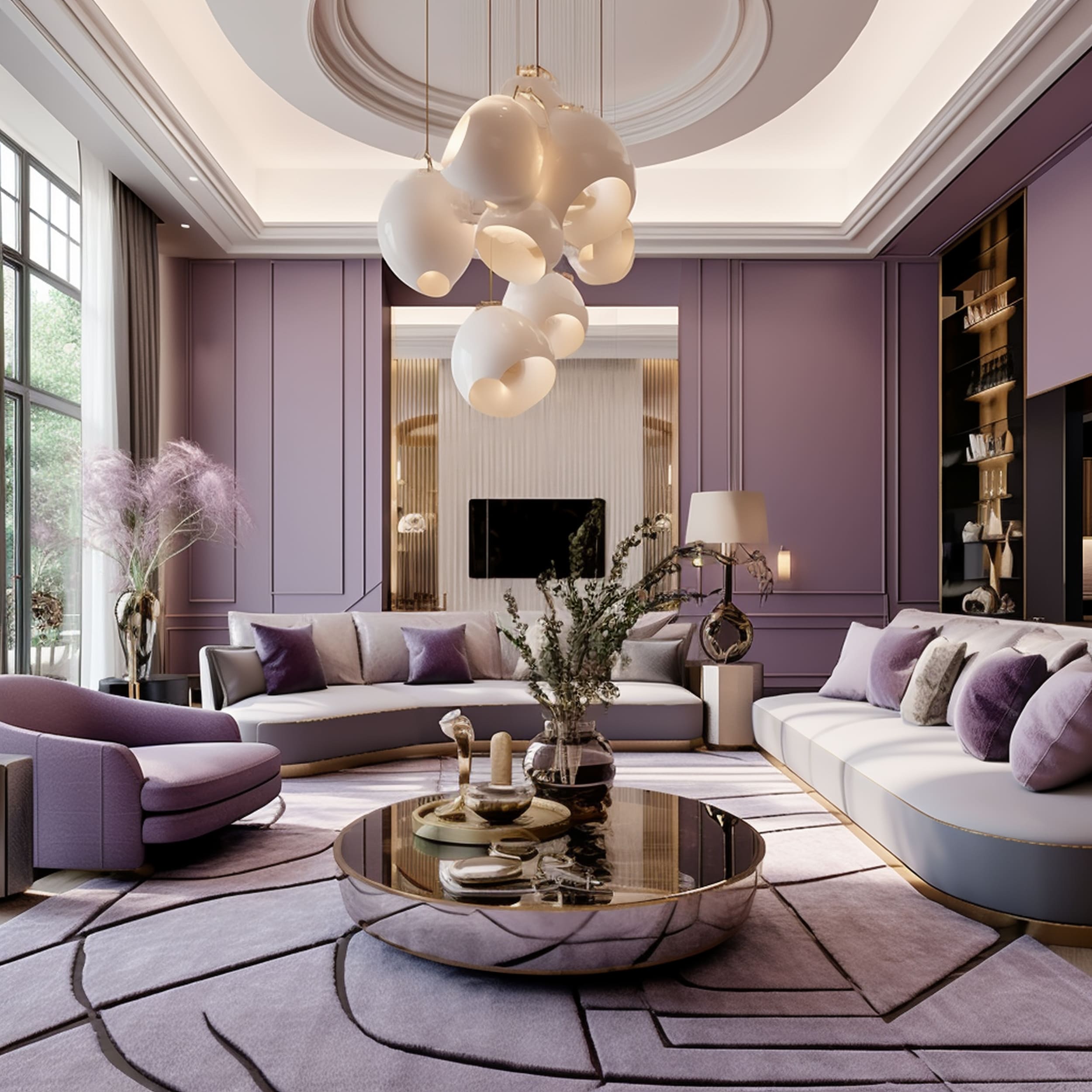
Purple has the reputation of being considered the color of royalty. It makes sense that it would make a good pairing with the luxurious appeal of gold. However, it’s actually not the best idea to combine regal purple tones with gold and instead opt for light shades such as lavender and lilac. These create a more understated effect when contrasted against pops of gold. Soft purple color schemes elevate the level of sophistication to suit modern decor styles more effectively.
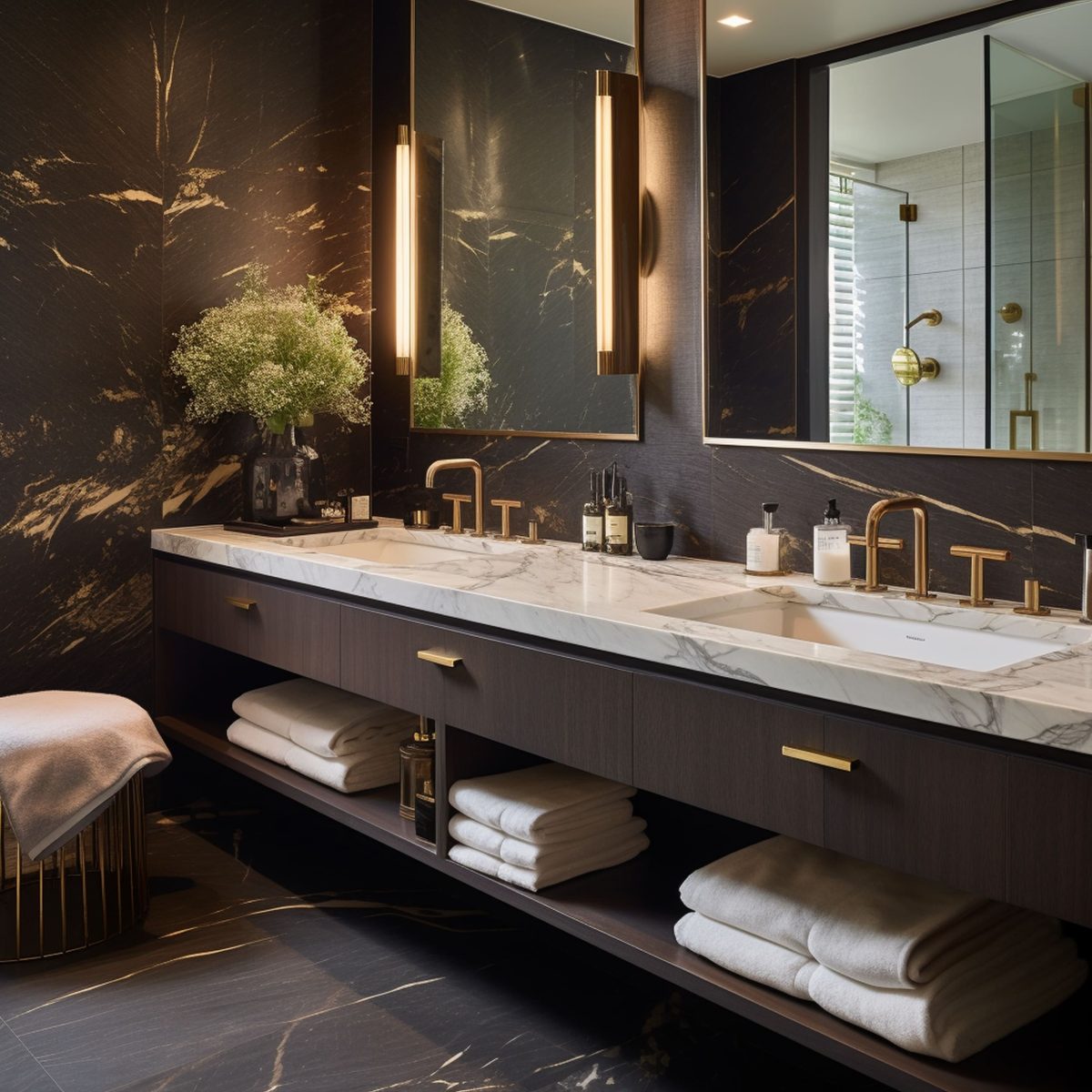
9. Brown
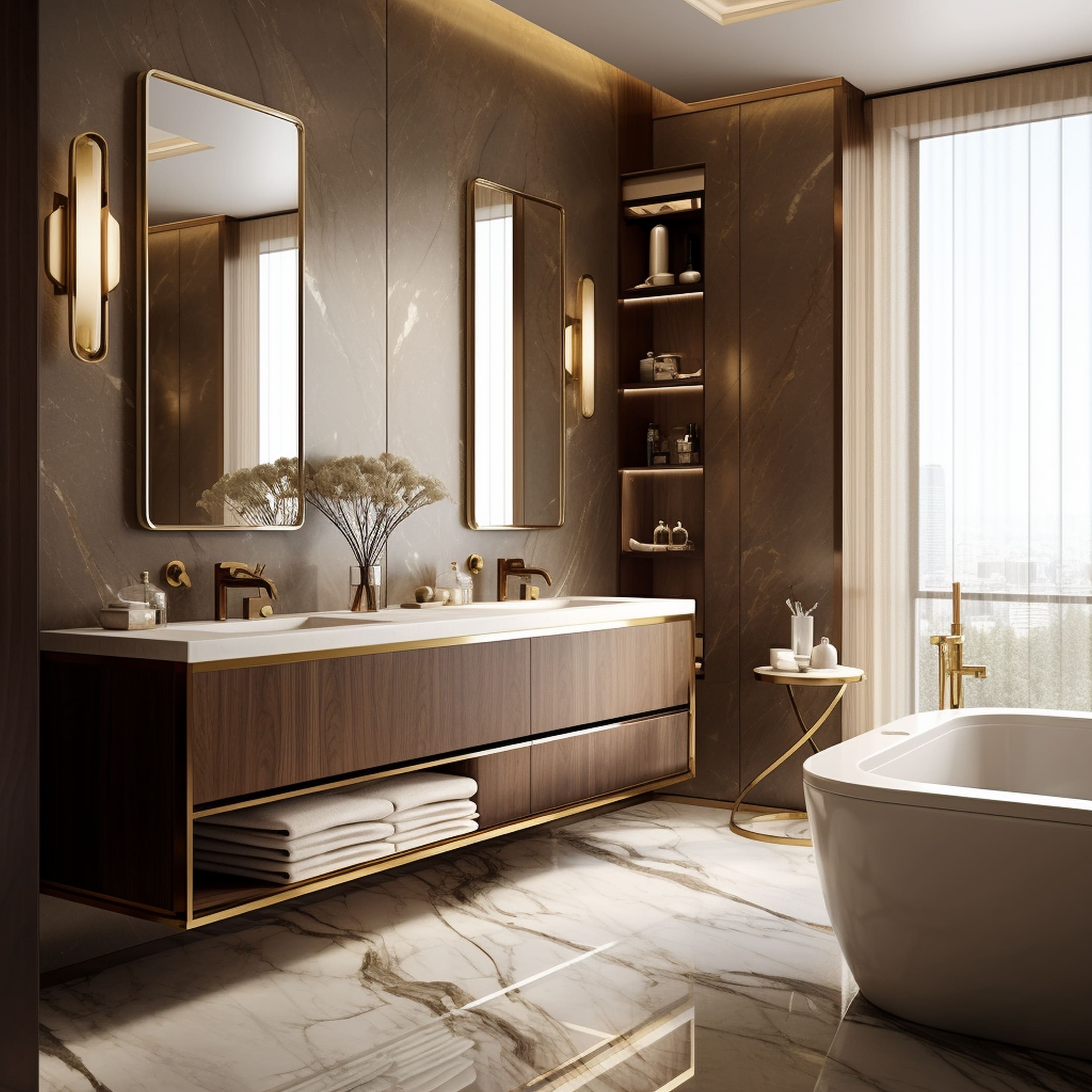
Is brown a good choice to combine with gold? It doesn’t seem like a first choice for many interior decorators but brown works surprisingly great with bolder tones thanks to its neutral vibe. Whether it’s an old-fashioned light brown tone or a dark chocolate shade, brown can be elegantly enriched with the help of glamorous gold elements. This walnut brown vanity looks stunning thanks to eye-catching gold accents. The addition of other luxurious items like marble contributes to the overall opulence of the bathroom.
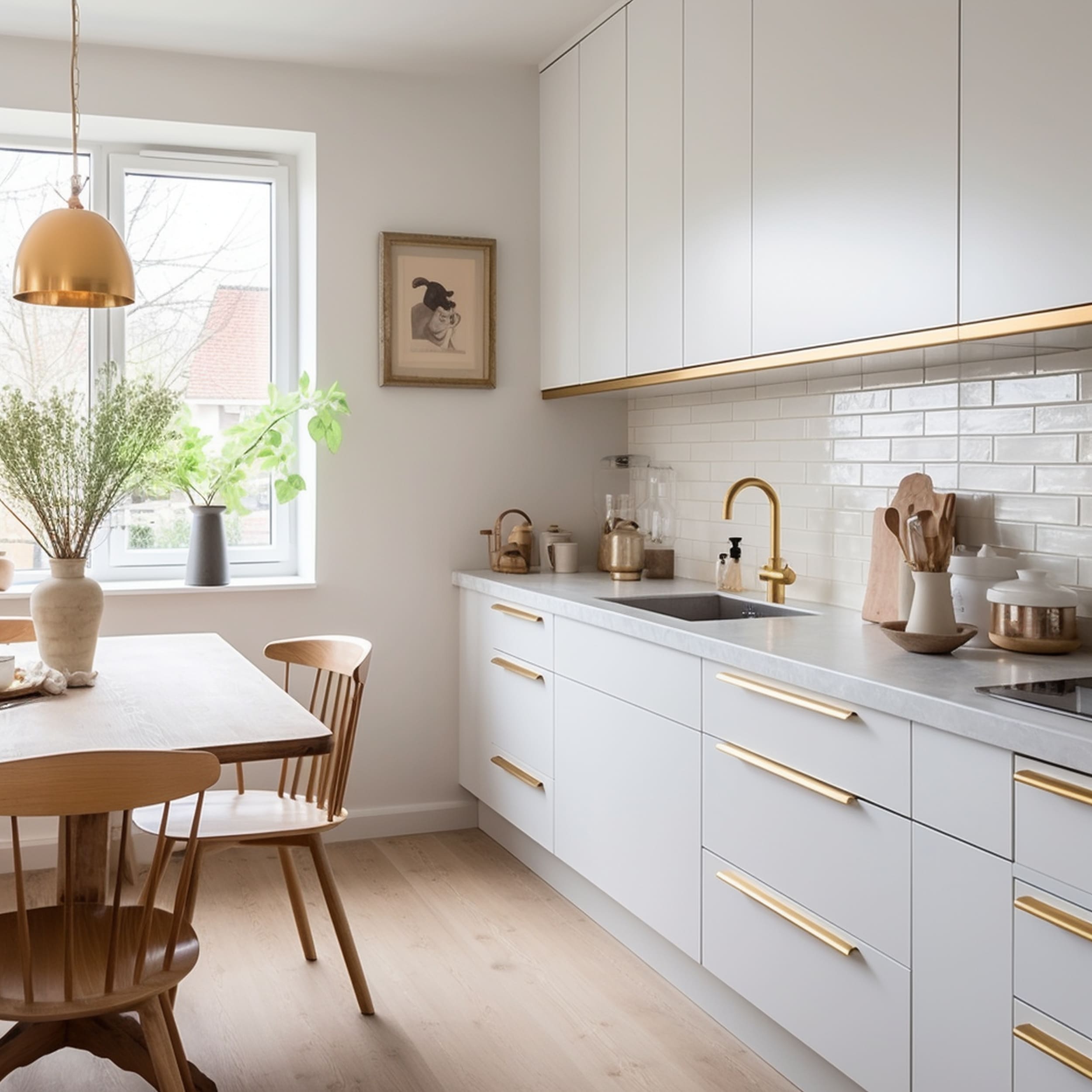
10. Yellow
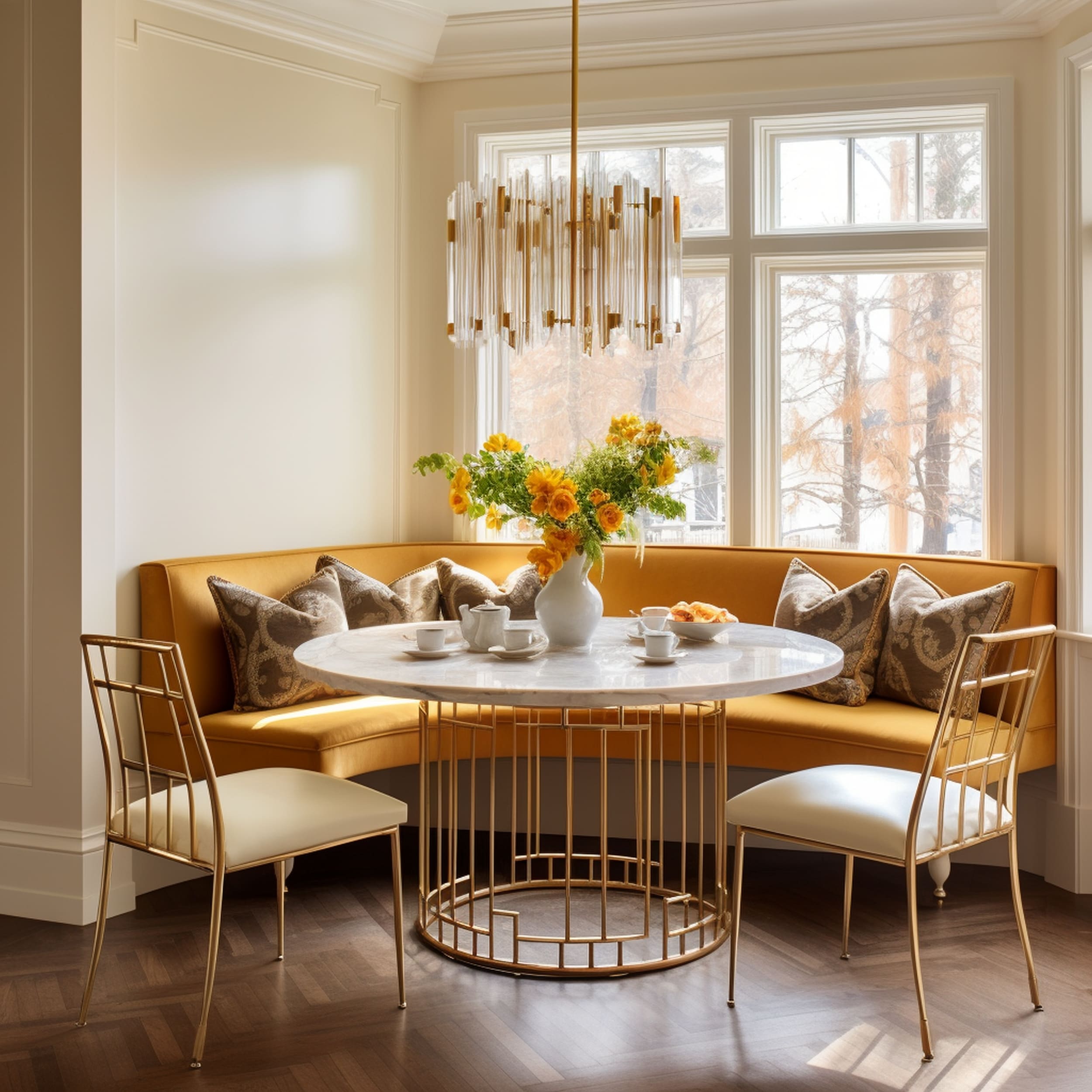
Yellow is very close to gold on the color wheel. If you combine them together, you can end up with a layered look that exudes a sense of subtle glamor. Despite the lack of a strong contrast present in this kind of color scheme, there’s still a considerable touch of drama that won’t go out of style too soon. Check out this elegant breakfast nook that feels vibrant and energizing thanks to a charming integration of yellow and gold accents. The inviting appeal of the area is emphasized by the balanced use of neutral details.
11. Beige
If the beige color scheme in the room starts to appear outdated, you can try incorporating some gold accents to breathe new life into it. Beige is a neutral color that works very well as a background tone for many interior color palettes. A few metallic pops of gold will bring back the energy of the space and complement the natural beauty of beige. Both shades are warm and inviting making this an attractive combination for many interior decorators.
12. Wine Red
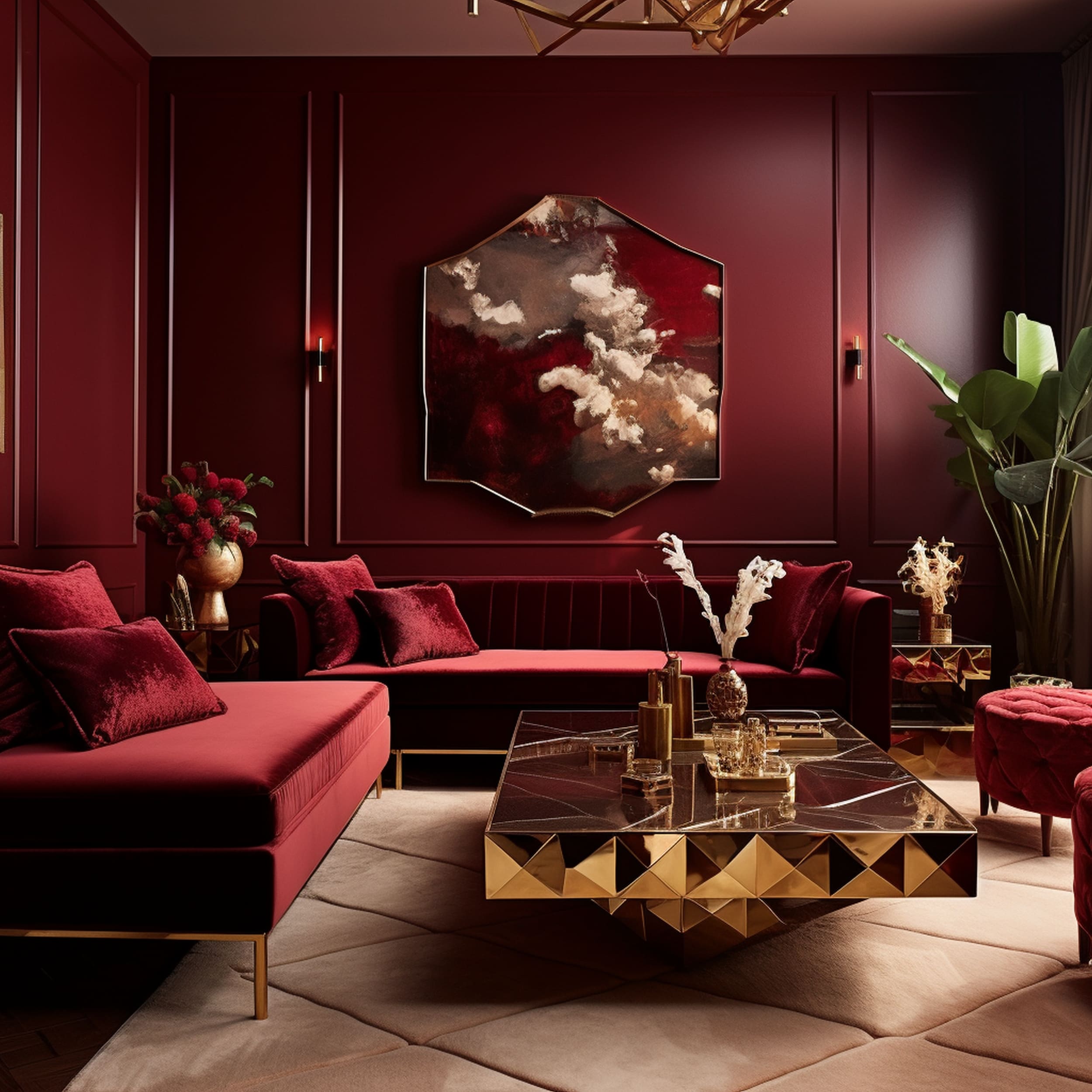
Decorating with a deep tone of red can be quite challenging because this is a bold color that can easily overpower other shades in the room. Gold is a good match for any kind of jewel tone, including wine red. It will result in a flawless maximalist style that’s very trendy in some modern decorating schemes. You don’t need a lot of gold to enhance the vivid beauty of red elements. Just a few touches of glamor should be enough to clearly evoke the idea of opulent luxury.

Leave a Reply