
Neutral colors can be used to craft a simple and minimalist look or you can paint a quiet background with their help when you plan on making dramatic accents stand out. One of the greatest advantages of a neutral tone is versatility. It’s very easy to craft a good match with other colors so neutrals can be considered essential in many interior design projects. Whether you’re a fan of industrial, retro, or bohemian-tribal styles, neutral colors can successfully act as the foundation of the décor.
The problem with neutral shades like cream and beige is that you can use them excessively. You might accidentally create a boring look if you don’t use neutral colors correctly. Decorating with neutral colors may be easier compared to integrating bolder hues, but you need to be aware of the risk of aesthetic stagnation. This is why this article has been created to serve as a guide and help you incorporate neutrals in every room without sacrificing the style and personality of the area.
1. Texture
![]()
Adding plenty of texture is crucial if you wish to decorate with neutral colors in a pleasing way. There’s something about the contrast of textures that allows you to find a perfect visual balance. Try to incorporate rough textures alongside softer ones and combine smooth with coarse textures. Given how neutrals don’t have eye-catching characteristics, it’s important to focus on other elements such as texture.
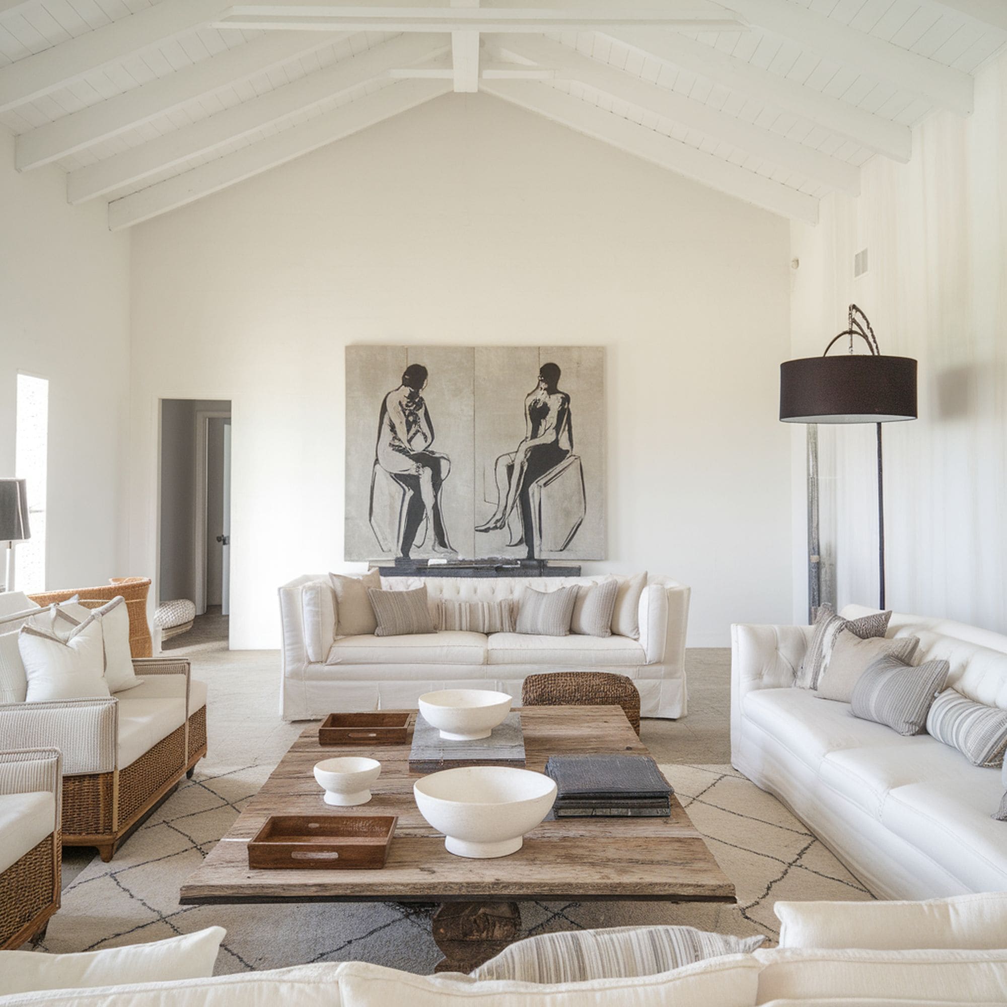
Lots of interior designers agree that you can’t really have too many objects that enhance the sense of texture in the room. That means you shouldn’t be afraid to integrate as many linens and sheepskins you prefer. This stylish living room is a great example of bringing in some much-needed texture for solid visual interest.
One of the most striking elements of the room is the rug which pairs very well with the chunky knit throw on the sofa. Check out this soft microfiber throw blanket from Amazon that gives off a similar textural feeling. Notice how the soft elements in this room are offset by the more solid textures such as the black wood from the ceiling and the gold metallic style of the coffee table.
2. Shapes
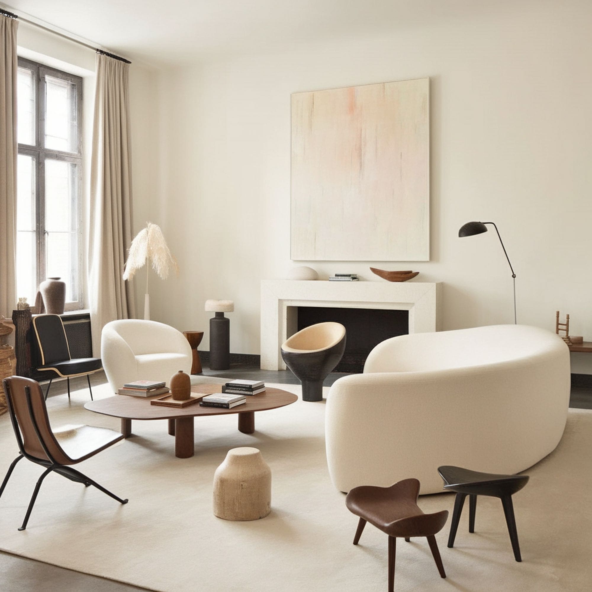
When neutral colors dominate the visual field, the overall look of the room can feel stagnant very easily. The colors appear to blend together as they’re so similar. To solve this problem, you need to focus on the shape of the elements placed in the room. Instead of paying little attention to the furniture you purchase, it’s highly recommended to take into consideration the shapes of the objects and how this impacts the aesthetic of the space.
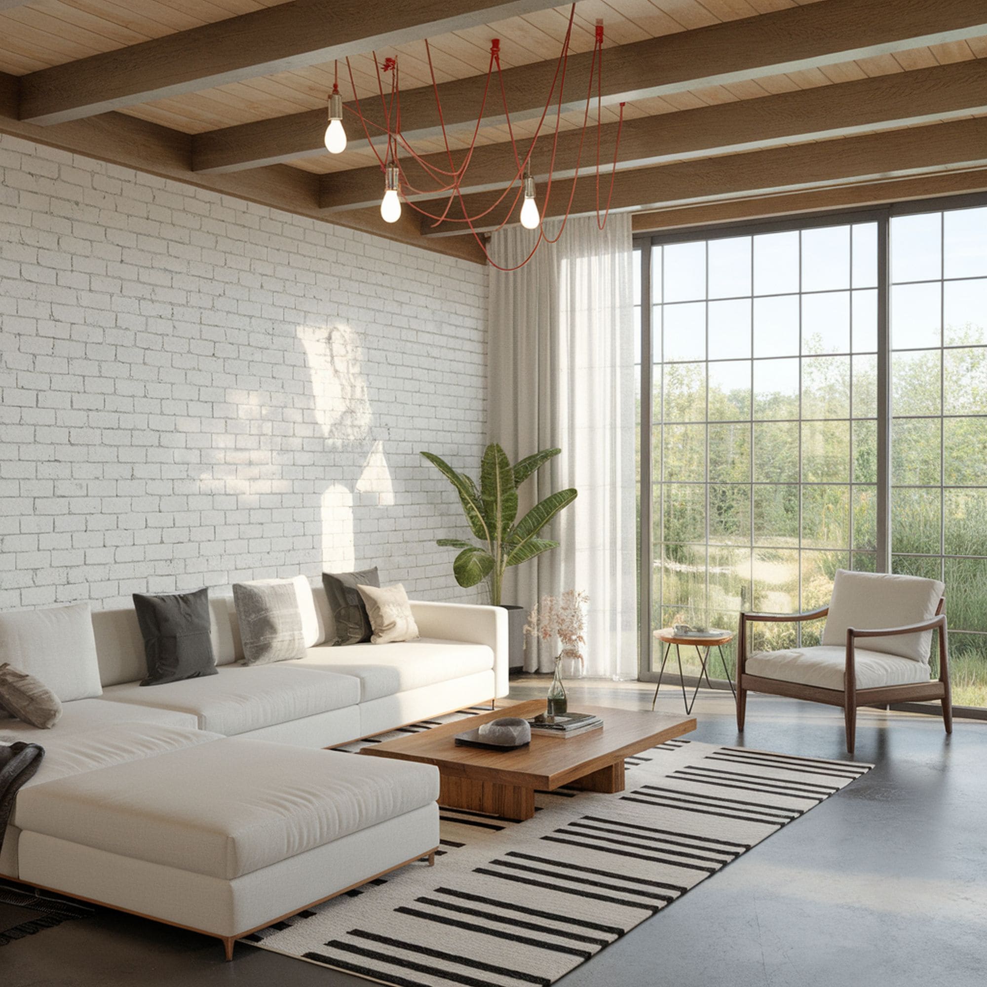
If you’re not careful about choosing more interesting shapes, you risk creating a bland look that’s easy to spot. With such a toned-down palette, shapes and silhouettes will start to take an important place in the general visual impression of the room. Take a look at this elegant living room that makes use of rounded and sculptural seating. The curves of the coffee table will also attract attention and keep the neutral style of the room interesting.
The room shown here is just an example. It can get very expensive to decorate your living room with lots of custom designer pieces. There’s no need to decorate every corner with premium furniture as just two or three well-placed objects will suffice to add that visual intrigue. Sometimes just a simple mid-century modern armchair like this sinuous beige model from Amazon will have a great impact to break the monotony of neutral colors.
3. Architectural Details
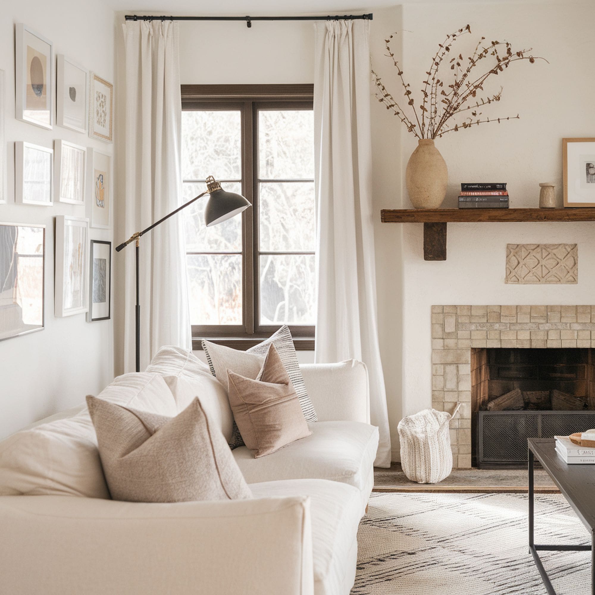
Architectural details can make a big difference for the look of a room where neutral color tones dominate. Unless you plan on renovating, it’s hard to use this piece of advice, but it’s still worth taking into account. If you add some crown molding, wainscoting or panels, the visual effect can be quite significant. Everyone’s attention will be more easily directed on the architectural details, particularly if we’re talking about an all-neutral room.
Elements such as the tile work on this fireplace as well as the domed ceiling in this elegant living room, make a great case for incorporating as many architectural details as possible. Notice how the neutral space gains a unique character thanks to these little details. Those lucky to have interesting architectural details already in place should definitely take advantage of their design potential.
4. Black or Metallic Touch
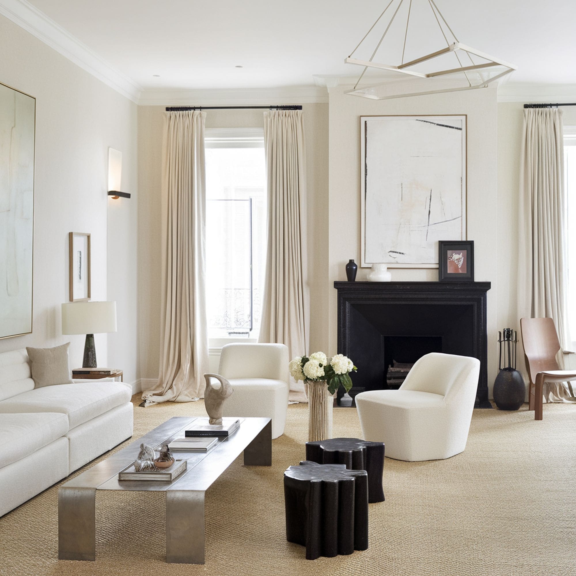
An all-neutral room will always look better if you bring in a black or metallic element. Check out this completely beige room and notice how the painted black fireplace adds plenty of depth and captivates the attention. It’s not really required to have a grounding element in a neutral room, but if you choose to go for a similar vibe as shown here, the addition of black is very welcomed.
Gold accents can be used in a similar manner to spice up neutrals and prevent boredom from setting in. As we’ve seen in the texture section, metallics are the perfect match for soft and fuzzy elements as they create a more balanced design. Adding some metallic tones helps if you plan on varying your textures in a neutral-toned room. Some extra glitz won’t hurt the look and can actually enhance the sophisticated vibe.
5. Warmth
When you’re trying to decorate a room using neutral colors, you will probably stumble upon the issue of warmth. Some all-neutral rooms can feel a bit too cold even if the textures are varied and interesting. To provide some nice warmth to the area, we recommend incorporating wood. There are other materials you can use as well, but wood holds a special place due to its ability to boost the warmth.
Wood tones have a certain rich characteristic that will work very well for neutral style rooms. The versatility of wood is also tough to match by other materials. You can include different wood textures and a nice range of hues to create multiple layers in the room. The extra depth and complexity are very welcomed for a room where neutral colors take center stage. Wood is ideal to warm up the atmosphere and create a cozy ambiance.
6. Living Room
The living room can benefit from a neutral color scheme, particularly if you incorporate a lot of white. This enables you to try some more adventurous choices for the furniture and accessories in the room. Using a white background where you show off some more colorful elements can be considered a simple and effective solution to decorate the living room with neutral colors.
Whites look amazing for the living room, but it’s important not to forget about other details in the room. Choose a white shade with cool undertones if the area is bathed in plenty of sunlight. In case you find yourself in the opposite situation, be sure to select warmer whites or neutrals to offset the lack of natural light. This is important because you should ideally avoid making the room feel flat and sterile.
Neutral colors in the living room offer the opportunity to make a particular feature of the room stand out. For example, color and décor can emphasize a fireplace wall. If you’re afraid that your neutral-toned living room might seem too bland-looking, you can add some drama with the help of imposing lighting such as an elegant chandelier. Check out this model from Amazon that comes with a modern design evoking sophistication.
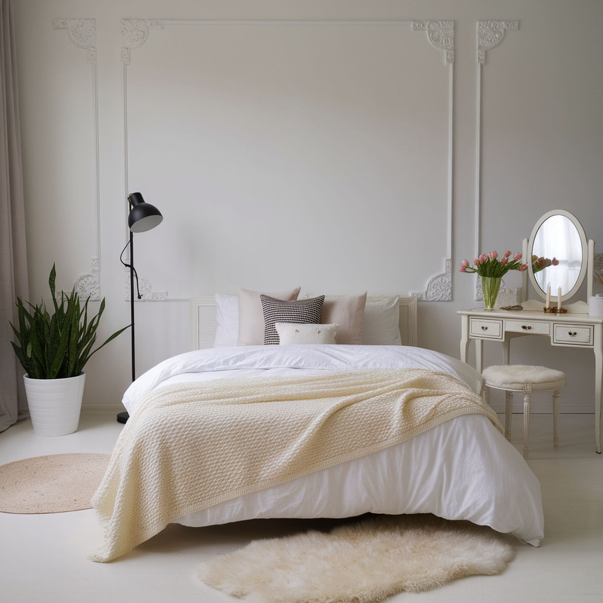
7. Bedroom
Crafting a high-style look for the bedroom is totally possible even if you restrict yourself to just neutral colors. Once you have decided on the right vibe for this room, it’s simply a matter of opting for neutral shades that inspire tranquility or colors that give off vivacious feelings. Using neutrals for the bedroom makes a lot of sense when you think about the flexibility of this kind of color scheme.
Neutrals will help you relax and sleep peacefully offering an adaptable backdrop to suit your particular interior design style. In case you want to enhance the sense of coziness as much as possible, consider going for warm neutrals like various shades of brown, ivory, and tan. It’s recommended to choose a warm neutral palette if you wish to keep a casual vibe for the bedroom.
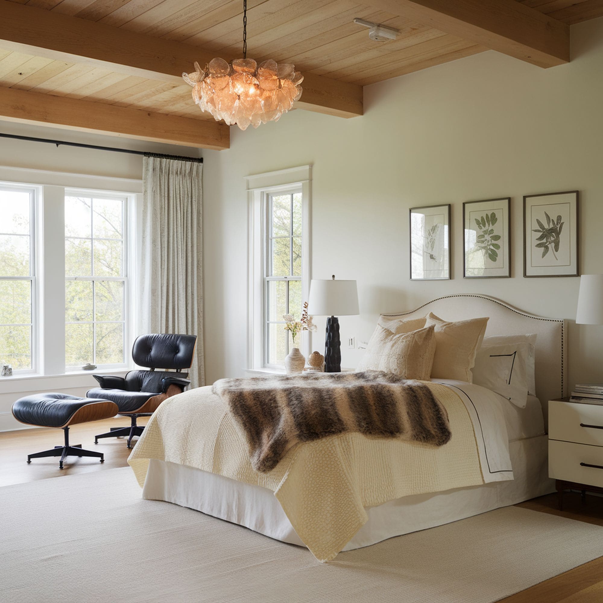
Alternatively, if you favor exquisite elegance and want to craft a composed scene that suggests sophistication, it’s a better idea to stick to cool neutrals. Think of tones of gray and whites that have cool undertones. Even some icy blue colors can work as neutrals in some cases. When it comes to decorating bedrooms with neutrals, one useful tip you should consider is incorporating natural elements. The look of this bedroom benefits from the sense of depth provided by the wood plank ceiling.
8. Kitchen
Colorful kitchens tend to be more eye-catching compared to neutral-toned ones. That doesn’t mean you can’t make this functional room exciting using just neutral colors. Once again we rely on the versatility of the neutral color palette as it allows for maximum adaptability regardless of the specific style of the kitchen. Whether you plan on creating a classic or modern aesthetic for your kitchen, neutrals can be successfully used for its décor.
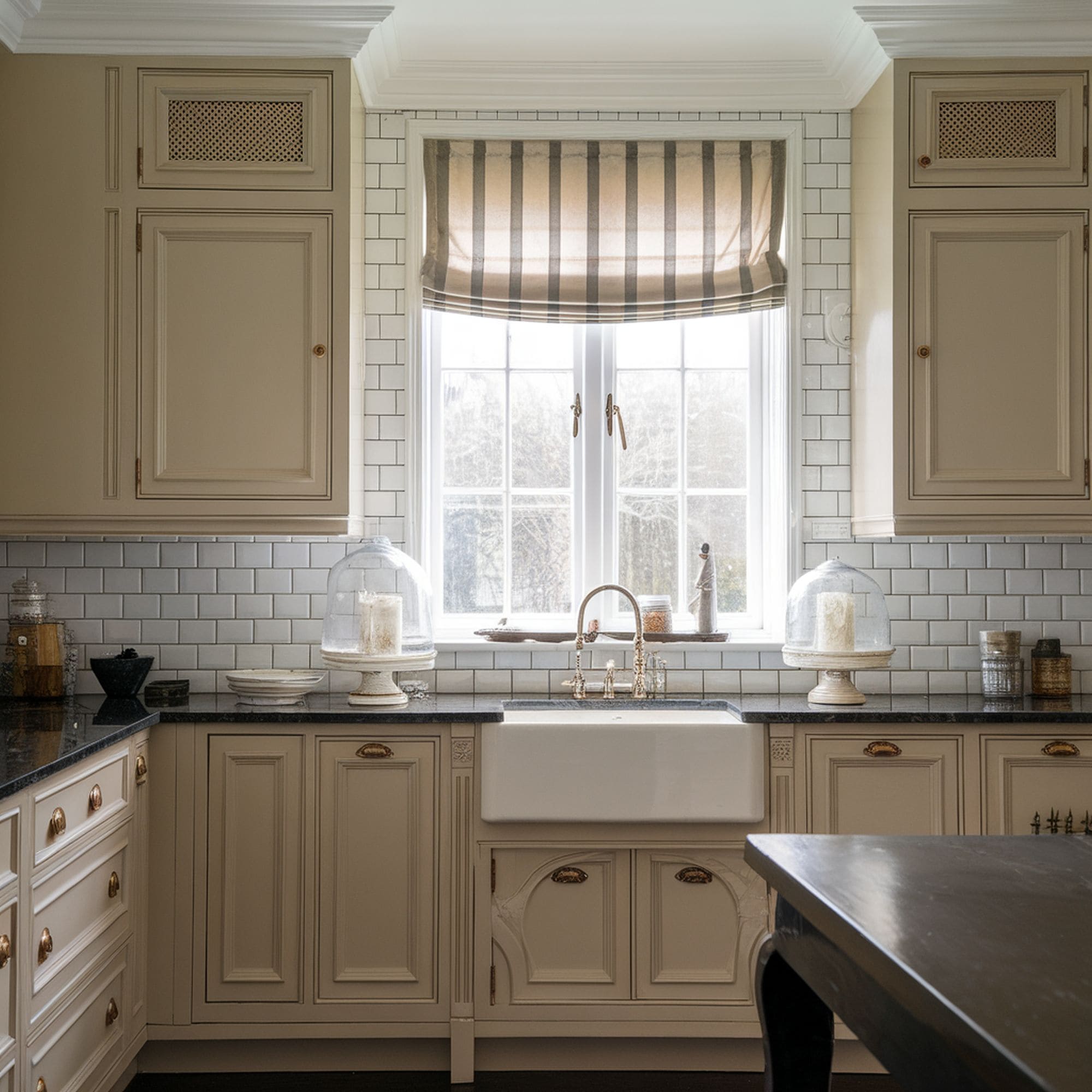
Classic neutral tones have a timeless quality that makes them suitable for a traditional kitchen. The neutral design of this kitchen is greatly enhanced by the striped patterns that fit perfectly for the classic style of the room. If you want to avoid creating a bland look for your neutral kitchen, simple patterns work best as they combine more naturally with the timeless color palette. Trying to make a cohesive design is more recommended than striking contrasts when you’re working with neutrals in the kitchen.
9. Dining Room
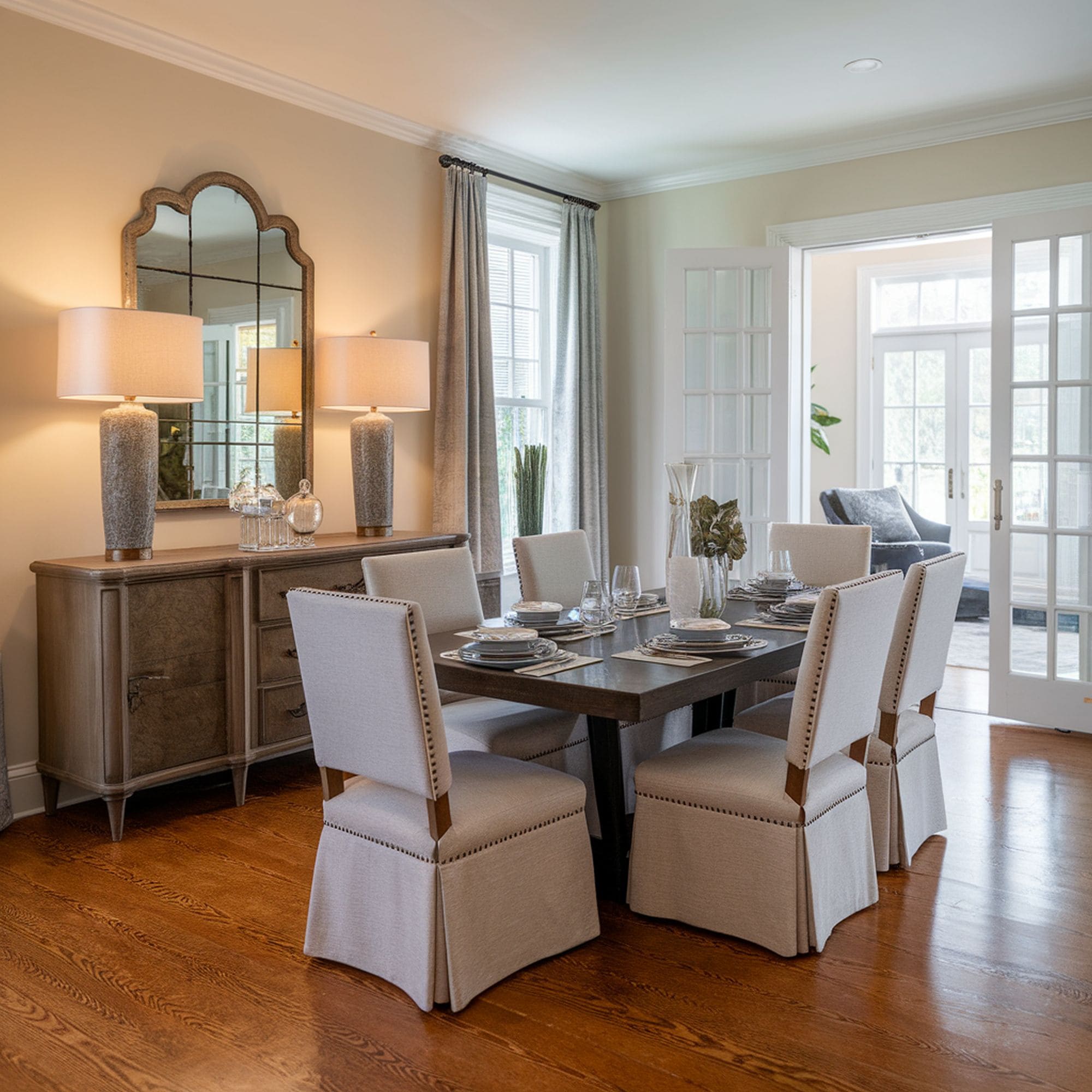
A stylish neutral dining room needs to be charming and to provide a sense of airiness. Focus on texture to make this area more comfortable and welcoming for the guests. A traditional-style dining room will look very nice with the help of warm neutral tones of cream and brown.
Add some textural wood through the furniture and consider linen upholstering for that extra comfort. The idea is to make the dining room as inviting as possible and warm neutrals enable you to achieve that with ease. Check out these wingback chairs from Amazon. Their elegant tan design makes them an ideal choice for a stylish dining room where neutral colors dominate.
10. Bathroom
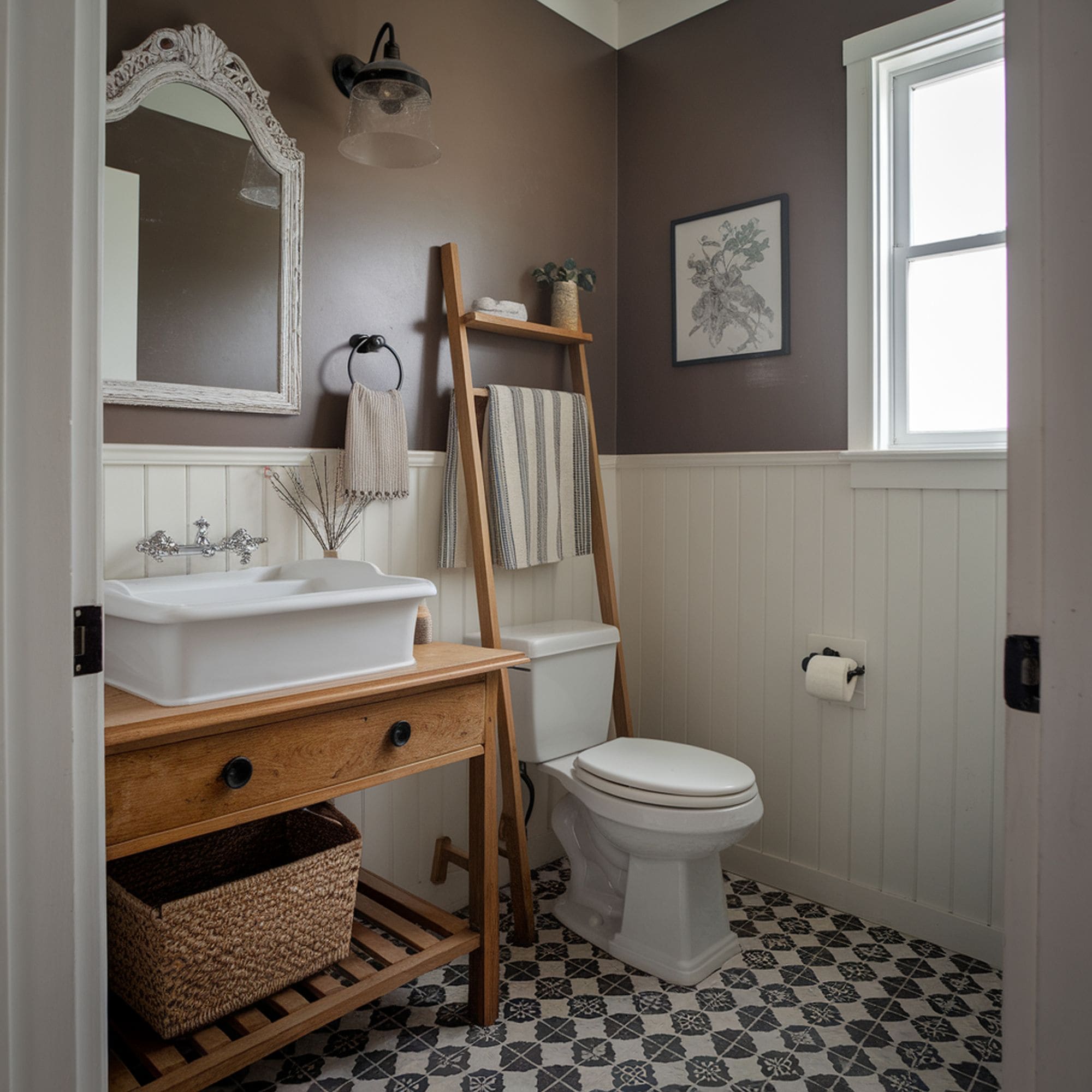
From warm tan to soothing cream and cloudy gray to bright white, there are plenty of neutral color tones you can use to decorate a bathroom. Compared to other rooms in the house, the bathroom will need some extra layers of color to prevent the space from getting a sterile look when you incorporate neutrals. Look to various elements of the bathroom such as the flooring or shower curtain and don’t be afraid to play with similar neutral tones.
One issue that you will often discover regarding bathroom décor is the unappealing nature of toiletries. It’s a good idea to keep your hair spray cans and plastic shampoo containers out of view if they have a vibrant and colorful design. They can easily feel out of place in an all-neutral bathroom and completely ruin the aesthetic of the area. A quick solution is to invest in appropriate storage solutions.
Woven baskets represent an excellent choice for a bathroom that relies on a neutral color palette. This is especially the case if you’re going for a rustic style as it pairs nicely together with wood elements. Baskets maintain the space organized and keep a harmonious design. They can also bring in some extra texture which is always welcomed when dealing with neutral colors. Check out this set of storage baskets with lids from Amazon.
This modern farmhouse bathroom looks gorgeous thanks to the balanced neutral colors used that provide just the right amount of warmth for a serene and cozy atmosphere. The addition of a ladder to hold various supplies is another smart decision to save precious storage space in the small bathroom. Place a plant nearby if you also wish to infuse the space with something green and living. That’s always recommended when you wish to avoid a monotonous neutral bathroom.
11. Home Office
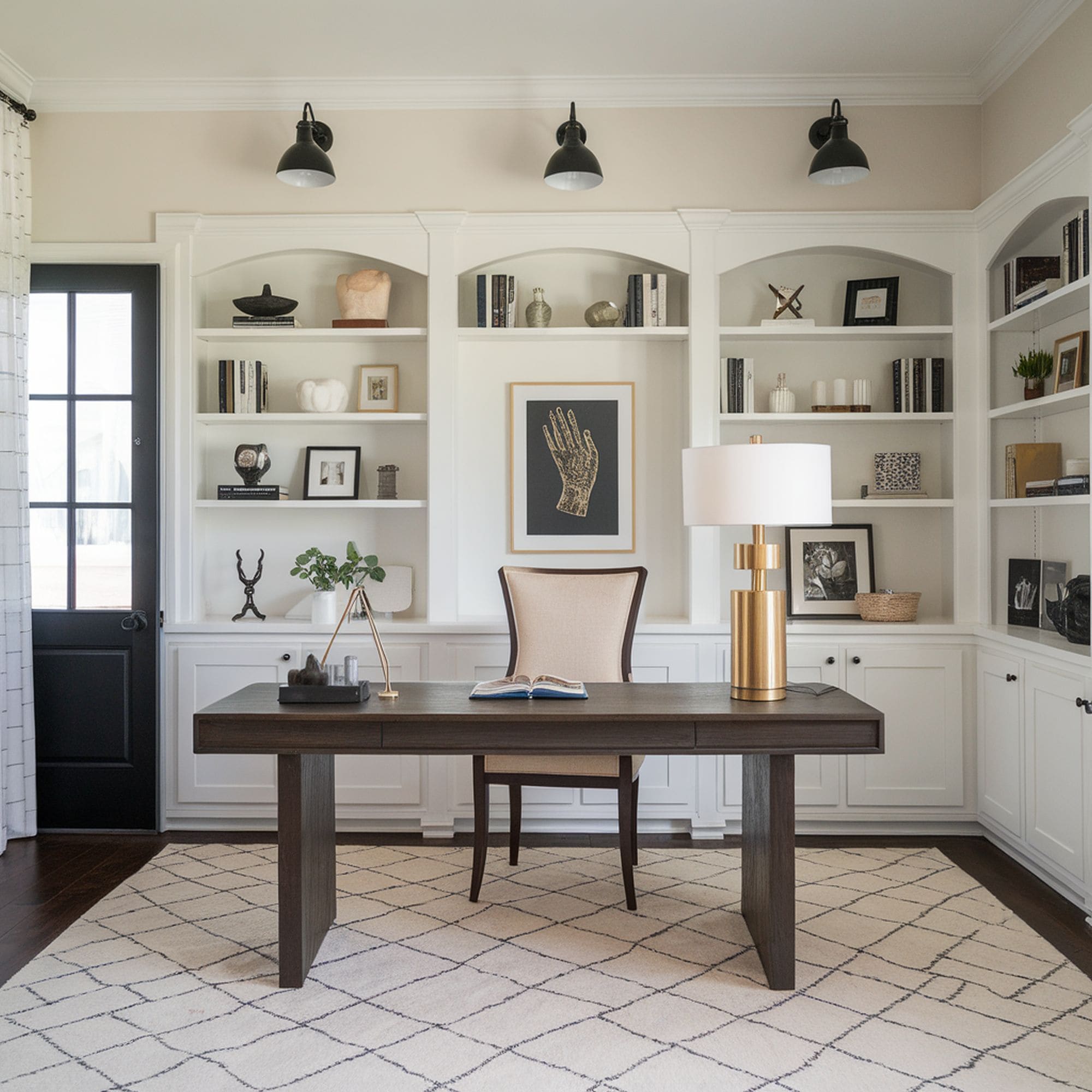
Big punches of color don’t feel ideal for a home office because you need to be able to concentrate on your work and avoid strong emotional responses. Neutrals can help you maintain productivity as they won’t have an impact on your mood and allow you to focus on the current task more effectively. Pair neutrals with copious amounts of natural light which emphasizes the color palette making your working space more appealing.
If you still crave a bit of excitement for the home office, you can use metallics as a great alternative to bolder colors. Gold accents used for the décor of the area add a bit of glam to prevent the neutral color scheme from feeling too monotonous. Whether it’s a brass lamp frame or a metallic lighting fixture, these details can deliver the punch you need to spice things up in the neutral home office.
12. Entryway
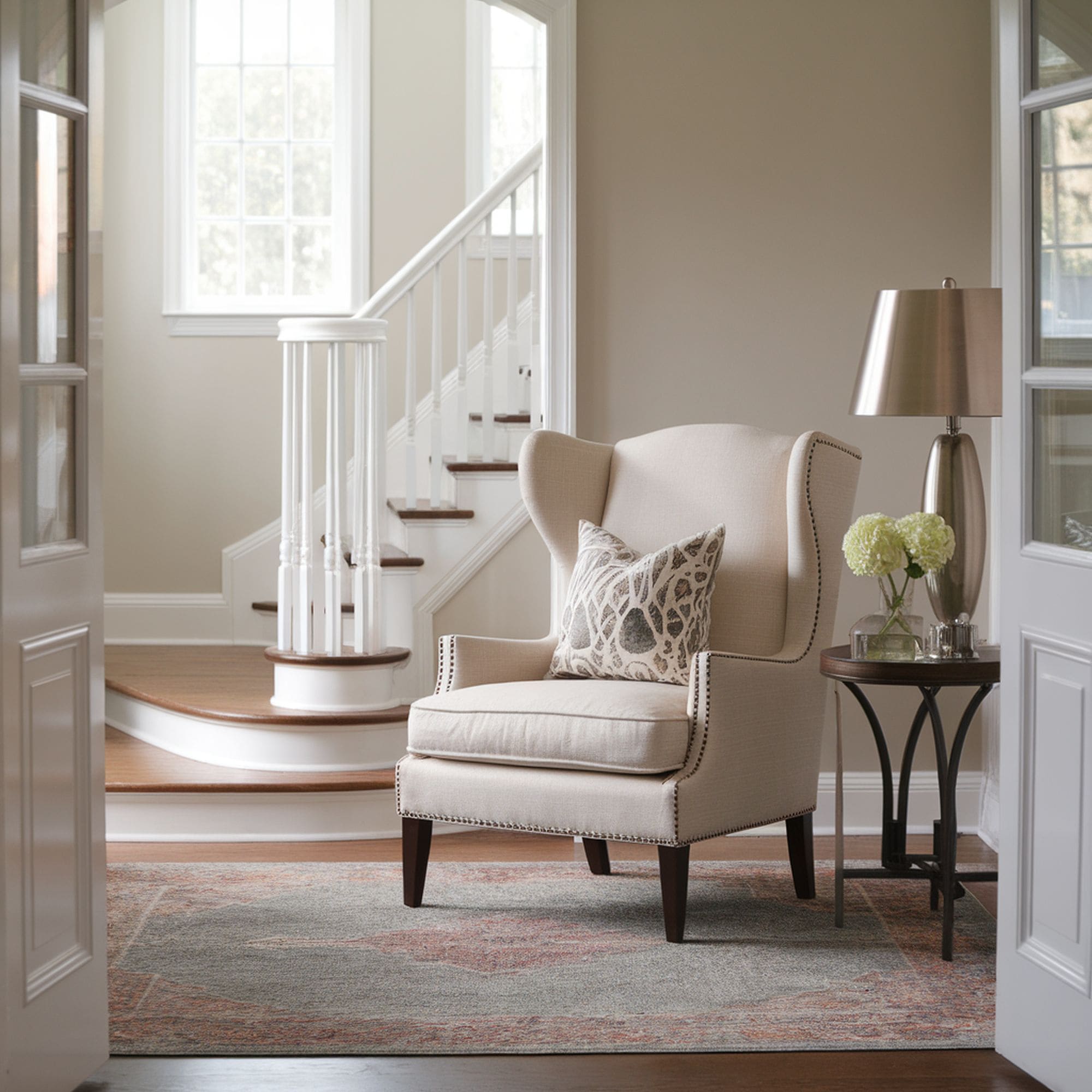
The entryway is the first place that anyone coming to visit your home will see. Most people imagine that you have to impress guests with some flashy colors, but a neutral-toned entryway can make a great statement as well. It’s all about using neutrals to show off your good taste and incorporating design elements in a balanced manner. Instead of striking patterns that immediately draw the attention, consider choosing subtler designs that are beautifully enhanced in a neutral color scheme.
In terms of furniture, a neutral entryway can gain a more interesting personality if you select an unexpected piece to highlight. The high-backed chair shown here is a great example as its aesthetic and functional style seems like a solid match for the neutral colors in the hallway. If the rest of your home makes use of a generally neutral color palette, it’s best to stick to a similar direction when designing the entryway. Guests can make the transition from this area to other rooms more naturally.
13. Powder Room
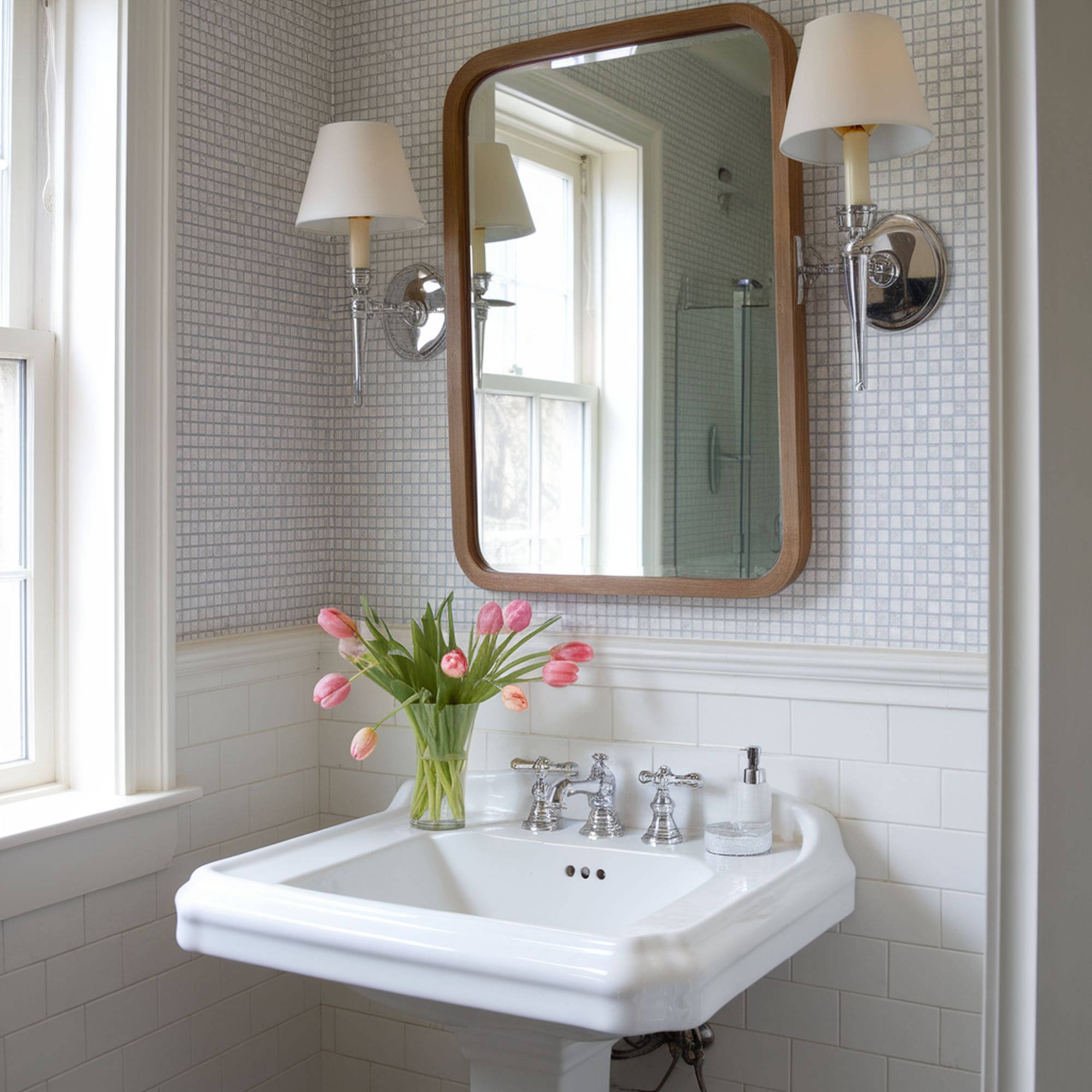
Powder rooms will usually benefit from vibrant colors and bold designs and that’s because this place has a better-defined aesthetic purpose compared to a normal bathroom. Using neutral colors here may not seem like the first option for the powder room, but this kind of color scheme can have a great supporting role if you wish to showcase some other interesting elements.
Solid neutrals in the powder room will look a bit bland. The easiest way to bring in some visual interest is through patterns. You can come up with a more elegant design for this area if you choose to integrate some wallpapers or stencils. Neutrals will never feel boring here if you know how to combine them with more eye-catching details.

Leave a Reply