
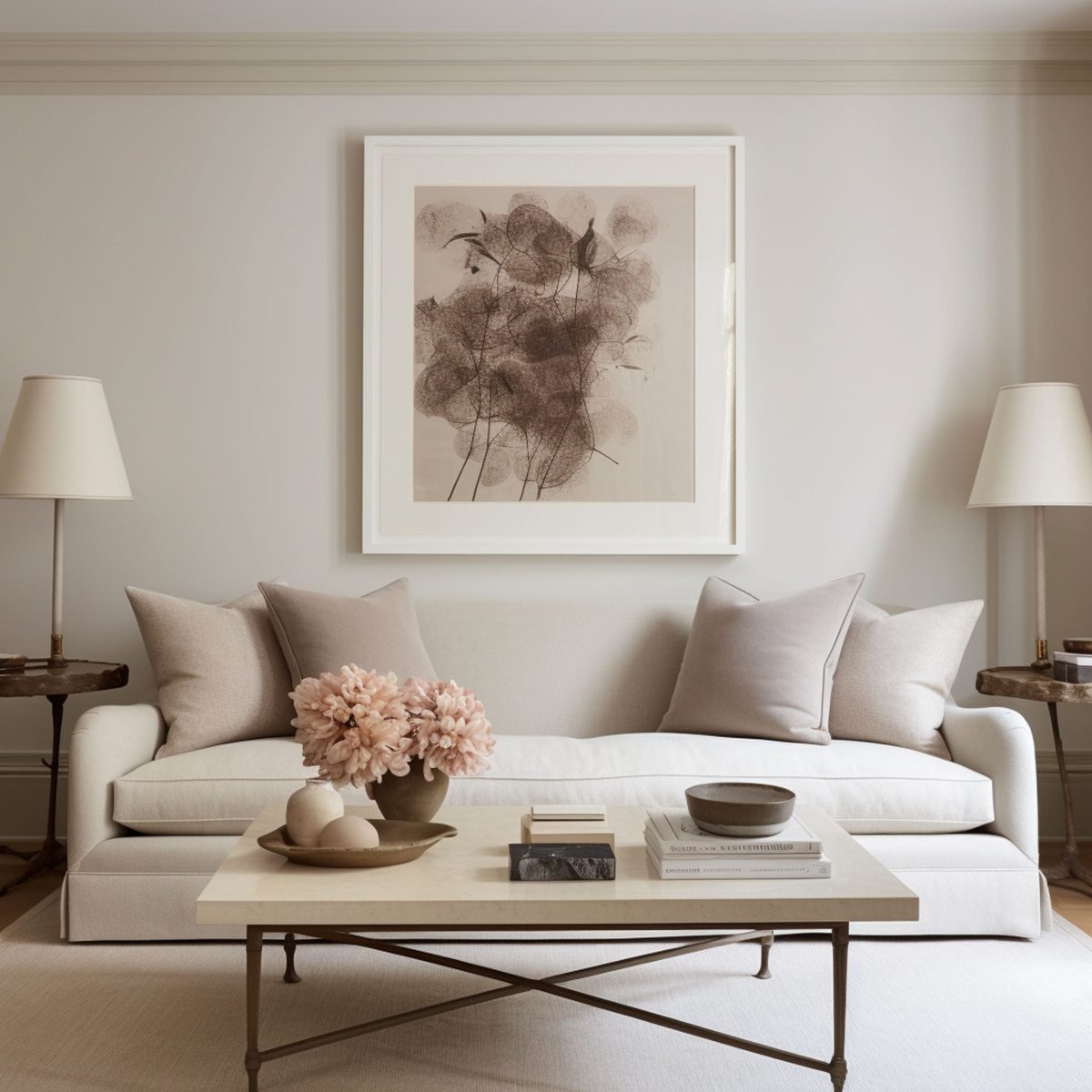
Thanks to its timeless qualities, white remains a consistently popular color in home design. If you like the neutral style of white but prefer an extra dose of warmth, you might consider cream or off-white tones to decorate your home. These shades of white can be fairly easy to integrate with any décor style but it’s important to understand the best matching tones that can improve upon the neutral beauty of warm or off-whites. If you’ve decided to create a cozy ambiance using a cream color palette, check out the best colors to incorporate alongside this white tone. Take advantage of cream’s amazing versatility while using specific shades to maintain a visual balance in the room.
1. Charcoal Gray
Gray is an excellent color to mix together with either cream or off-white thanks to its ability to create a pleasant contrast. The warmth of creamy tones can be counteracted elegantly with the coolness of gray resulting in a soothing atmosphere. The fact that both colors are neutral means you can successfully combine them in different décor styles. Charcoal gray is a recommended shade if you enjoy a more intense contrast that’s still safely in a neutral range.
2. Yellow
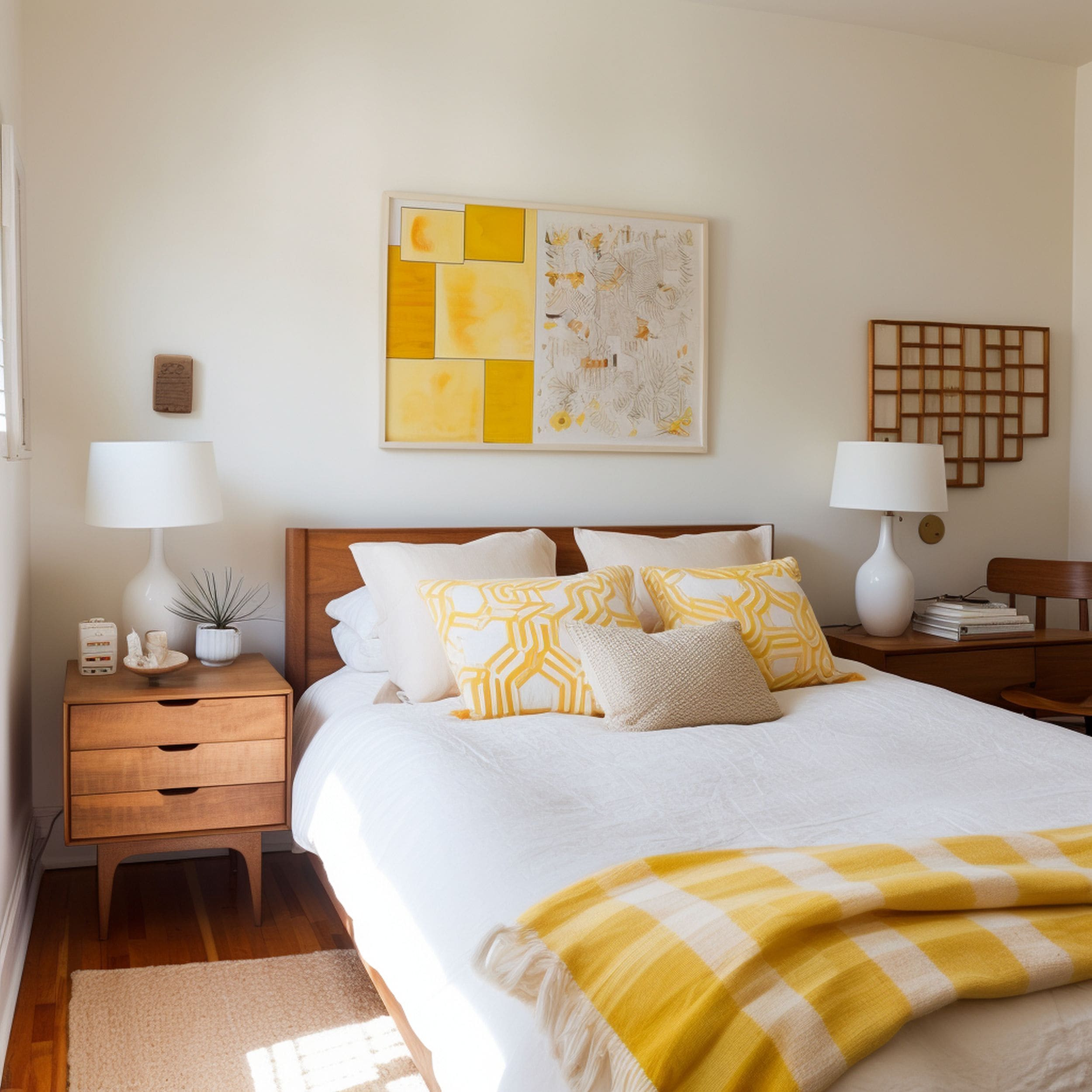
Cream is essentially a mix of yellow and white that results in a cozy pastel tone. You can take advantage of the subtle hint of yellow in cream to enhance the warmth of the color scheme even further. By introducing a cheerful tone of yellow in a cream room, you can build upon the natural warmth that’s already present in cream. The result is a luminous home design that feels very inviting. This sunny color combination works very well with classy wood furniture pieces for a cozy modern vibe.
3. Sage Green
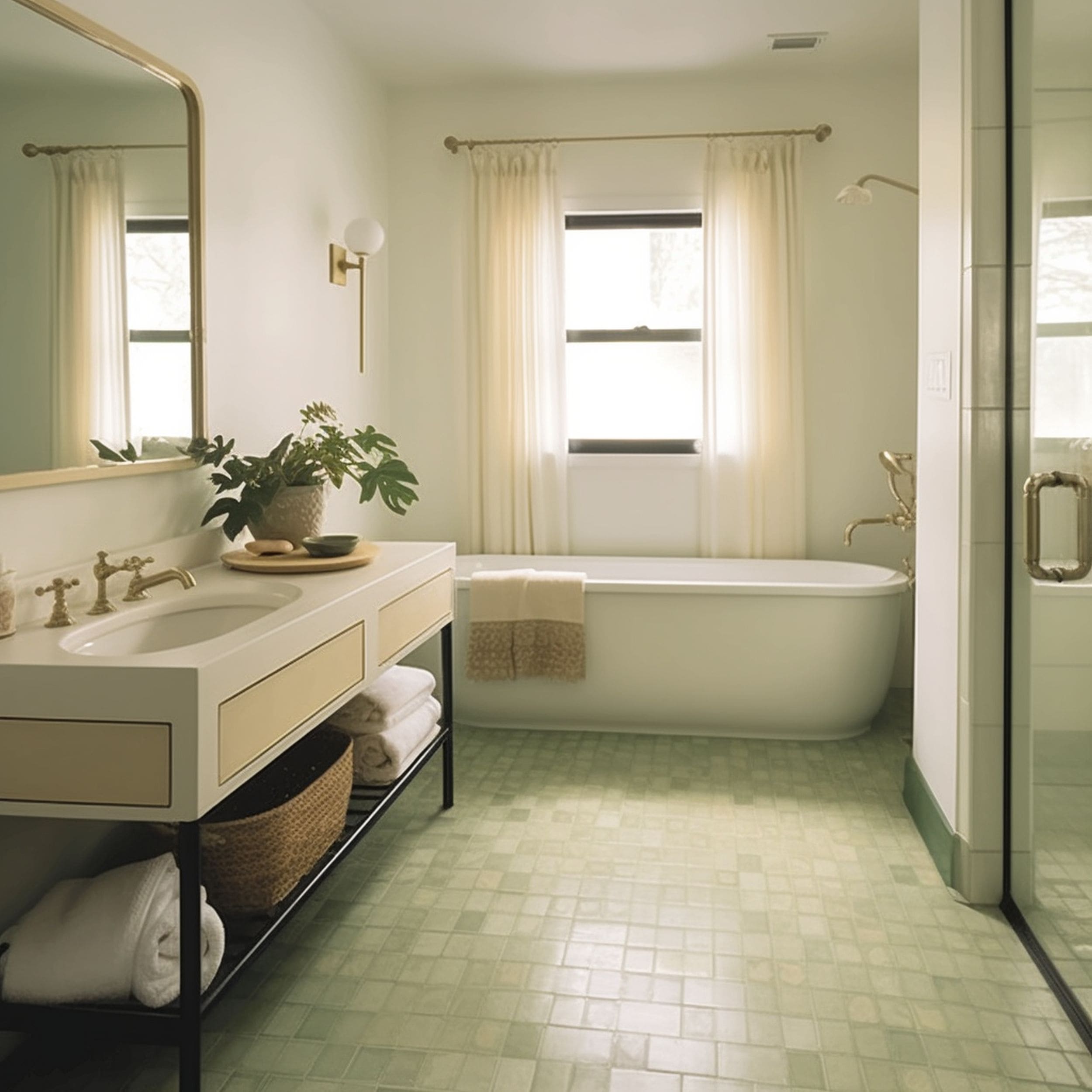
When it comes to calming tones to match cream, a few options work better than sage green. This lovely shade of green offers the same pastel vibe of cream while infusing the space with an organic feel. While other green tones can also be considered great companions to cream, it looks like sage green makes the most impressive visual impact. If you want to incorporate a cream or off-white color scheme in the bathroom, sage green floor tile can bring a lush spa-like vibe to the area.
4. Teal
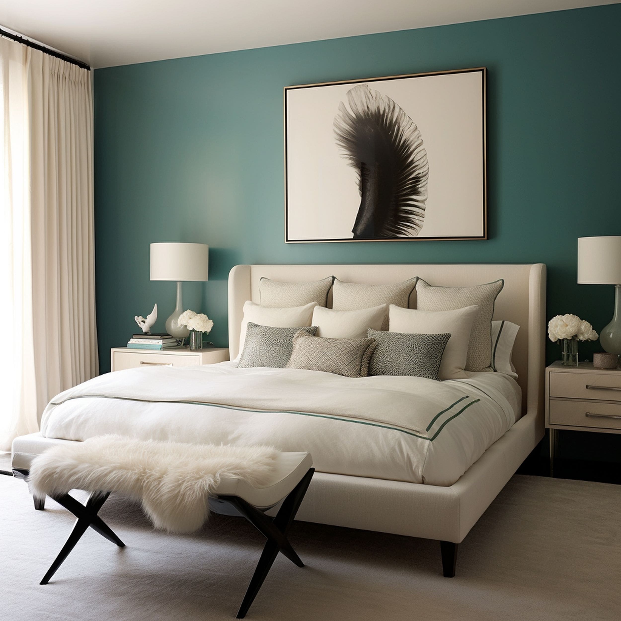
Blue is another interesting color that can enhance the relaxing vibe of cream. Thanks to its characteristic coolness, blue might be a better candidate than other colors to create a strong contrast in a warm neutral color scheme. If you’re looking to make a bold statement, try mixing up creamy white tones with teal. This shade of blue can be used quite effectively to infuse the room with a sense of cool elegance. Check out this stunning teal accent wall that provides excellent contrast when paired with neutral cream elements.
5. Leather Brown
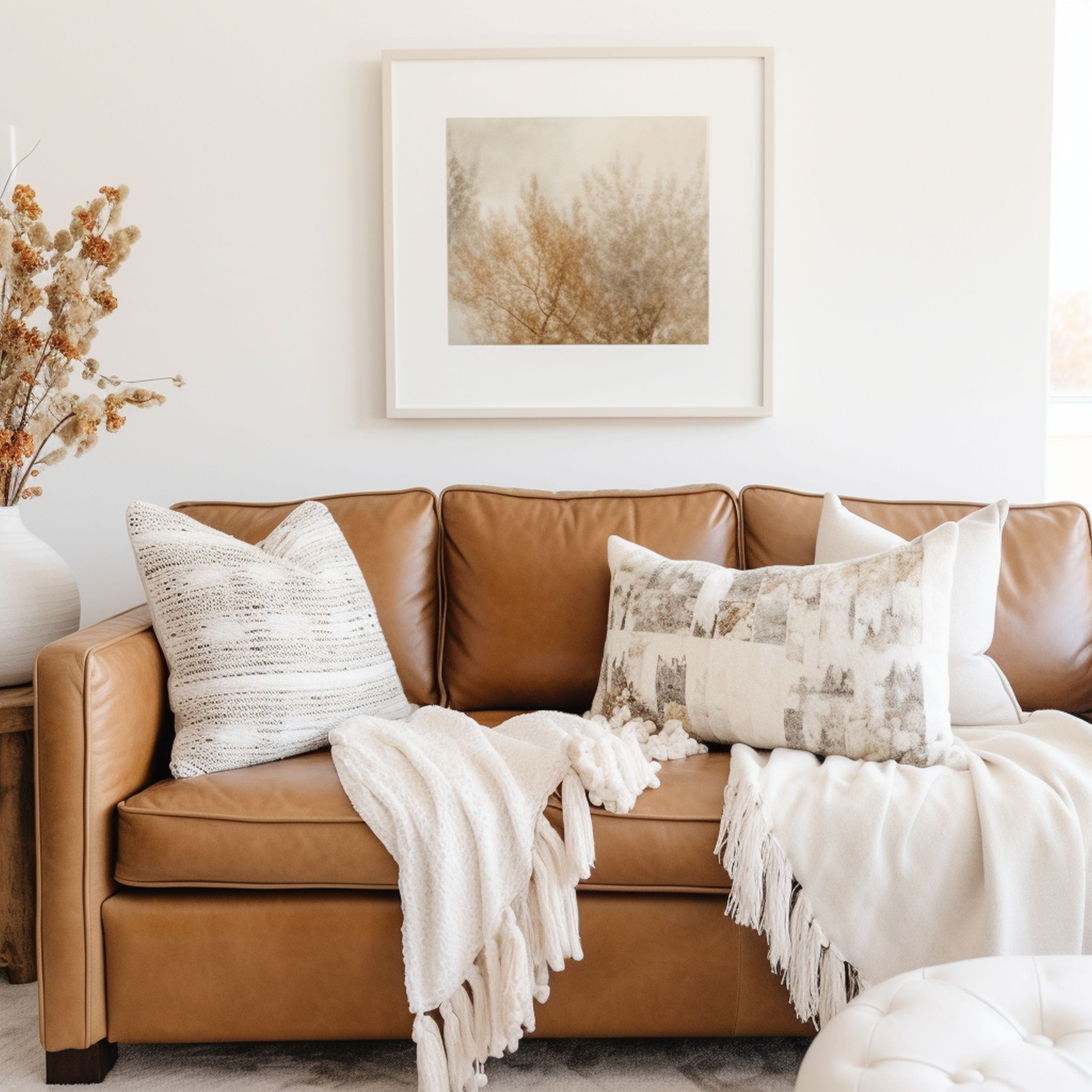
Whether it’s a toasty shade or chocolate tone, brown seems like a solid match for cream and off-white. A leather brown shade can enhance the depth of a pastel shade like cream and introduce some great boldness to the room. It’s a particularly good color option if you’re looking to add a more masculine vibe to the space without compromising on the beauty of neutrals. A leather sofa can be elegantly accented with cream pillows and blankets that allow the eye to focus on contrasting textures as well.
6. Light Blue
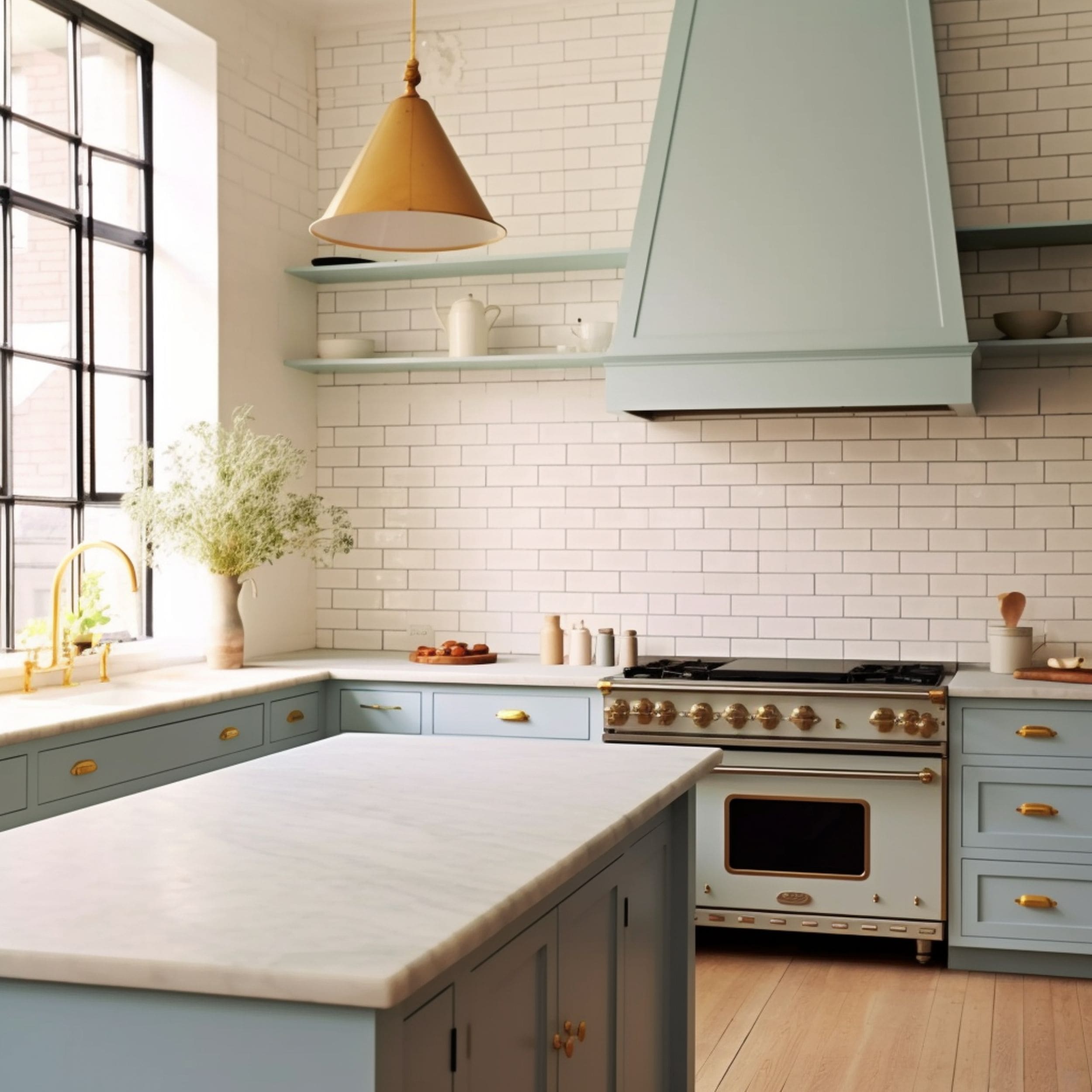
If navy blue or teal feels too intense for your tastes, perhaps a pastel blue shade would work much better when combined with cream. Take a look at this stylish kitchen decorated in pastel tones. It combines a creamy subway-tile backsplash with sky-blue cabinets. Thanks to copious amounts of natural light, the atmosphere in this kitchen feels bright and airy. The light blue provides just enough cool contrast to the warmth of the cream without overwhelming the space.
7. Pale Gray
We’ve already mentioned how cream and off-white go well with gray. Instead of dark tones, consider mixing a pale shade of gray to add depth to your neutral space. Focusing only on warm neutral colors might not always create the desired visual effect. Simply put, there’s a risk of creating a monotonous look if you blend too many similar neutrals together. Keeping your neutral color palette varied can bring a great benefit to enhance the style of the room. That’s why pale gray mixes so well with warm cream.
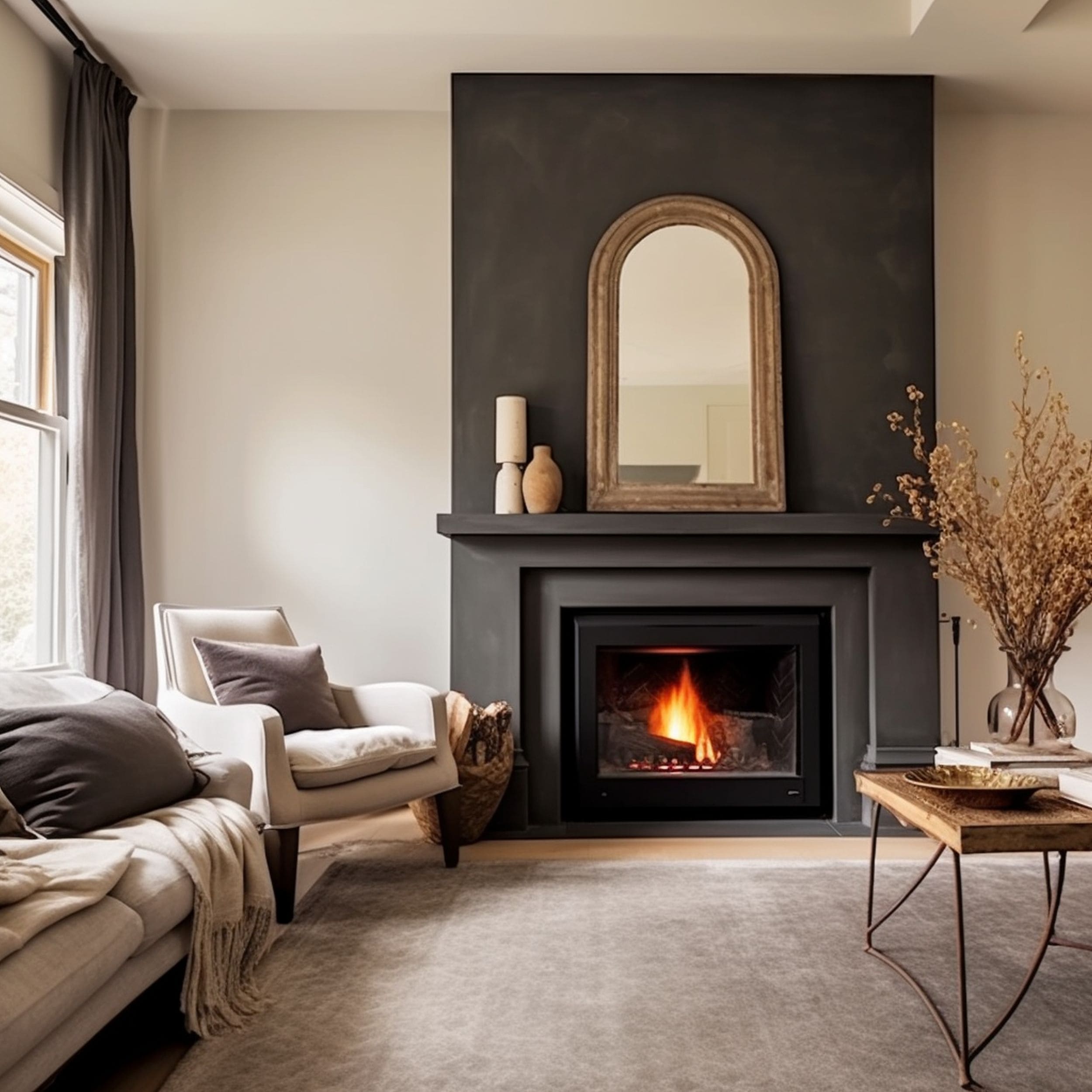
8. Black
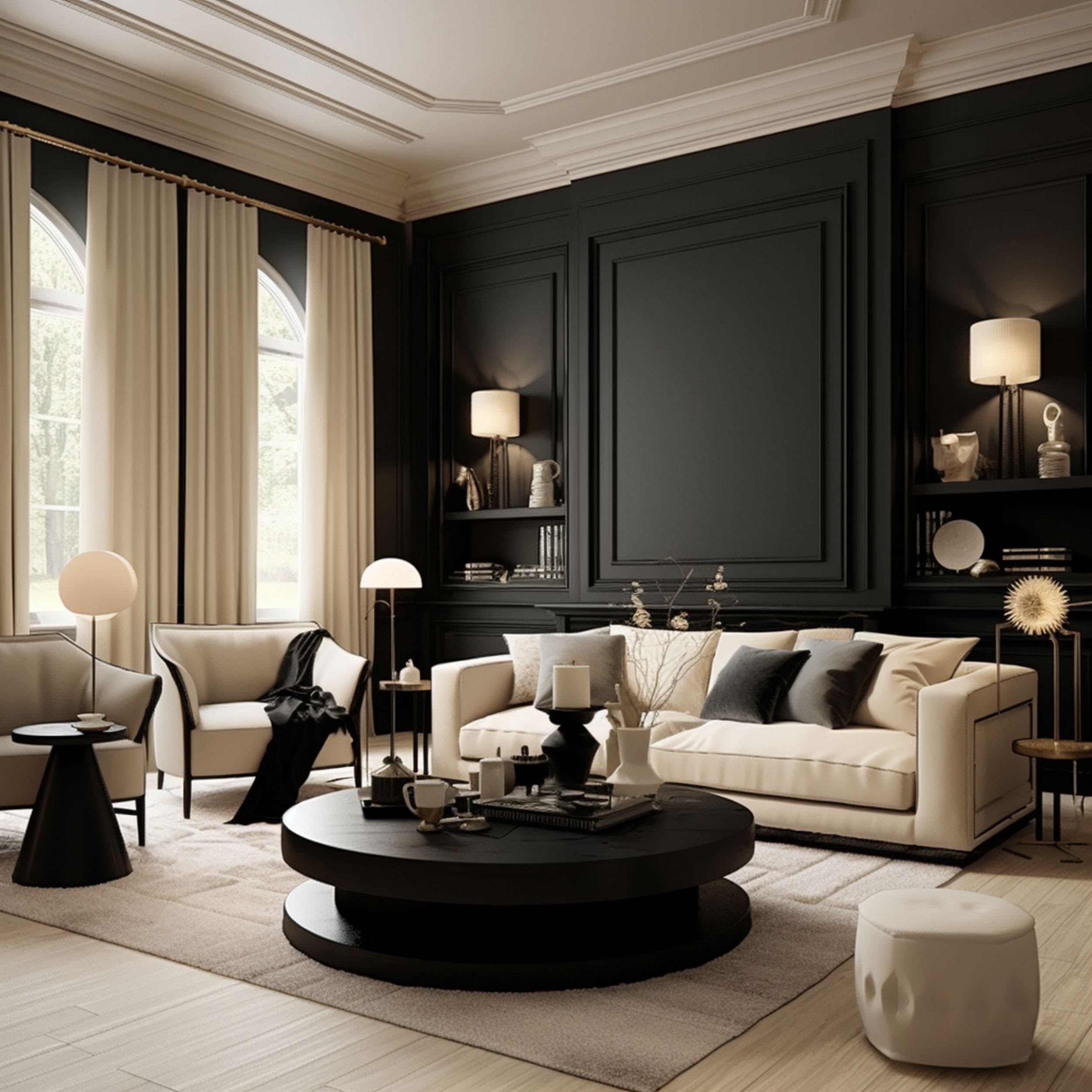
If you’re interested in maintaining a sleek aesthetic suitable for a modern setting, black works as a great companion to cream. It’s recommended to incorporate black elements together with the warmer undertones of cream to bring a sense of drama to the room. It’s safe to say that black and cream is quite the creative combination that could look out of place without the proper elements to emphasize its bold appeal. Consider accenting this color scheme with lots of decorative patterns and luxurious furniture pieces.
9. White
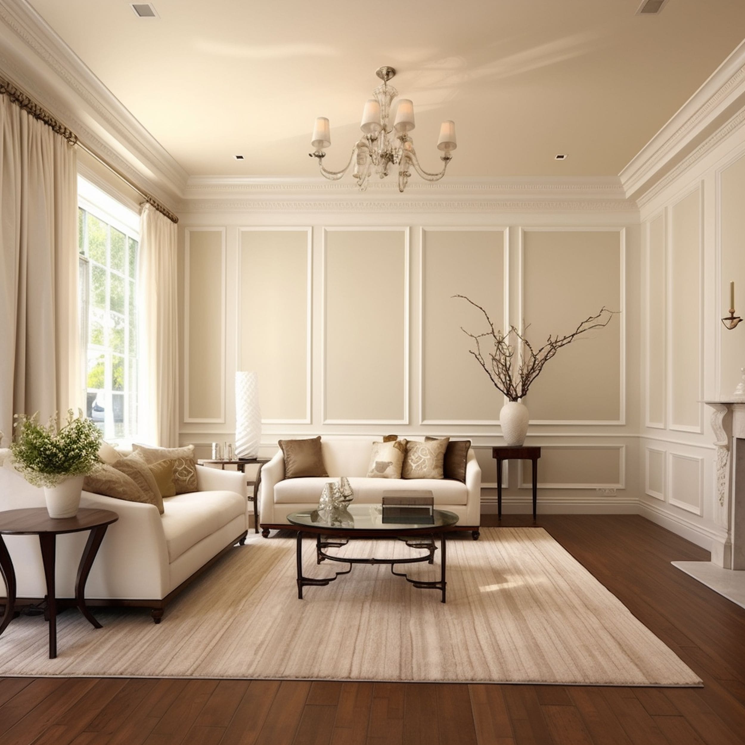
The subtle yellow hue of cream stands out properly when you add clean white elements. Although there’s not a lot of contrast between white and cream, you can create a distinctive monochromatic style by mixing together the right accessories. Keep the walls cream and focus on white moldings or other decorative elements to bring the warmth into focus more effectively. At the same time, this approach doesn’t sacrifice subtlety to maintain a welcoming atmosphere.
10. Forest Green
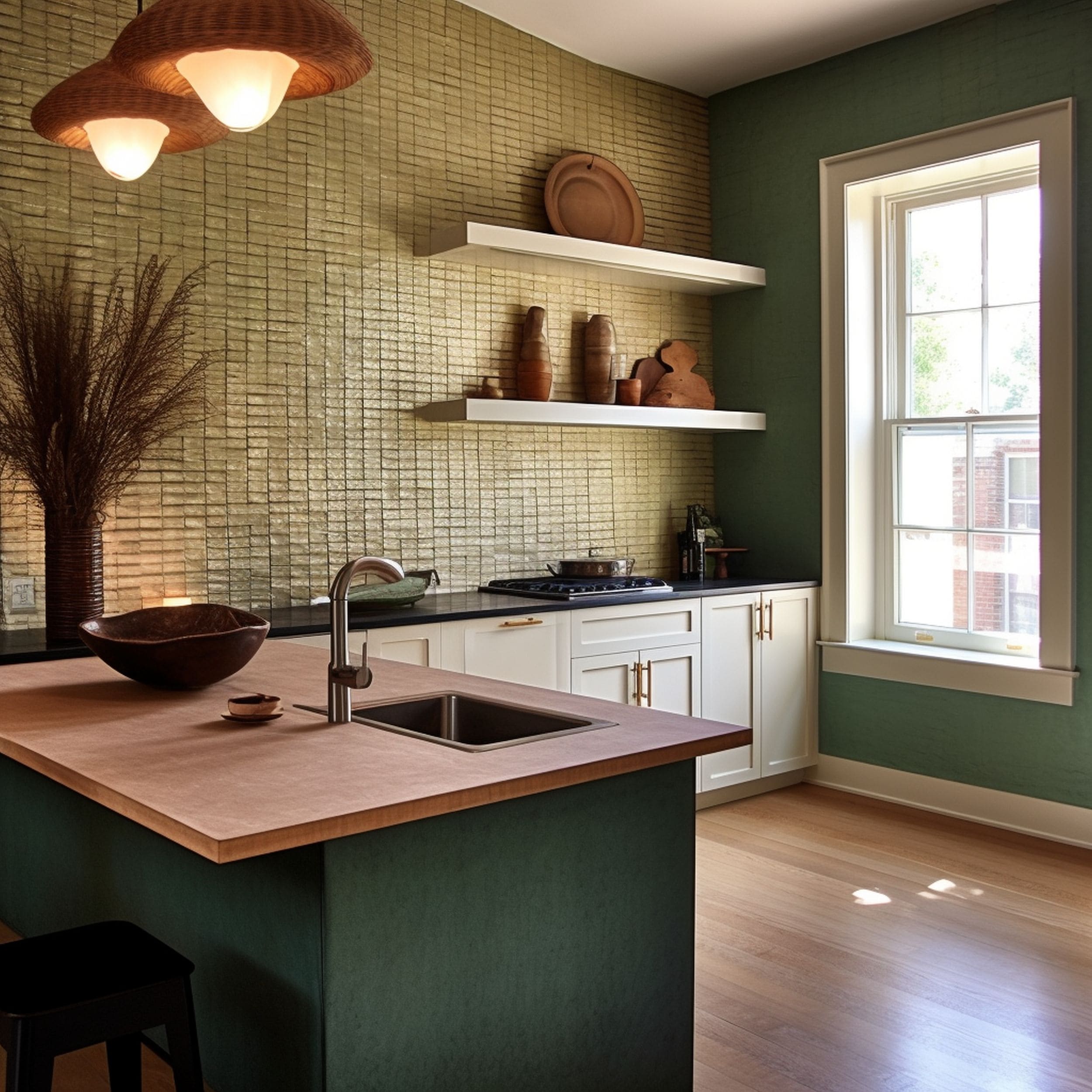
Anyone who enjoys the warm appeal of cream will probably be delighted to combine it with the earthy vibe of forest green. A deeper shade of green seems to enhance the connection to the natural world. It’s a welcoming color punch in a neutral color scheme focused on creamy tones of white. Depending on your personal preferences, you could try a particularly dark green tone to modernize the style of a kitchen whose walls are dressed in textured cream wallpaper.

Leave a Reply