
When it comes to color intensity, it’s safe to say that red is somewhere at the top. Figuring out which colors match well with its can be a great challenge in the world of interior design. Due to the strength of red and what it may usually represent for people, this color is typically not recommended for complete makeovers, especially in areas that are supposed to be relaxing such as the bedroom. While there are some rules to follow if you’re interested in good design practices, you might discover that some unusual combinations can have exciting aesthetic potential.
Red is associated with anger and love so it’s not surprising that it has a reputation for being too strong and intense for most home décor applications. That being said, when used in correct color combinations, red starts to shine by showcasing its fiery character more effectively. It turns out that red is a solid pick for bold and attractive interior design projects. The following color combinations can show you the true potential of this misunderstood hue and inspire your own décor decisions.
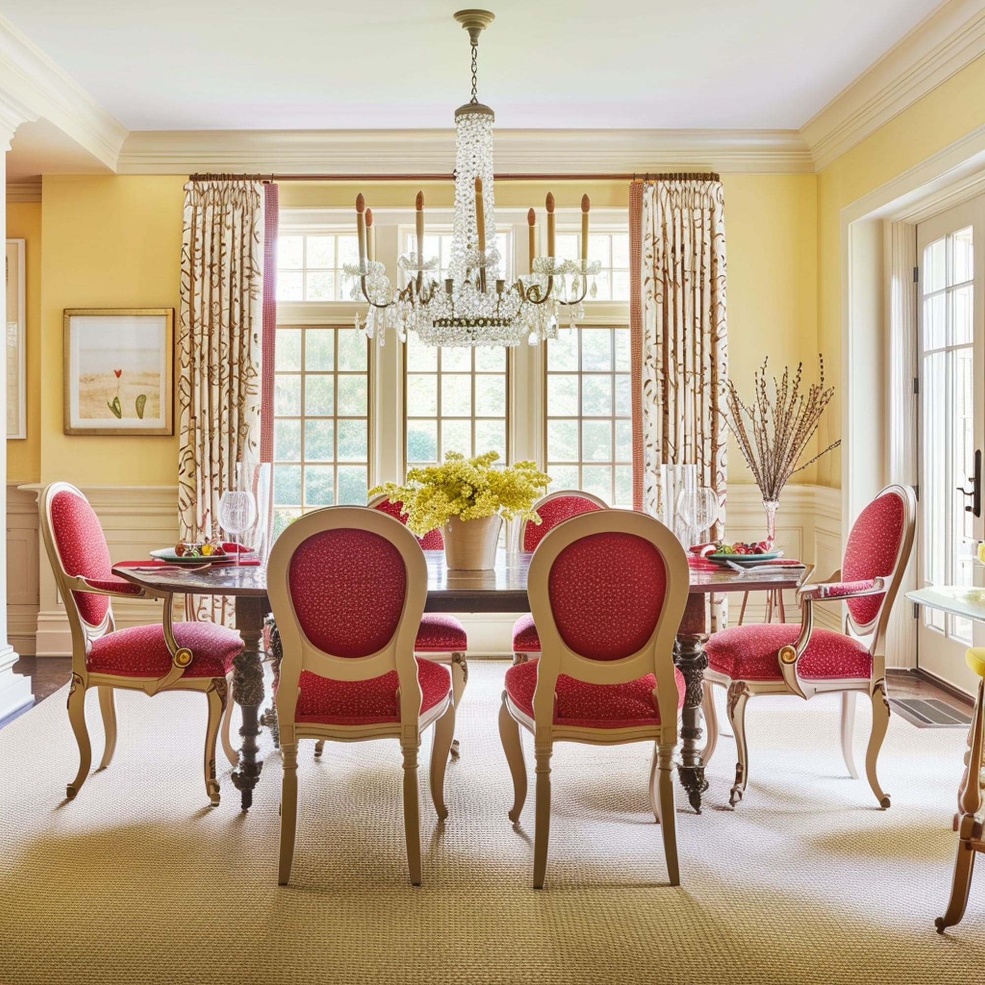
1. Red & Turquoise
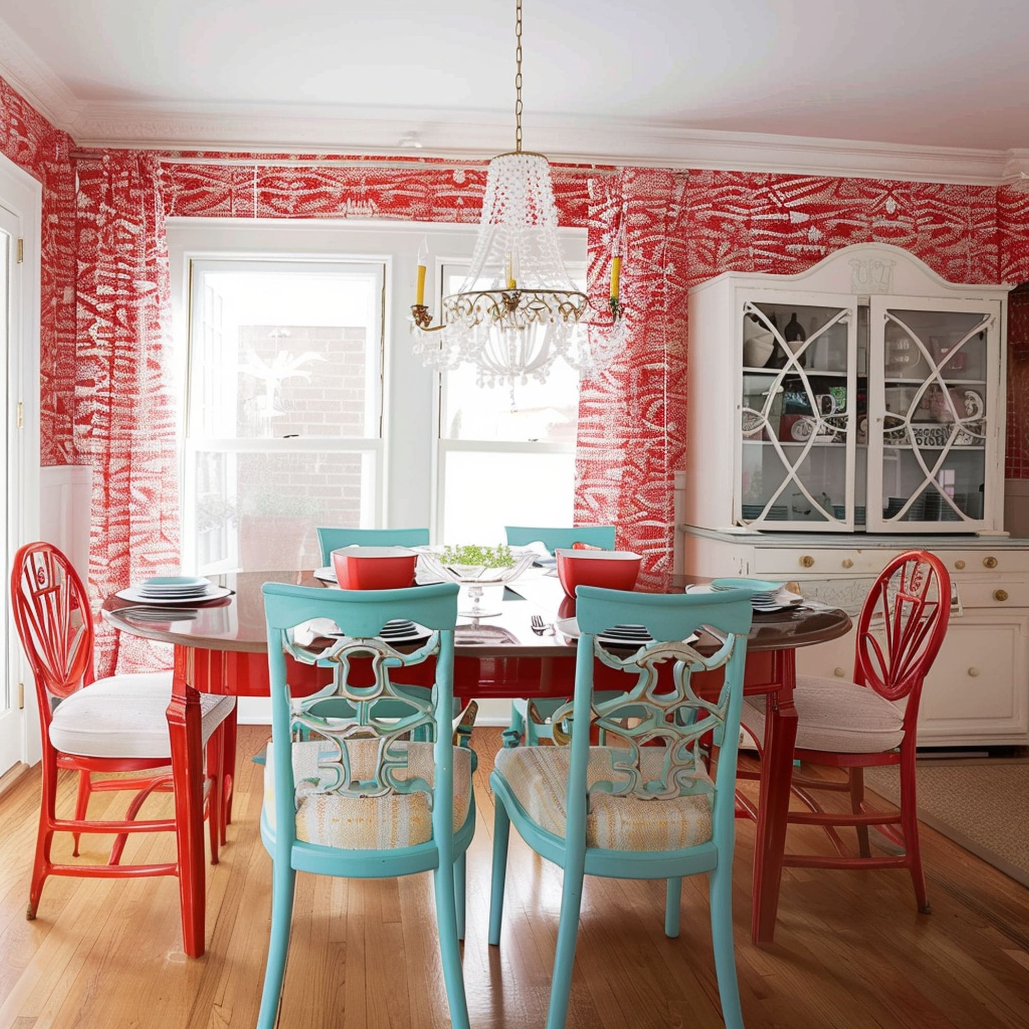
Bringing two loud color shades together could be a smart idea because the resulting contrast is often very attractive. The secret is to combine them properly to create a neutralizing effect. Here’s a great example of the style created by mixing red and turquoise. The pop of color provided by turquoise gives off an unexpectedly soothing vibe. It blends nicely with the red-and-white color scheme making this dining room feel quirky in a subtle way. The result is a sense of pleasant intensity that puts you in a cheerful mood.
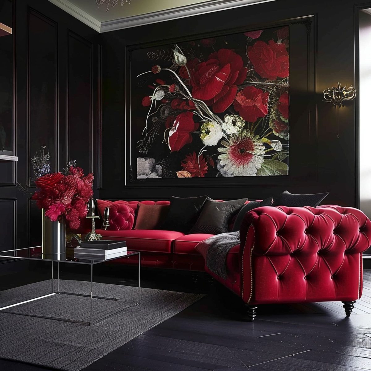
2. Red & Black
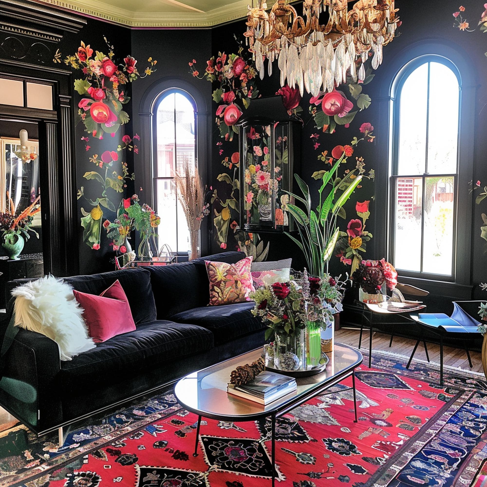
The combination of red and black has a certain timeless quality to it. Bold interior designers can take advantage of a darker background to showcase the vivid beauty of red elements. Notice the contrast between the black couch and the red rug in this maximalist living room. The elegant air of the furnishings is greatly accentuated by the floral design of the removable wallpaper. It’s certainly not the kind of design that would appeal to everyone’s taste, but it’s worth a try if you have some flair for dramatic visuals.
3. Red & Pink Blush
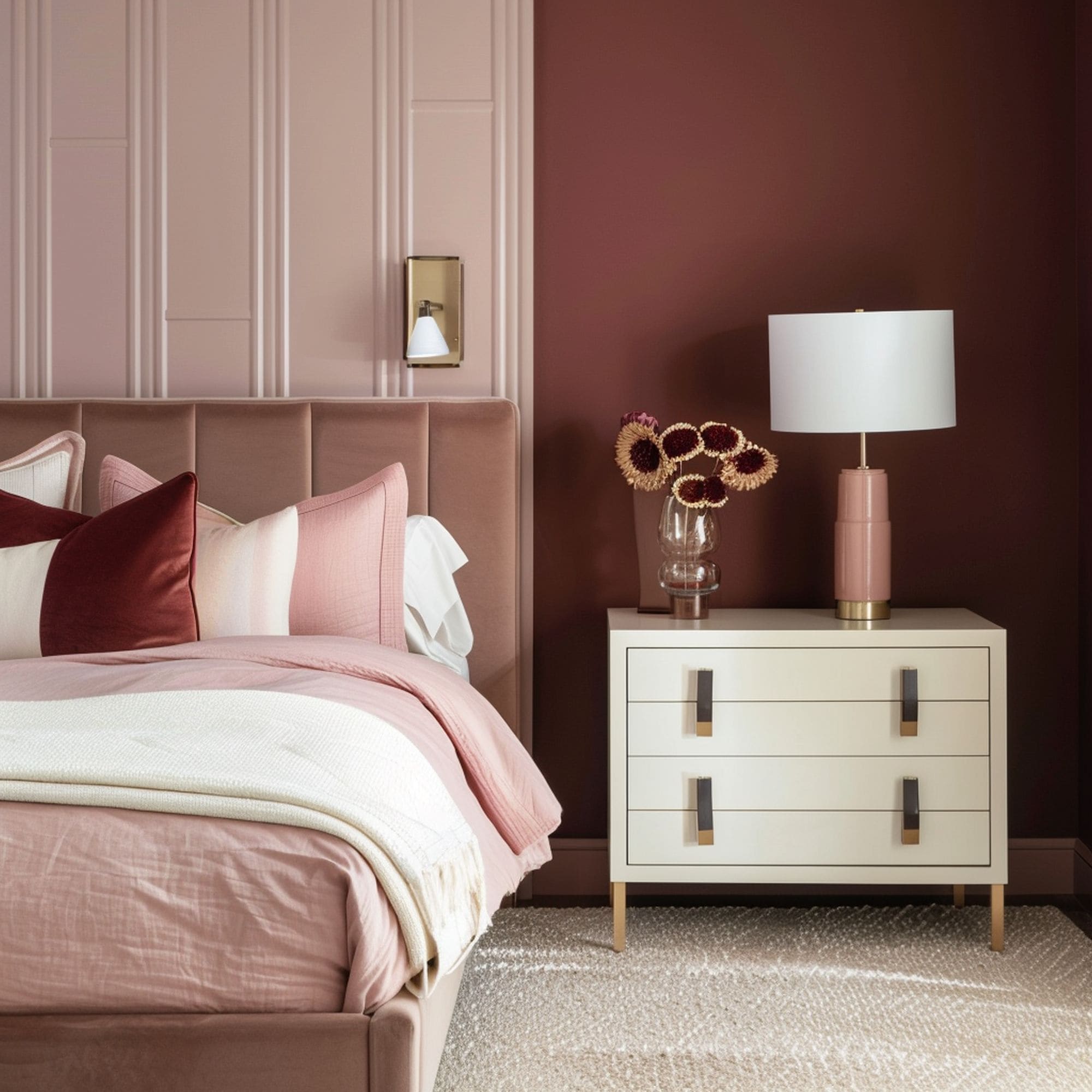
Bordering on the edge of being a neutral color, pink blush can subdue the impact of a stronger color such as red. The delicate rosy shade is somewhat similar to a neutral hue but it pairs even better with intense colors. Considering the light tone of blush, it’s usually recommended to opt for darker shades of red to pull off a harmonious color scheme. Deep burgundy is a solid example, as evidenced by this bedroom that feels cozy and vibrant at the same time.
4. Red & Yellow
If you’re looking to create a warm environment that keeps you energized, it’s worth considering the combination of red and yellow. It doesn’t feel like the most intuitive pairing given the lack of subtlety of either shade. However, mixing them thoughtfully can avoid the overwhelming sensation of an eyesore whenever you enter the room. Combine delicate shades of red and yellow that bring sufficient warmth while neutral tones maintain a proper visual balance.
5. Red & Green
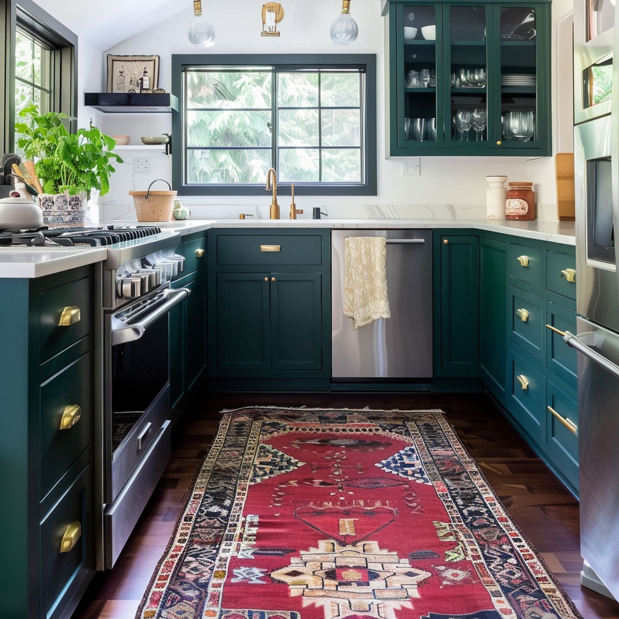
Red and green is a great pairing but it’s usually avoided by interior designers because of the strong association with Christmas. This doesn’t mean you can’t use it. The trick is to focus on some creative tones that combine very well. Here’s a nice example in this kitchen that’s primarily based on a dark teal green and white color palette. Red is subtly introduced in the form of a vintage rug. A muted shade of red is recommended to prevent the room from feeling like a scene from a holiday card.
6. Red & Neutral Tones
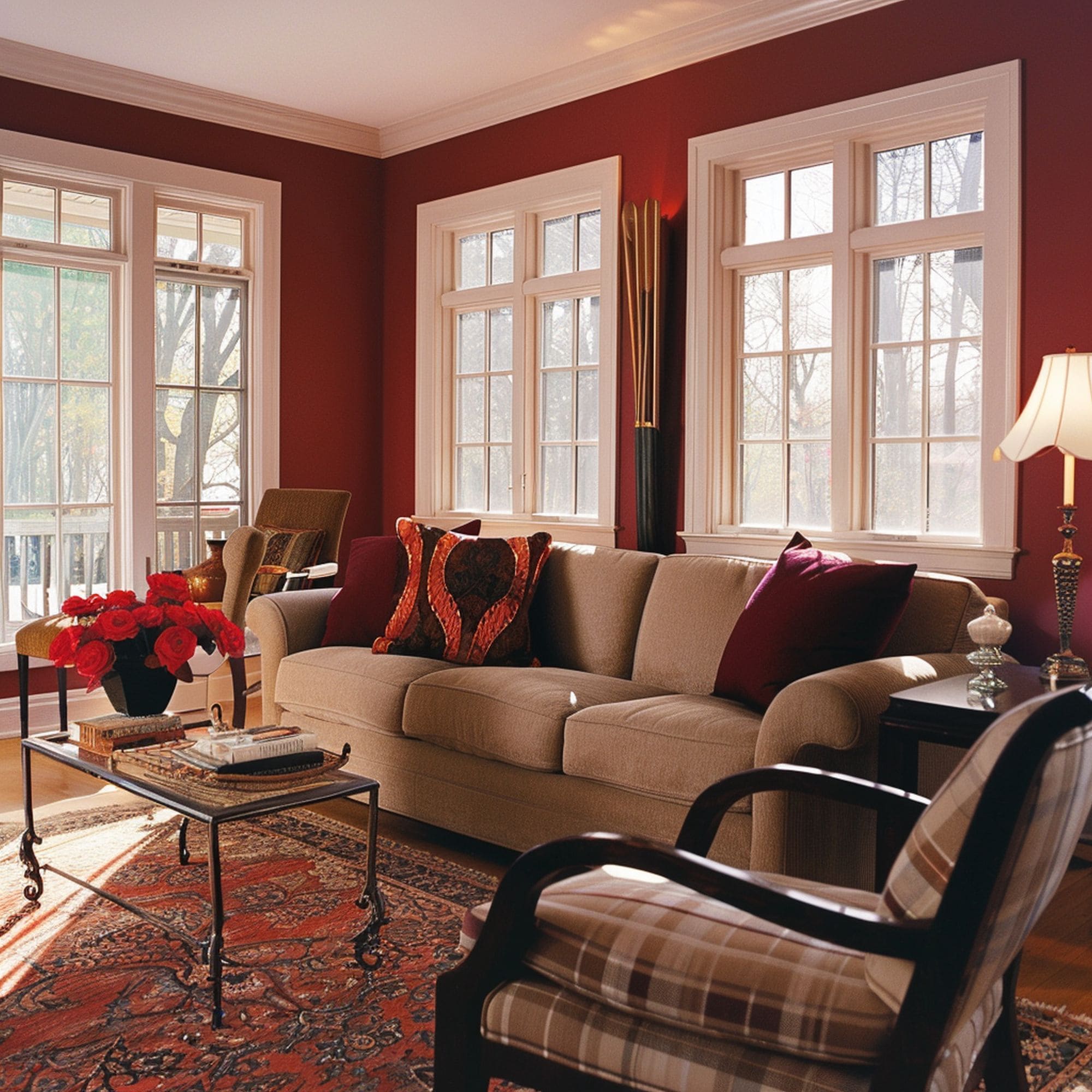
Neutral tones go well with red because of the need to balance its intensity. While the first neutral pick for many would be a bright white, it’s actually recommended to opt for darker neutrals such as grays or beiges. This is a good solution to avoid the bright clash from fiery red and plain white, which can happen more often in a living room that’s flooded with natural light. It results in a cozy color combination that also exudes an air of confidence.
7. Red & Brown
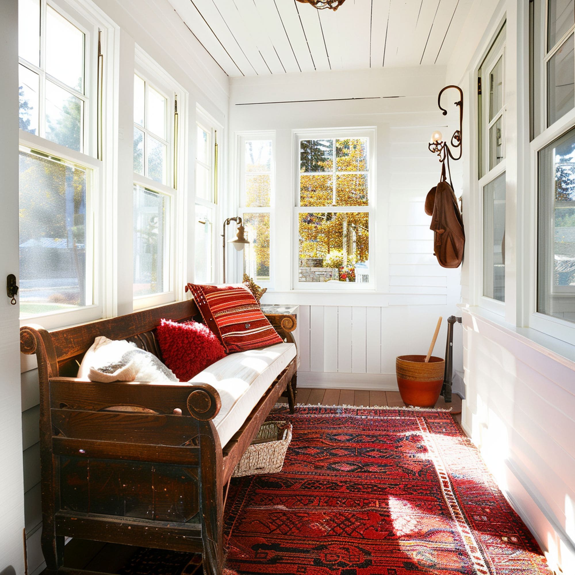
Burgundy red forms a great pairing with brown in this cozy sunroom. The area relies mostly on neutral shades of white and brown to keep the room firmly grounded. It provides the perfect background for a more notable pop of color. The red rug doesn’t feel overwhelming at all but actually contributes to the sense of coziness. It adds some welcomed intensity through the burgundy hue that warms the space. This is proof that red can be surprisingly versatile.
8. Red & Purple
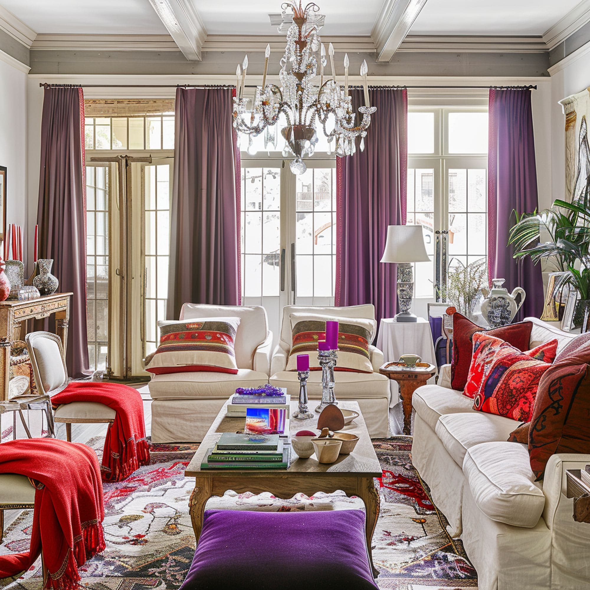
Another dramatic combination, the mix of red and purple can be a fitting choice for maximalist décor styles. It’s an unlikely duo that only works well for certain home aesthetics. The secret to pulling off a red and purple look is to keep in mind the tonal range similarity. There are lots of red and purple shades that can clash so it’s a riskier combination than others. Make sure you keep the space well-grounded with the help of neutral tones to allow the color mix to stand out properly.
9. Red & Gray
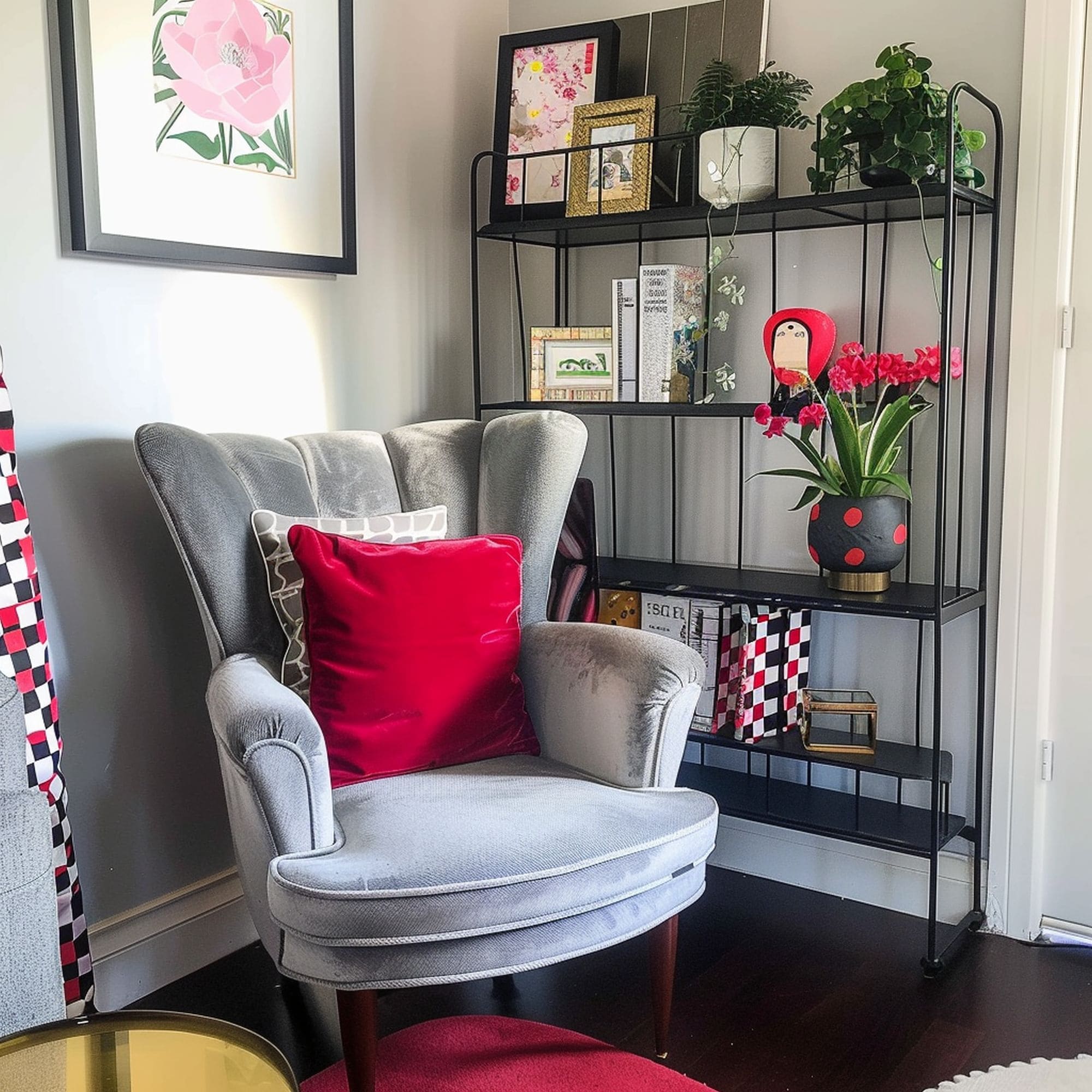
With the right neutral background, a red accent can show off its full decorative potential. Take a look at this creative blend of gray tones with some punchy red. This little corner of the room is transformed by the addition of fun patterns and an abundance of greenery. The red pillow on the chair has the ability to instantly grab all the attention. It’s a welcomed pop of color to make the predominantly neutral-toned area feel livelier.
10. Red & Navy
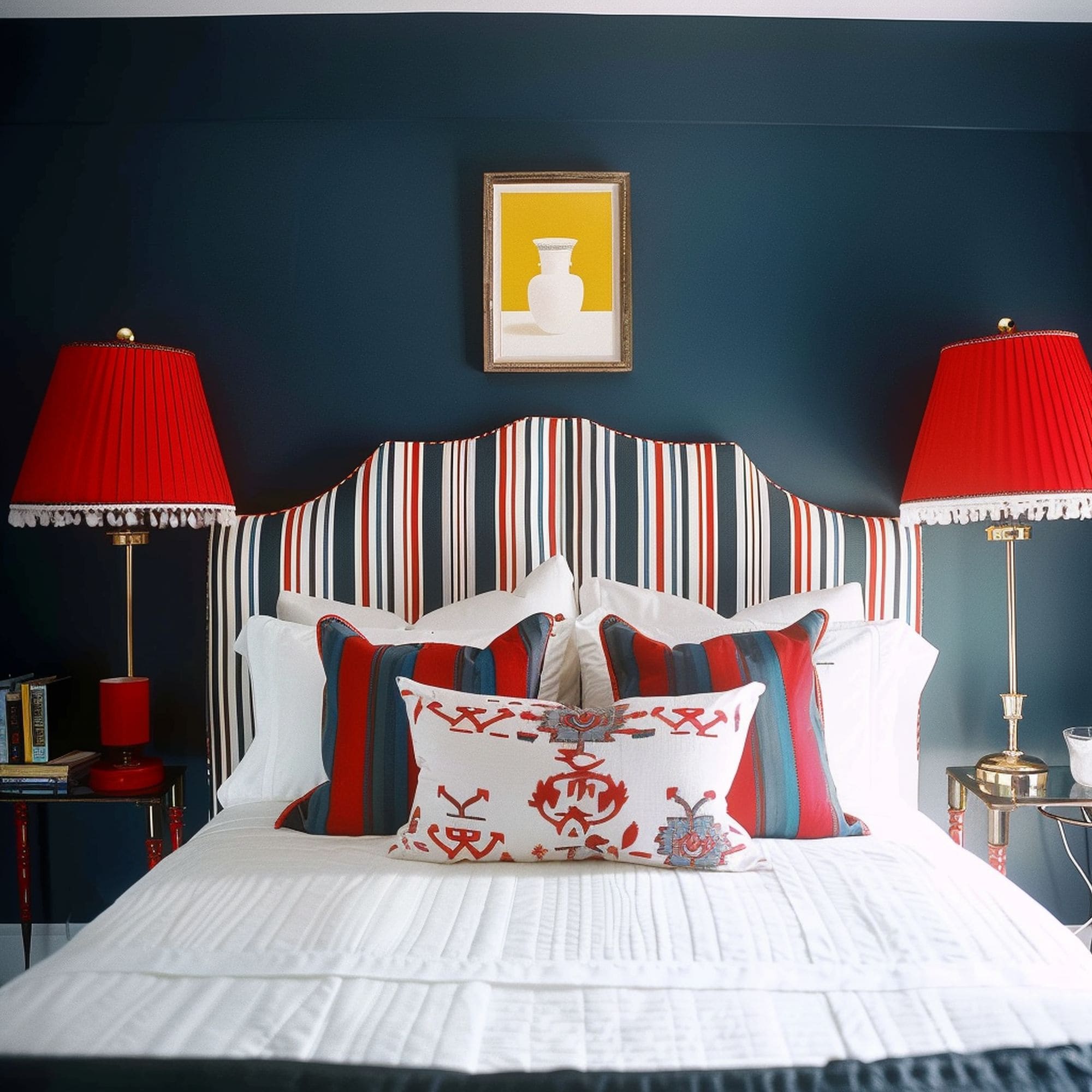
A deep shade of navy blue can form an attractive pairing with vibrant red tones. Check out the color scheme of this bedroom that gives an air of sophistication to the classic mix of red and blue. There’s a somewhat unexpected visual effect created when combining primary red from the lamps with the elegant navy blue walls. The use of striped patterns can increase the cheerfulness of the bedroom but they’re not always necessary. Just using solid color combinations should suffice if you don’t want color to play a huge role in the room’s styling.

Leave a Reply